Beauty and skincare
Beauty and skincare photography with AI
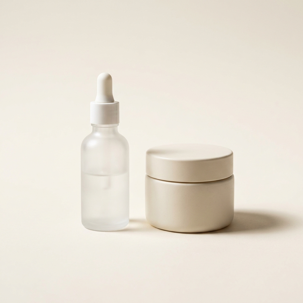
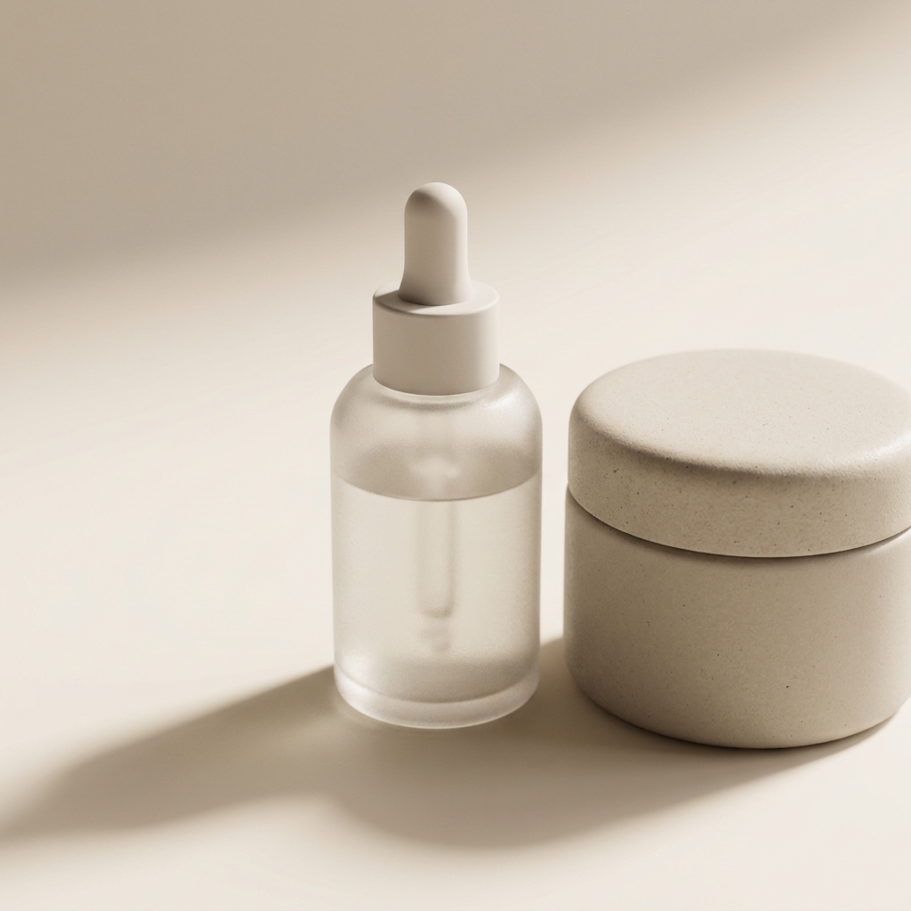
A skincare bottle is a curved label, a glass wall and a chrome pump in one object. Light it so the brand name stays readable and the glass reads clean. Then shoot the texture, so a buyer can see what the product is really like. Every picture keeps your brand's look, at any volume.
Last updated
Who it is for
Does that sound like you?
Scaling without compromising quality.
You need more pictures every week for the shop, the ads and the socials. Anyone can make an AI picture. Making hundreds that still look like your brand is the hard part. A shoot for every product costs weeks, and every new generator returns a different look.
- A template or a workflow you build once, with your brand rules
- One run on one product, or a batch over your whole catalogue
- Every result in Assets, with the same look on the first and the last
Cut the waiting time and budget for deliverables.
You make this for clients, and every client has their own look. A shoot for each one costs weeks and most of the budget. A different generator for each one returns a different look, so somebody fixes it by hand before it is delivered.
- Each client's brand rules, saved once and used on every run
- A workflow you build once and run for every client
- A batch over a client's whole catalogue, delivered from Assets
Beauty and skincare
Beauty photography is the job of keeping a small vessel readable. A label wraps a curve, so only a narrow strip faces the camera. The brand name has to sit inside that strip. Clear glass takes its colour from whatever is behind it, so the background is doing half the work. Then a texture frame shows what is inside, because a sealed bottle tells a buyer nothing about the product itself.
What a beauty listing has to solve
Four problems that come with photographing a small curved vessel.
The label on a curve
A cylinder shows only a narrow strip of its label to the camera. The rest curves away into shadow. Rotate the bottle until the brand name and the product name sit in that strip. Keep the light broad, or the type at the edges goes dark and stops reading.
Glass, droppers and pumps
Clear glass borrows its colour from whatever sits behind it. A dark background turns a clear serum brown. Put a bright card behind the bottle to light the liquid, and a dark card at each side to draw the edges. A chrome pump mirrors the room, so keep the room plain.
Texture and swatch frames
A sealed jar shows nothing about the product. Photograph a smear of the cream, a drop from the dropper, a swatch drawn with a finger. Shoot it close and from the side, with light raking across so the thickness reads. Show the real consistency, since a gel photographed as a balm is a false picture.
Ingredient cues, kept honest
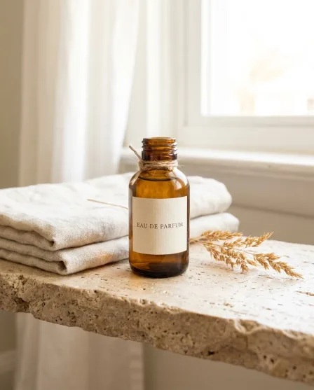
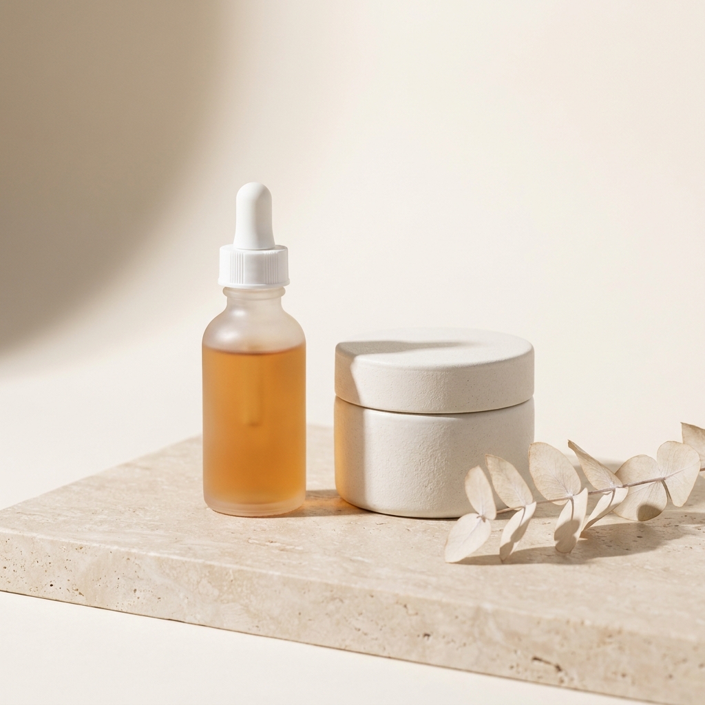
A sprig of botanical next to the bottle sets a mood and hints at the formula. Keep the hint true to the ingredient list, and keep it away from anything that reads as a result. A prop that suggests an effect the product has not proven is a claim, and the seller answers for it.
The shot list for one skincare product
Four steps, from the label to the texture.
The label decides the packshot, so fix the rotation before anything else. Then set the background, because clear glass reports whatever is behind it and the light cannot correct that afterwards. Lighting comes third, wide and soft, so the type stays readable across the curve. Texture and swatch frames are a separate setup and belong in their own session, not squeezed between packshots. Scenes and ad crops come last, since they sit on a bottle that is already correct. Hold one surface and one light across the whole range, or a shelf of your products looks like several brands.
What a beauty listing needs
The frames to have ready before you upload.
Packshot with the label square on
The bottle or jar on plain white, turned so the brand name and product name read at thumbnail size. This is the frame a search grid shows, so the type matters more than the styling.
Texture or swatch frame
The product out of the vessel, shot close with side light. A cream, a gel and an oil look different, and this is the only frame that shows which one a buyer is getting.
Readable ingredient panel
A close frame of the back label, sharp enough to read. Shoot it square to the panel so no line curves away. Small print needs a flat, even light and a high-resolution file, or the type breaks up at the edges.
Size in context
A 30ml bottle and a 100ml bottle look identical alone. Photograph the product beside a hand or on a shelf, so a buyer reads the real size before it arrives smaller than expected.
Questions about beauty product photos
What beauty sellers ask before they shoot a range.
How do I keep the label readable on a round bottle?
Why does my clear serum look the wrong colour?
Do I need a texture shot as well as a packshot?
Can I show a before and after result?
How do I keep a whole range looking like one line?
How do these images reach my store?
Other categories
The same craft, written for a different product.
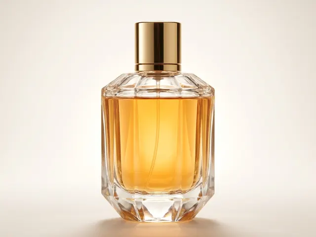
Fragrance and perfume
Glass edges, juice colour, cap detail and a scene that names the note.
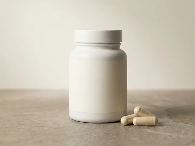
Supplements and wellness
Readable labels, tub and pouch shapes, and clear serving cues.
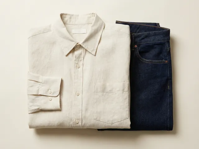
Fashion and apparel
Drape, fabric weight and true colour, held across every image in a clothing listing.
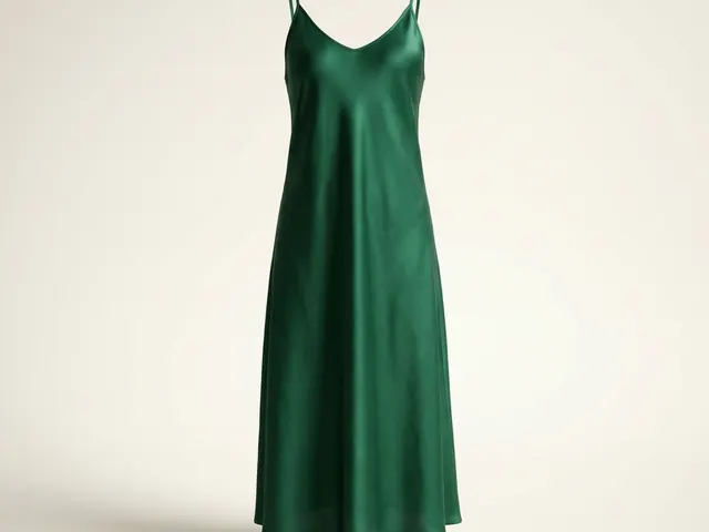
Dresses
Hem line, the fall of a skirt, and a full-length garment inside a square crop.

Wedding dresses
White on white, lace and beadwork detail, and a train that has to be measured.
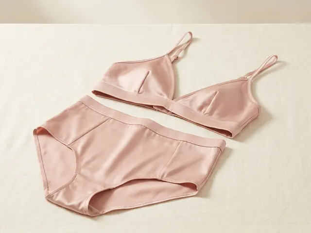
Lingerie photography
Flat lay sets, open lace cut-outs, sheer mesh backing and true nude colour.
Everything you need, in one place
The full workflow from the first product photo to the finished ad, in one subscription.
Scale content without limits.
Generate content for your products or services with AI, starting today, and keep your brand on every piece.