


Wood surface backgrounds
Wood background product photography without the yellow tint
Upload one photo of your product. DesignerBox places it on oak, walnut or ash, with the grain running the way you ask. The wood stays warm and your product keeps its own colour. The cost of a full set shows before you run it. Every picture keeps your brand's look, at any volume.
Who it is for
Does that sound like you?
Scaling without compromising quality.
You need more pictures every week for the shop, the ads and the socials. Anyone can make an AI picture. Making hundreds that still look like your brand is the hard part. A shoot for every product costs weeks, and every new generator returns a different look.
- A template or a workflow you build once, with your brand rules
- One run on one product, or a batch over your whole catalogue
- Every result in Assets, with the same look on the first and the last
Cut the waiting time and budget for deliverables.
You make this for clients, and every client has their own look. A shoot for each one costs weeks and most of the budget. A different generator for each one returns a different look, so somebody fixes it by hand before it is delivered.
- One workspace per client, with that client's brand rules
- A workflow you build once and run for every client
- A batch over a client's whole catalogue, delivered from Assets
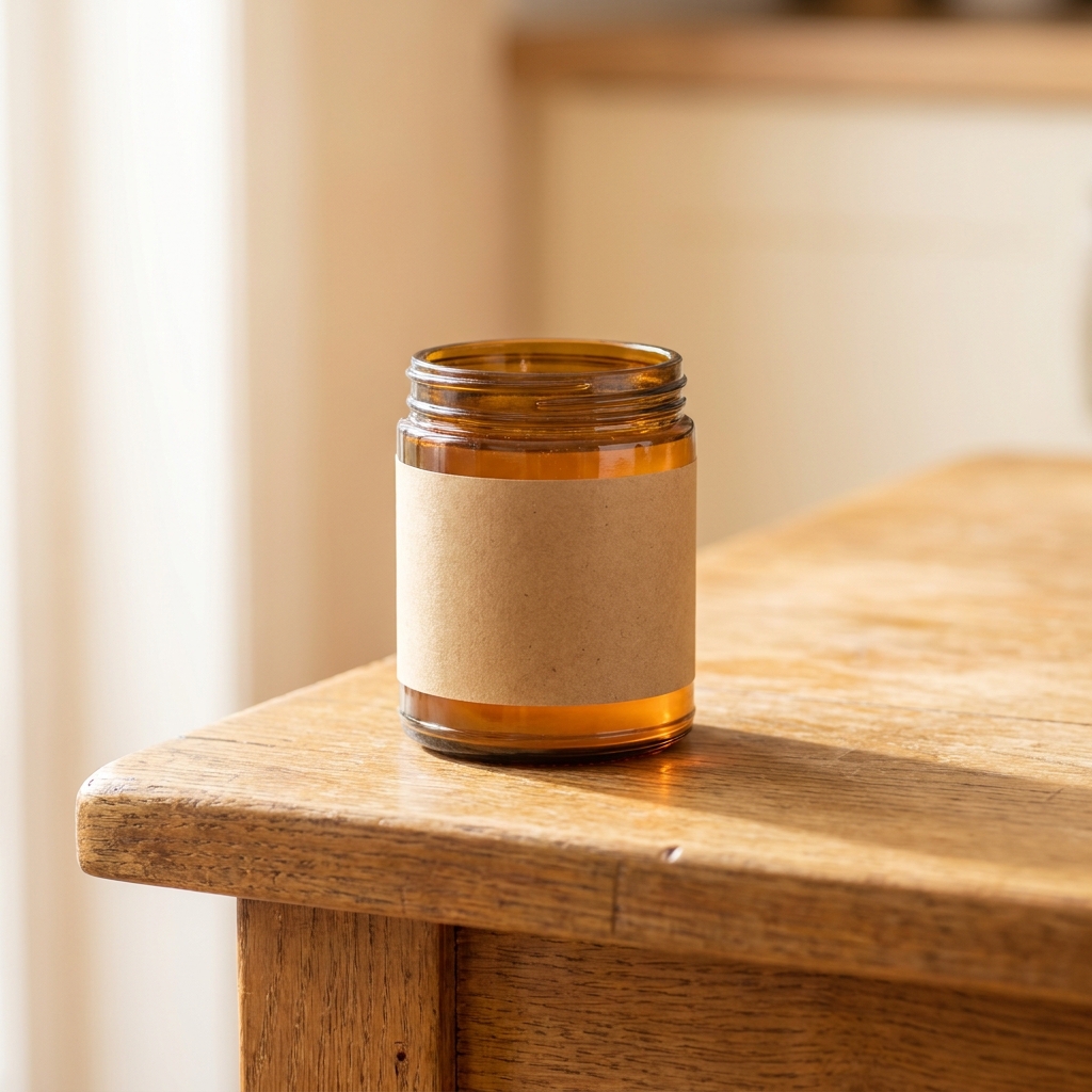
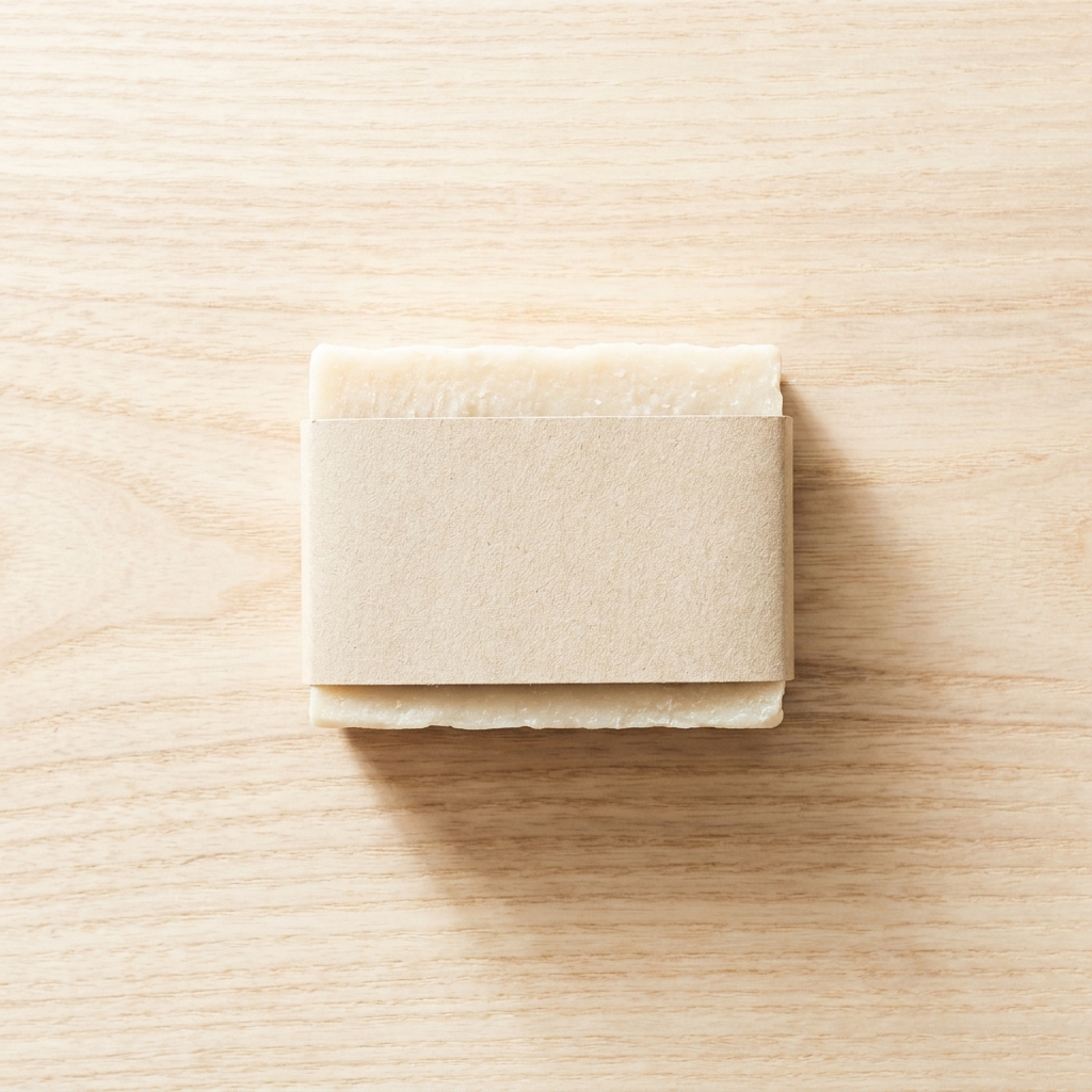
A wood product photography background is a real timber surface, usually oak, walnut or ash, placed under food, drinks, candles, soap and handmade goods. The grain reads as warm, natural and made by a person. That is why wood suits a kitchen worktop or a bathroom shelf, and why it looks like clutter under tech or medical kit. One thing decides whether the frame works, and it is the gap in lightness between the wood and the product. A tan leather wallet on mid oak loses its edges. A cream candle on pale ash does the same. Pick the species by that gap first, then by taste. Dark walnut and pale ash are the two ends you reach for when a product sits stubbornly in the middle.
The hard parts of a wood surface
Warm bounce, grain direction, tone gap and sheen decide whether the frame works.
Wood throws a warm cast
Light hits oak and bounces back orange. That bounce lands on the side of your product facing the table. A white label turns cream and a grey box turns beige. Set the white balance from a neutral grey card lying on the wood. That reading usually drops from 5500K to around 5200K, which cools the product back to true. Then add a white card on the shadow side to reflect clean light onto the product.
Grain leads the eye
Wood grain is a set of long parallel lines. The eye follows them. If the grain runs out of the corner of the frame, the viewer leaves with it. Run the grain across the frame, left to right, behind the product. The lines then act as a shelf and hold the product in place. For a tall bottle, turn the grain across the bottle, not along it. Parallel lines beside a tall shape flatten the shape.
Match the wood tone to the product
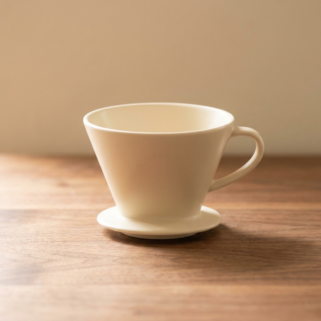
Dark walnut and a dark product merge. Pale ash and a pale product do the same. Pick the wood by the tone of what you sell. A cream ceramic dripper needs walnut. A dark green glass bottle needs light ash. Mid oak is the safe middle, but it fights beige, kraft card and tan leather. Aim for a clear step in lightness between product and table. If you squint and the edges blur, the step is too small.
Grain needs low, raking light
Flat light from the front kills grain. The wood then looks like printed paper, and the whole shot looks fake. Put the key light low and to one side, around 20 degrees above the table. The grooves in the grain fill with small shadows and the texture returns. Watch the finish too. A varnished table throws a bright hotspot back at the lens. Oiled or waxed wood holds the light and keeps the pores visible.
From product photo to wood frame
Four steps that decide the wood, the grain and the colour.
Order of work
Tone comes first because no later step can fix it. If a cream jar sits on pale ash, the edges are already gone, and relighting will not restore them. The grain and the light come next, in the same prompt, because a low side light only works when the grain is aimed the right way. The colour check comes third, after the wood exists, since the warm bounce cannot be judged on a white studio frame. Saving the workflow comes last. You only want to lock a setup you have already proved, and upscaling a frame you will re-run wastes credits.
Deliverables for a wood set
Four files that prove the wood held its colour and texture.
A neutral test frame
One frame that contains something you know is white, such as a blank paper label or a plain ceramic lid. That patch is your proof. If it stays paper white while the oak stays warm, your white balance held. If it turns cream, the whole set carries a yellow tint and needs a re-run.
An overhead grain frame
One top down frame where the grain runs edge to edge across the board. This is the frame that carries the mood on a feed post. It has to show the pores of the wood at full size. If the surface reads smooth and even, the model has drawn a flat brown panel, not real timber.
A square crop for the grid
A 1:1 crop where the product still reads at 200 pixels wide. Wood is busy, and busy backgrounds eat small products. Test it by shrinking the file to thumbnail size. If the outline of the product disappears into the grain, crop tighter or move to a plainer plank.
A close crop of product and plank
One tight frame of the join, showing the last centimetre of the product and the board under it. Two things have to hold there at full size. The contact shadow must be dark and narrow at the join and then fade, or the product floats. The pores must stay visible right up to the edge, because a model that cannot draw grain hides it by blurring exactly that strip.
Wood background questions
Six things sellers ask before shooting a product on wood.
Why does my product look yellow on a wood background?
Which wood should I use for a white product?
Which way should the wood grain run?
My wood grain repeats like wallpaper. How do I stop it?
Can I use a photo taken on my own kitchen table?
How much does a wood background set cost?
Other product photo backgrounds
These are the other backgrounds in the catalogue. Open any page to compare them before you choose.
Marble backgrounds
For beauty, jewellery and fragrance shots that need a premium stone surface.
Concrete background
Hard daylight and one crisp shadow, for streetwear, tech and modern skincare.
Linen and cotton cloth
Soft, tactile cloth for skincare, candles, soap and folded clothing.
Pure white sweep
The plain white main image, for listings, grids and price banners.
Gradient background
Smooth tone shift for tech, cosmetics and products with a simple shape.
Pastel paper
Soft colour paper for beauty, wellness and pale packaging that needs a calm frame.
Black background
For fragrance, watches, spirits and premium packaging that read by their edges.
Podium and plinth
Raises small products on plaster or stone, and leaves clean space for a headline.
Botanical background
Fresh or dried foliage around skincare, soap, candles and other natural products.
Outdoor natural light
For active, travel and outdoor goods that need real daylight and a found place.
Christmas holiday set
For gift products that need to look seasonal in November and December.
The full background catalogue
The hub lists all twelve backgrounds side by side, so you can compare wood against stone, paper, linen and the rest before you shoot.
Everything you need, in one place
The full workflow from the first product photo to the finished ad, in one subscription.
Scale content without limits.
Generate content for your products or services with AI, starting today, and keep your brand on every piece.
Get started free