


Surface background
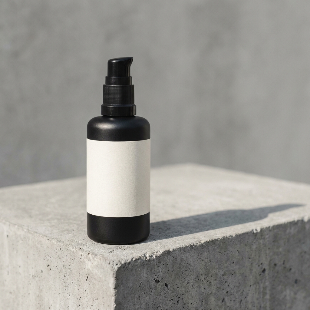
Concrete background product photography with one hard shadow
Upload one photo of your product. DesignerBox places it on raw poured concrete or a smooth grey wall. Hard sun gives one crisp shadow, in the direction you ask for. The set works on a store page, in ads and in social posts. Every picture keeps your brand's look, at any volume.


Who it is for
Does that sound like you?
Scaling without compromising quality.
You need more pictures every week for the shop, the ads and the socials. Anyone can make an AI picture. Making hundreds that still look like your brand is the hard part. A shoot for every product costs weeks, and every new generator returns a different look.
- A template or a workflow you build once, with your brand rules
- One run on one product, or a batch over your whole catalogue
- Every result in Assets, with the same look on the first and the last
Cut the waiting time and budget for deliverables.
You make this for clients, and every client has their own look. A shoot for each one costs weeks and most of the budget. A different generator for each one returns a different look, so somebody fixes it by hand before it is delivered.
- One workspace per client, with that client's brand rules
- A workflow you build once and run for every client
- A batch over a client's whole catalogue, delivered from Assets
A concrete background in product photography is a surface of raw poured concrete or smooth grey cement. It sits under the product as a floor, or behind it as a wall. Streetwear, trainers, tech hardware, tools and modern skincare all sit well on it, because grey reads as urban and plain without adding any colour of its own. The surface works by brightness alone. Cement is close to mid grey, so the product has to be clearly lighter or clearly darker than the slab, and one hard shadow has to do the rest. That is why a mid grey or silver product fails here. The two tones merge and the outline of the product disappears. Food, baby goods and soft textiles fail for a different reason. Concrete is cold and hard, and that works against what those products promise.
Four craft problems on concrete
The four things that break a concrete frame, and the fix for each one.
Grey product on grey concrete
Concrete sits around mid grey. A grey or silver product placed on it has almost no difference in brightness, so the edges vanish and the shape goes flat. Fix this with light, not with colour. A hard key from behind and to one side draws a bright line along the top edge of the product. If that is not enough, ask for a paler trowelled slab, so the product stays clearly darker than the surface.
Hard sun, one crisp shadow
Most surfaces want soft light. Concrete wants the opposite. One hard source, like midday sun about 40 degrees above the slab, throws a sharp shadow that becomes part of the picture. Two shadows read as a mistake, so ask for no fill light on the second side. The shadow has to start at the base of the product. A gap of even a few millimetres tells a shopper the product was pasted on.
Aggregate size fights small products
Poured concrete carries stones. On a rough slab they run 10 to 20 millimetres across. Behind a 300mm trainer that grain looks correct. Behind a 60mm lipstick the same stones look like boulders, and the product reads as a toy. For small items ask for a smooth trowelled finish or a fine sand float. Keep the coarse aggregate for footwear, tools and large boxes.
Concrete shows every colour cast
Cement grey is close to neutral, so the slab behaves like a grey card. Any wrong white balance appears in it at once. Under open sky with no direct sun, concrete takes blue from above and can turn slightly green. A white product goes cold with it. In direct sun near 5600K the same slab reads warm grey. Name the light in the prompt, then judge the cast on the concrete first and on the product second.
Four steps to a concrete set
Pick the slab, set the sun, check the brightness gap, then upscale.
Working order on concrete
Slab first, light second, everything else after that. On concrete the light does the separating, so there is no point relighting a slab whose tone you may still change. Once the tone is set, the sun angle decides the shadow. On this surface the shadow is a large part of the picture. Placement follows the shadow, not the reverse, because moving the product changes where the shadow lands and what it crosses. The brightness check comes last of the creative steps, since only the final frame shows whether the product edge holds against the grey. Upscale after that. A 4K copy of a flat frame is still a flat frame.
Four files a concrete set needs
What each frame in a concrete set has to prove.
A hero with one hard shadow
One frame with the product on the slab and a single crisp shadow running off to one side. The shadow must begin where the product meets the concrete, with no gap. Its edge should stay sharp for the first 50mm and spread after that. Real sun behaves that way, and shoppers recognise it.
An edge-lit frame for dark products
One frame where a hard light sits behind and to the side, drawing a bright line along the top edge of the product. This is the file that proves a black bottle or a charcoal speaker still has a shape on grey. Without it, dark products on concrete read as a flat silhouette.
A smooth wall frame
One frame against a trowelled grey wall with no visible stones. Small items need this, because coarse aggregate behind a 60mm product turns the background into the subject. The wall version also crops well to square and to portrait, since there is no grain pattern to line up.
An ad frame with copy space
One wide frame with the product and its shadow on the left and bare concrete on the right. The empty slab has to hold white text at a readable contrast, so keep that side out of deep shade. Product static ads then places a headline and a price on the clear side.
Concrete background questions
Six questions sellers ask before shooting a product on concrete.
What colour concrete works best for product photography?
How do I stop a grey product disappearing on a concrete background?
Why does concrete look blue or green in my photos?
Should the shadow be hard or soft on concrete?
Which products suit a concrete background?
How do I make concrete look expensive and not like a building site?
Other product photo backgrounds
These are the other backgrounds in the catalogue. Open any page to compare them before you choose.
Marble backgrounds
For beauty, jewellery and fragrance shots that need a premium stone surface.
Wood background
Warm oak, walnut and ash for food, coffee, candles, soap and handmade goods.
Linen and cotton cloth
Soft, tactile cloth for skincare, candles, soap and folded clothing.
Pure white sweep
The plain white main image, for listings, grids and price banners.
Gradient background
Smooth tone shift for tech, cosmetics and products with a simple shape.
Pastel paper
Soft colour paper for beauty, wellness and pale packaging that needs a calm frame.
Black background
For fragrance, watches, spirits and premium packaging that read by their edges.
Podium and plinth
Raises small products on plaster or stone, and leaves clean space for a headline.
Botanical background
Fresh or dried foliage around skincare, soap, candles and other natural products.
Outdoor natural light
For active, travel and outdoor goods that need real daylight and a found place.
Christmas holiday set
For gift products that need to look seasonal in November and December.
The full background catalogue
The catalogue lists all twelve backgrounds side by side, so you can compare concrete with marble, linen and the rest.
Everything you need, in one place
The full workflow from the first product photo to the finished ad, in one subscription.
Scale content without limits.
Generate content for your products or services with AI, starting today, and keep your brand on every piece.
Get started free