


Styled scene background
Botanical plant background product photography with leaves in the right place
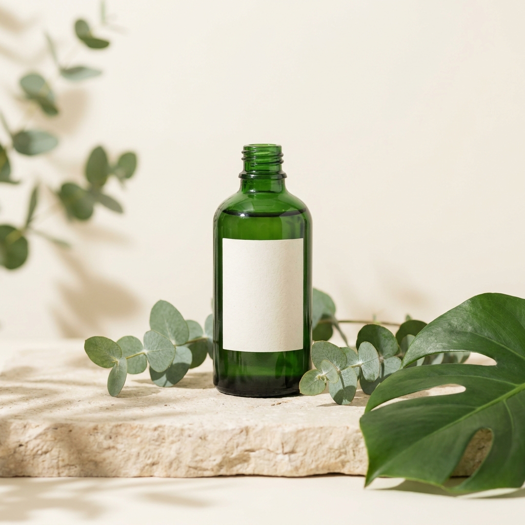
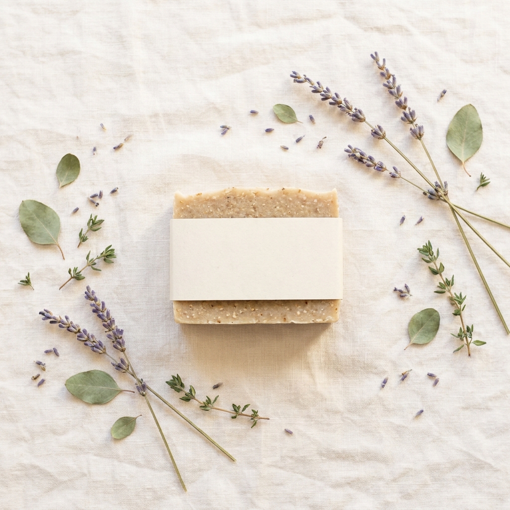
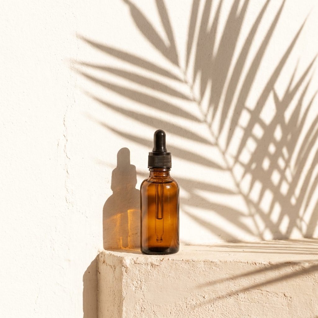
Upload one photo of your product. DesignerBox builds the botanical set around it: eucalyptus at the frame edge, dried lavender on linen, or a single palm leaf that casts a shadow on the wall. You get a hero shot, a flat lay and social crops from the same product file. Every picture keeps your brand's look, at any volume.
Who it is for
Does that sound like you?
Scaling without compromising quality.
You need more pictures every week for the shop, the ads and the socials. Anyone can make an AI picture. Making hundreds that still look like your brand is the hard part. A shoot for every product costs weeks, and every new generator returns a different look.
- A template or a workflow you build once, with your brand rules
- One run on one product, or a batch over your whole catalogue
- Every result in Assets, with the same look on the first and the last
Cut the waiting time and budget for deliverables.
You make this for clients, and every client has their own look. A shoot for each one costs weeks and most of the budget. A different generator for each one returns a different look, so somebody fixes it by hand before it is delivered.
- One workspace per client, with that client's brand rules
- A workflow you build once and run for every client
- A batch over a client's whole catalogue, delivered from Assets
A botanical product background is a set built from real foliage, fresh or dried, arranged around the product. The usual pieces are eucalyptus sprigs, monstera and palm leaves, dried lavender and olive branches. A buyer reads the plant as a claim. They see eucalyptus beside a bottle and expect eucalyptus inside it, which is why the set sells skincare, soap, candles, tea and haircare, and why it looks odd next to a charger or a hand tool. The physics are unusual as well. A leaf is often the highest contrast shape in the frame, so it takes the eye before the product does. Green surfaces also throw green light, so pale packaging near a stem picks up a tint the real product does not have. Both problems are settled while you arrange the set, by keeping the stems few, pushing them to the edge and holding them away from the label.
Craft problems on a botanical set
Four things that go wrong when leaves share the frame with a product.
Foliage frames, never crowds
A leaf is a high contrast shape with a hard edge, so the eye lands on it before the product. Keep foliage to the frame edge and leave clear space around the label. Three or four stems read better than a full bed. Push the leaves slightly out of focus, or set them behind the product, so the sharpest edge in the picture belongs to the product.
Green cast on pale labels
Green leaves reflect green light. Put a white jar or a cream label within about 10 cm of foliage and the packaging turns slightly green. Buyers then see a colour your product does not have. Move the leaves further away, or slide a small white card between leaf and product. When you correct colour, set the neutral point on the packaging, not on the leaf.
Leaf shadows need hard light
A crisp leaf shadow on a wall comes from one small hard source, such as direct sun or a bare bulb placed far away. A soft box gives a soft grey blur with no leaf shape in it. The gap between leaf and wall sets the sharpness: close to the wall gives clean edges, further back gives softer ones. Angle the light low for a long shadow that reads as late afternoon.
Fresh foliage wilts fast
Cut eucalyptus curls and lavender drops seed under warm lamps, often within an hour. On a long shoot the last product sits in tired foliage while the first sat in fresh stems, so a set of eight images never matches. Dried stems hold their shape but read grey and brown, not green. In DesignerBox the foliage is described in the prompt, so every product in a set gets the same stems in the same place.
Four steps to a botanical shot
From one product photo to a hero, a flat lay and crops.
Order of work
The cut-out comes first because foliage overlaps the product. A soft or wrong edge is visible where a leaf passes in front of a cap, and no later step repairs it. You check colour before making formats, because a green tint copied into six crops means six files to redo. Leave the leaf shadow until the end, because Relighting studio changes the light across the whole frame, including the foliage. Upscale last, because it enlarges whatever is already in the frame. When a set works, save it as a workflow, so the second product gets the same stems in the same corner.
Deliverables from one botanical shoot
Four files, each proving a different thing about the product.
Hero with foliage at the edge
One frame where the product stands clear and the leaves sit at the border. The label must be fully readable, with no stem crossing the brand name. A buyer scanning a grid should read the product first and the plants second, at 300 pixels wide.
Colour-true packaging shot
A version where white is white and cream is cream, with the green bounce removed. Compare the file against the real product under daylight. If a customer receives a bottle paler or warmer than the picture, the return is caused by the foliage, not the camera.
Overhead flat lay with dried stems
A square and a 4:5 version shot from directly above, with dried lavender or olive along two sides and clear linen in the centre. Dried foliage holds a matte grey-green, so it stays quiet under the product. This file carries the feed post and the email header.
Leaf shadow wall frame
A tall 9:16 frame with the product on a plain ledge and a hard palm leaf shadow behind. The shadow must have visible leaf edges, not a soft grey patch. Keep the shadow off the label, since a dark band across text costs you the read on a small screen.
Questions about botanical backgrounds
Answers on foliage, colour cast, shadows and cost per run.
How do I stop the leaves taking attention from my product?
Why does my white label look green on a plant background?
How do I get a sharp palm leaf shadow on the wall?
Should I use fresh or dried foliage?
Which products suit a botanical background?
How much does a botanical set cost to make?
Other product photo backgrounds
These are the other backgrounds in the catalogue. Open any page to compare them before you choose.
Podium and plinth
Raises small products on plaster or stone, and leaves clean space for a headline.
Outdoor natural light
For active, travel and outdoor goods that need real daylight and a found place.
Christmas holiday set
For gift products that need to look seasonal in November and December.
Pure white sweep
The plain white main image, for listings, grids and price banners.
Gradient background
Smooth tone shift for tech, cosmetics and products with a simple shape.
Pastel paper
Soft colour paper for beauty, wellness and pale packaging that needs a calm frame.
Black background
For fragrance, watches, spirits and premium packaging that read by their edges.
Marble backgrounds
For beauty, jewellery and fragrance shots that need a premium stone surface.
Concrete background
Hard daylight and one crisp shadow, for streetwear, tech and modern skincare.
Wood background
Warm oak, walnut and ash for food, coffee, candles, soap and handmade goods.
Linen and cotton cloth
Soft, tactile cloth for skincare, candles, soap and folded clothing.
The full background catalogue
The hub lists all twelve product backgrounds side by side, so you can compare foliage against marble, concrete and plain paper before you shoot.
Everything you need, in one place
The full workflow from the first product photo to the finished ad, in one subscription.
Scale content without limits.
Generate content for your products or services with AI, starting today, and keep your brand on every piece.
Get started free