


Gradient backdrops
Gradient background product photography from one photo
Upload one photo of your product. You get a backdrop that shades smoothly from one tone to another, a soft contact shadow, and a clear area for a headline. The ramp stays even at store sizes, so no stripes appear when the file is compressed. Every picture keeps your brand's look, at any volume.


Who it is for
Does that sound like you?
Scaling without compromising quality.
You need more pictures every week for the shop, the ads and the socials. Anyone can make an AI picture. Making hundreds that still look like your brand is the hard part. A shoot for every product costs weeks, and every new generator returns a different look.
- A template or a workflow you build once, with your brand rules
- One run on one product, or a batch over your whole catalogue
- Every result in Assets, with the same look on the first and the last
Cut the waiting time and budget for deliverables.
You make this for clients, and every client has their own look. A shoot for each one costs weeks and most of the budget. A different generator for each one returns a different look, so somebody fixes it by hand before it is delivered.
- One workspace per client, with that client's brand rules
- A workflow you build once and run for every client
- A batch over a client's whole catalogue, delivered from Assets
A gradient background is a studio backdrop that shades smoothly from one tone to another, with no hard edge where the two meet. The reason to reach for one is that it puts two different tones behind a single product. A light edge can sit on the darker end and a dark edge on the lighter end, so the outline holds all the way round without a rim light. That only works when the product has one clear silhouette, which is why the ramp sits well behind tech, cosmetics and glass. Put a patterned tin or a cluster of small parts on the same ramp and the moving tone fights the detail, because the eye is already tracking two changes at once.
Craft problems on a gradient backdrop
Four things that go wrong on a smooth ramp, and the fix.
Banding across the ramp
A long, smooth tone change is the hardest thing for an 8-bit JPEG to hold. The file rounds nearby values to the same number, so the ramp breaks into visible stripes. Keep the change gentle across the frame, add a light grain, and export at high quality. Check the file at full width on a phone, not only in the editor, because stripes appear most on bright screens.
Ramp direction against the product
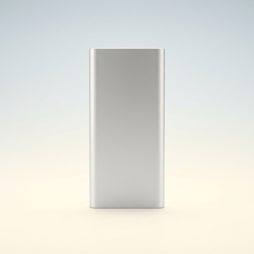
The ramp has a light end and a dark end. If the dark end sits behind the dark part of your product, that edge disappears. Run the ramp the other way. A silver power bank is bright at the top and shaded at the base, so put the darker tone high and the lighter tone low. Look at the shot in black and white to check the edge still reads.
A flat area for the headline
Text on a ramp changes contrast from one line to the next. The top of a headline can pass 4.5:1 while the bottom fails it. Pick the flattest part of the ramp for text and hold the tone steady across that block. Remember the crop moves it. A 4:5 frame cut to 1:1 loses one end of the ramp, so the text area shifts.
Colour cast on white and metal
A warm ramp throws colour back onto the product. Peach to cream turns matte white earbuds slightly pink, and it lays a warm line down brushed aluminium. For white or silver goods, pick a near neutral ramp such as pale grey to sand. Then sample the white part of the product. Red, green and blue should sit within about five points of each other.
Steps to a gradient frame
From one product photo to a set with room for text.
Order of work
Cut the product out first. On a flat backdrop a slightly rough edge hides, but on a ramp the tone behind the edge keeps changing, so any leftover fringe reads as a line. Set the ramp direction second, before you touch the lighting, because relighting cannot rescue a ramp that runs the same way as the product's own tones. Check for banding third, at the size the file will be seen, since compression damage appears at export and not in the editor. Place the headline last, once the ramp is fixed, because moving the ramp moves the flat area the text needs.
Files in a finished gradient set
Four results to check before the set goes to your store.
A ramp with no visible bands
Open the exported JPEG at 100 percent and drag your eye along the longest part of the ramp. You should see one continuous change, not steps. Test the same file after your store's own compression, because a second save can make the stripes return on a ramp that looked clean.
A text area with measured contrast
Sample the backdrop tone at the top and at the bottom of the headline block. Both readings must clear 4.5:1 against your text colour. If only one passes, move the block towards the flatter end of the ramp or shorten it to two lines.
The same ramp across the set
Put every frame of the set side by side at thumbnail size. The end tones and the direction should match on all of them. One shot with the light end at the top and the rest with it at the base makes a grid look careless, even when each frame is good alone.
A plain white file beside it
Keep the clean white cut-out from Clean white background next to every gradient frame. Most stores want a plain white main image, and a ramp will not pass that rule. The gradient version then works for the second image, the ad and the feed post.
Gradient background questions
Six questions sellers ask before they build a gradient set.
What is a gradient background in product photography?
Why does my gradient background show stripes?
Which way should the gradient run behind my product?
Should the gradient use my brand colours?
How do I keep the same gradient across a whole catalogue?
How much does a gradient background set cost?
Other product photo backgrounds
These are the other backgrounds in the catalogue. Open any page to compare them before you choose.
Pure white sweep
The plain white main image, for listings, grids and price banners.
Pastel paper
Soft colour paper for beauty, wellness and pale packaging that needs a calm frame.
Black background
For fragrance, watches, spirits and premium packaging that read by their edges.
Marble backgrounds
For beauty, jewellery and fragrance shots that need a premium stone surface.
Concrete background
Hard daylight and one crisp shadow, for streetwear, tech and modern skincare.
Wood background
Warm oak, walnut and ash for food, coffee, candles, soap and handmade goods.
Linen and cotton cloth
Soft, tactile cloth for skincare, candles, soap and folded clothing.
Podium and plinth
Raises small products on plaster or stone, and leaves clean space for a headline.
Botanical background
Fresh or dried foliage around skincare, soap, candles and other natural products.
Outdoor natural light
For active, travel and outdoor goods that need real daylight and a found place.
Christmas holiday set
For gift products that need to look seasonal in November and December.
All twelve backdrops
The hub lists all twelve product photo backgrounds side by side, so you can compare them before you pick one.
Everything you need, in one place
The full workflow from the first product photo to the finished ad, in one subscription.
Scale content without limits.
Generate content for your products or services with AI, starting today, and keep your brand on every piece.
Get started free