


An ad layout is the arrangement of the parts of an ad inside the frame: the product, the headline, the proof, the offer, the logo and the call to action. A product ad uses one of six layout types, and each type does one job. On a phone, the app covers part of the frame. So every layout also needs one safe box that survives 1:1, 4:5 and 9:16.
Suppose a team approves a square ad for a 250 ml hand cream. The headline sits at the top edge, and the logo sits in the bottom corner. Then the same file runs as a vertical ad in Stories. The profile icon covers the headline, and the call to action button covers the logo.
This guide covers the six ad layouts, the elements each one carries, and where Meta, TikTok, Google and Pinterest cover the frame. It is written for brands with 20 to 500 products and the agencies that build their ads.
Key Takeaways
- Six types cover most product ads. Product hero, lineup, bundle flat lay, lifestyle crop, split and text-led. Each one answers one question.
- Every layout carries six elements. Product, headline, proof, offer, logo and call to action, in that order.
- The app covers part of a vertical frame. Meta recommends keeping about 14% of the top, 35% of the bottom and 6% of each side free. That leaves about 45% of a 9:16 frame.
- One box survives three ratios. On a 1080 x 1920 master it is 950 pixels wide and 828 pixels tall, about 38% of the frame.
- Google wants a clean image. For responsive display ads it advises against overlaid text, overlaid logos and collages.
What is an ad layout?
An ad layout is the plan for where each part of an ad sits and how large it is. The layout sets the reading order. A good advertising layout lets a viewer name the product, the reason to care and the next step in one look.
The term has a second meaning. In publishing, an ad layout is the position of ad slots on a web page. This guide covers the first meaning: the design inside one ad. For the whole build around the layout, from the offer to the test, see how to make an ad in seven steps.
One large eye-tracking study explains why the order matters. Rik Pieters and Michel Wedel tested 1,363 print ads on more than 3,600 consumers. The picture captured attention at any size. Text captured attention in proportion to its size. The brand element moved attention to the other elements (Journal of Marketing, 2004, read October 2026). The study covered print ads, so test your own on a phone feed.
The six elements of an ad layout, in order
Every product ad layout carries the same six elements. The order below is the reading order. In a small frame, drop elements from the bottom of the list first.
| Order | Element | What it does | Where it usually sits |
|---|---|---|---|
| 1 | Product | Shows what is for sale | The center of the safe box, the largest thing in the frame |
| 2 | Headline | Gives one reason to care | Above or beside the product, in large type |
| 3 | Proof | Makes the reason believable | Near the headline: a rating, a short quote, a material fact |
| 4 | Offer | Says why now | One short line or a badge near the product |
| 5 | Logo | Says who is speaking | A corner of the safe box, or the pack itself |
| 6 | Call to action | Names the next step | Usually the platform’s own button, outside the image |
The pack is often the logo: if the label is readable, a second logo repeats it. The platform also draws the button. Meta places a call to action over the lower part of a vertical ad. Google says an image must not contain button graphics (Google Ads Help, October 2026).
Six ad layouts for a product ad
Each ad design example below is a structure with a generic product. For finished formats and the rule that limits each one, see our list of product ad examples.

1. Product hero
One product, large, in the center, on a plain ground, with the headline above it. This layout answers “what is it”. The ratio risk is low, because a centered product stays centered in every crop.
2. Lineup or variant row
Three to five variants stand side by side: flavors, colors or sizes. This layout answers “which one is mine”.
The ratio risk is high. A row is wide and a phone is tall. In a 9:16 frame a row of five becomes small, and the outer packs touch the side bands. Rebuild it as two short rows for the vertical file.
3. Bundle flat lay
Every item in the set lies flat and is shot from above, with one item leading. This layout answers “what is in the box”. Show only what the buyer receives.
The ratio risk is medium. A flat lay fits 1:1 well, but a tighter crop cuts the items at the edge. Keep the whole set inside the safe box.
4. In-hand or lifestyle crop
A hand or part of a person holds or uses the product. Lifestyle ads show scale and use, which a packshot cannot. Our guide to lifestyle product photography covers the source picture.
The ratio risk is medium. Hands enter from the bottom of a frame, so the product often sits low, where a vertical ad is covered. Compose with the product in the upper middle.
5. Split or comparison
The frame is cut in two: with and without, old and new. This layout answers “what is the difference”.
The ratio risk is high. A side-by-side split gives each half 540 pixels of a 1080 pixel width. Stack the halves for vertical files. Two rules also apply. Google says collages are not recommended for responsive display images. Meta lists cosmetic ads “depicting before and after transformation” among those that may run only to people aged 18 or older (Meta Transparency Center, October 2026).
6. Text-led
The headline is the main image, and the product is small beside it. This layout answers “why now”. It suits an offer, a launch date or a single number. Meta says there is no longer a limit on the amount of text in an ad image (Meta Business Help Center, October 2026). Google advises against text on top of a responsive display image, because it can repeat the headline and be unreadable in small sizes.
Layout, job and ratio risk
| Layout | The job | Ratio risk | The fix |
|---|---|---|---|
| Product hero | What is it | Low | Keep the headline in the safe box |
| Lineup or variant row | Which one is mine | High in 9:16 | Two short rows |
| Bundle flat lay | What is in the box | Medium | Keep the whole set in the safe box |
| In-hand or lifestyle crop | How big is it | Medium | Product in the upper middle |
| Split or comparison | What is the difference | High in 9:16 | Stack the halves |
| Text-led | Why now | High on Google Display | A clean image, text in the headline field |
Where the platform interface covers the frame
A safe zone is the part of the frame that the app does not cover or crop. Meta defines it as the area where text overlays and logos “will not be cropped out or covered by the user interface” (Meta Business Help Center, October 2026). Each platform states its rule in a different way.
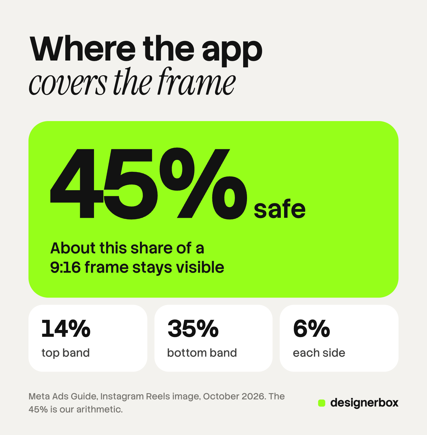
Meta. For a 9:16 image in Stories or Reels, Meta’s Ads Guide says to consider leaving roughly 14% of the top, 35% of the bottom and 6% of each side free from text, logos and other key elements (Meta Ads Guide, October 2026). The profile icon and the call to action sit there. For Instagram Feed ads at 1:1 or 4:5, Meta says to keep the bottom and side edges free, with no percentage. A Reels ad with a disclaimer should leave the bottom 40% free.
TikTok. TikTok publishes no single percentage. It says the safe zone depends on the dimension, the ad caption length and any additional formats used, and it offers safe zone files to download (TikTok Ads Manager help, October 2026). Our TikTok product ad formats guide explains what follows from that.
Google. A responsive display ad has no fixed frame. You upload a 1.91:1 image and a 1:1 image, and Google combines them with your headlines and logo. Its best practices guide says not to overlay a logo, to avoid overlaid text, and to keep blank space under 80% of the image (Google Ads Help, October 2026).
Pinterest. Pinterest recommends a 2:3 image at 1000 x 1500 pixels and says taller Pins might get cut off in feeds (Pinterest Business help, October 2026).
In Ads Manager, the safe zone guardrail shows the safe area inside a yellow overlay. For Meta’s pixel sizes and text rules, see our guide to Facebook ad design.
One safe box for 1:1, 4:5 and 9:16
Meta’s three numbers are enough to draw one box that works in all three ratios. The arithmetic below is ours and is illustrative. It uses a 1080 x 1920 master and a centered crop.
The top band is 14% of 1920, or 269 pixels. The bottom band is 35%, or 672 pixels. Each side band is 6% of 1080, or 65 pixels. So the 9:16 safe box is 950 pixels wide and 979 pixels tall, about 45% of the frame.
The safe box ends at row 1248, and a centered square crop starts at row 420. The shared box runs between those rows. It is 950 pixels wide and 828 pixels tall, about 38% of the vertical frame.
| Region on a 1080 x 1920 master | Rows kept | Size in pixels | Share of the frame |
|---|---|---|---|
| 9:16 safe box | 269 to 1248 | 950 x 979 | About 45% |
| Centered 4:5 crop | 285 to 1635 | 1080 x 1350 | About 70% |
| Centered 1:1 crop | 420 to 1500 | 1080 x 1080 | About 56% |
| Shared box for all three | 420 to 1248 | 950 x 828 | About 38% |
The shared box sits above the middle of the vertical frame. A layout drawn around the exact center puts its lower part under the bottom band, so move the product and the headline up.
One limit applies. Meta may crop differently when it adjusts a file for you, and it says that uploading your own variations gives you the most control (Meta Business Help Center, October 2026). So check every file in the platform preview before it runs.
How to build one ad layout for three ratios
- Start with the 9:16 file. It has the largest covered area.
- Draw the shared box first. Place the product, the headline and the logo inside it.
- Fill the bands with background. The top and bottom bands hold surface, color or scene, and no message.
- Keep text live. Text that is part of the picture cannot move when the ratio changes.
- Export three files and preview each one. Use the safe zone guardrail on Meta and the downloaded safe zone file on TikTok.
For Google Display, export a fourth version with no overlaid text and no overlaid logo. The headline goes in the headline field, and the logo goes in the logo slot.

Our guide to ad resizing across platforms covers the master file in more detail, and image ad specs for five platforms lists the pixel sizes.
Ad layouts as a saved workflow
DesignerBox is AI creative production for brands and agencies. It makes images, ads and video from your brand and your products. Anyone can make an AI picture. Making hundreds that still look like your brand is the hard part.
A layout decision is a rule, and a rule can be saved. You build a workflow once. It reads your brand rules: the logo, the colors, the fonts, the voice, your products and your reference pictures. You write the layout into the steps, including the ratio and the bands to keep free. The same workflow then runs on the next product. For static ads, the AI ad generator page shows the job.
Batch runs one workflow over a sheet of up to 200 rows, one product per row, and you keep or discard each result. An app gives a colleague the same workflow as a form. It is the full workflow from the first product photo to the finished ad, in one subscription. The cost is shown before the run.
DesignerBox does not send finished work to an ad account. You download the results, or send them with a webhook or an S3 step. Check each ratio in the platform preview. Every plan below Ultra is one seat. There is a free plan, and it runs on sample products.
Uploading your own photos and the commercial license start on the Pro plan. AI video, virtual try-on, upscaling, the image editor and the video editor start on the Premium plan. Plans and credits are on the pricing page.
Start from a template and run one layout on a sample product. Get started free
FAQ
What is an ad layout?
An ad layout is the arrangement of the parts of an ad inside the frame. It sets where the product, the headline, the proof, the offer, the logo and the call to action sit, and what a viewer reads first.
What are the main types of ad layouts?
Product ads use six: product hero, lineup or variant row, bundle flat lay, in-hand or lifestyle crop, split or comparison, and text-led. Each one answers one question about the product.
What elements should an advertising layout include?
Six elements, in this order: product, headline, proof, offer, logo and call to action. A small ad drops elements from the end of the list. On Meta the platform draws the call to action in a vertical ad.
What is the safe zone on a 9:16 ad?
For Stories and Reels, Meta recommends keeping roughly 14% of the top, 35% of the bottom and 6% of each side free from text and logos. By our arithmetic that leaves about 45% of the frame. TikTok gives no fixed percentage and offers safe zone files to download.
Can one ad layout work in 1:1, 4:5 and 9:16?
Yes, if the product, the headline and the logo sit inside one shared box. On a 1080 x 1920 master with centered crops, that box is 950 by 828 pixels, from row 420 to row 1248. Fill the rest of the frame with background, and preview each file.
Can DesignerBox apply one ad layout to many products?
A saved DesignerBox workflow holds the layout as steps and reads your brand rules on every run. Batch runs it over a sheet of up to 200 rows, and you keep or discard each result. You download the files and check each ratio in the platform preview.
Sources
- Safe zone definition, the 9:16 and Instagram Feed edge rules, the safe zone guardrail and the 40% disclaimer rule: Meta Business Help Center, text overlays and the safe zone, accessed October 2026
- The 14%, 35% and 6% recommendation for a 9:16 image: Meta Ads Guide, Instagram Reels image, accessed October 2026
- Supported ratios by placement, automatic adjustments and uploading your own variations: Meta Business Help Center, best practices for aspect ratios, accessed October 2026
- No limit on text in an ad image: Meta Business Help Center, image ads, accessed October 2026
- Cosmetic ads depicting before and after transformation, for people aged 18 or older: Meta Transparency Center, health and wellness, accessed October 2026
- TikTok safe zone by dimension, caption length and format, with files to download: TikTok Ads Manager help, in-feed ads, accessed October 2026
- No overlaid logos, text or buttons, the 80% blank space line and collages: Google Ads Help, best practices guide for responsive display ads, accessed October 2026
- The 1.91:1 and 1:1 image assets of a responsive display ad: Google Ads Help, responsive display ads specs, accessed October 2026
- The 2:3 ratio at 1000 x 1500 pixels: Pinterest Business help, review ad specs, accessed October 2026
- Eye tracking of 1,363 print ads on more than 3,600 consumers: Pieters and Wedel, “Attention Capture and Transfer in Advertising: Brand, Pictorial, and Text-Size Effects”, Journal of Marketing, 2004, abstract read October 2026
- DesignerBox brand rules, batch and plan gates: DesignerBox brand page (designerbox.ai/product/brand), batch page (designerbox.ai/product/batch) and pricing page (designerbox.ai/pricing), October 2026
Meta, TikTok, Google and Pinterest rules verified on each platform’s own page, October 2026. The safe box figures are illustrative arithmetic from Meta’s published percentages, with a centered crop. DesignerBox features verified on designerbox.ai, October 2026. Individual results vary.