


A product detail page (PDP) is the page in an online store that shows one product. It holds the images, the title, the price, the options such as size and color, the description, the delivery and return terms, the reviews and the buy button. A shopper decides on this page. Search engines and AI shopping tools also read it to learn what you sell.
Most stores treat the product detail page as a design job that is done once. Then the catalog grows. Product 1 has eight images and a size guide. Product 140 has two images and a description copied from the supplier. The page template is the same, and the pages are not.
This guide explains what a product detail page is, how a PDP differs from a PLP, and the eight parts each page needs. It also covers who reads the page, the mistakes research finds most often, and a short check you can run on one page today. It is written for brands and agencies that manage 20 to 500 products.
Key Takeaways
- A PDP is the page for one product. A PLP is the page that lists many products. The shopper chooses on the PLP and decides on the PDP.
- Eight parts do the work. Title, images, price, options, buy button, description, delivery and returns, and reviews.
- Images come first. In Baymard Institute’s 2017 testing, 56% of first actions on a new product page were exploring the images.
- Most pages score low. Baymard rates 62% of mobile product pages as mediocre or worse.
- Three readers use the page. A shopper, a search engine and an AI shopping tool each read different parts of it.
- Images are the part that stops scaling. Copy can come from a product sheet. A full image set has to be made for each product.
What is a product detail page?
A product detail page is a web page about one product that a customer can buy. It answers the questions a shopper has before paying: what the product is, what it looks like, what it costs, which options exist and when it arrives. People also call it a product page, a product details page or a PDP.
The term has the same meaning on a marketplace. Amazon’s seller help says “a product detail page is where a customer discovers a unique product sold on Amazon”. It adds that the page “can include one or more offers from sellers or from Amazon” (Amazon Seller Central, October 2026). On your own store there is one seller, so the page and the offer are the same thing.
In ecommerce, PDP stands for product detail page. Outside ecommerce the same letters have other meanings, such as a personal development plan. If a colleague in retail says PDP, they mean the page.
PDP vs PLP: what is the difference?
A PLP is a product listing page. It shows many products as a grid or a list, such as a category page or a search results page. A PDP shows one product in full. The shopper compares on the PLP and decides on the PDP. The image rules for the grid are in the product listing page guide.
| PLP (product listing page) | PDP (product detail page) | |
|---|---|---|
| Shows | Many products | One product |
| Shopper’s question | Which of these do I want to look at? | Is this the right one for me? |
| Image job | One small image for each product, in the same style | A full set: front, angles, detail, scale, in use |
| Text | Name, price, a rating | Description, sizes, materials, delivery, returns |
| Main action | Click a product | Add to cart |
The two pages depend on each other. The first image of the PDP is usually the image the PLP shows. If that image has a different crop, light or background on each product, the listing page looks untidy before anyone opens a product.
What does a product detail page need?
A product detail page needs eight parts: a title, an image gallery, a price, an options selector, a buy button, a description with facts, delivery and return terms, and reviews. Each part answers one shopper question. A missing part sends the shopper to another tab to find the answer.
| Part | The question it answers | What to know |
|---|---|---|
| Title | What is this? | Read after the images, not before |
| Image gallery | What does it look like, and how big is it? | 37% of sites show no image with scale |
| Price | What does it cost in total? | 67% of sites give no total order cost near the buy section |
| Options | Does it come in my size and color? | 57% of sites do not use buttons for size |
| Buy button | How do I get it? | Keep one main action on the page |
| Description and facts | What is it made of, and what are the sizes? | Facts shoppers cannot see in a photo |
| Delivery and returns | When does it arrive, and can I send it back? | 44% of sites do not show or link the return policy in the main content |
| Reviews | What did other buyers think? | 63% of sites do not let shoppers browse reviews by customer images |
The percentages come from Baymard Institute’s product page benchmark (Baymard Institute, October 2026). The same research says 60% of the people in one of its surveys look for return policy information on the product page.

Two of the eight parts are harder than the rest. Reviews depend on your customers. Images depend on production, and they are the only part that has to be made again for each product and each color.
Why are images the part shoppers use first?
Shoppers use images first because an image answers several questions at once. In a 2017 study, Baymard Institute found that 56% of test participants’ first actions on a new product page were exploring the product images, before they read the title or the description (Baymard Institute, October 2026).
The same study found that 42% of users try to judge the size of a product from its images. A photo on a white background cannot answer that. An image with scale can, such as a bag on a shoulder or a lamp beside a chair.
Worn products need one more image. Baymard’s benchmark says 23% of sites do not show apparel, accessories or cosmetics on a human model. The order of the set also matters, and the six-slot image order for a product page covers that in detail.
Who reads a product detail page?
Three readers use a product detail page: the shopper, the search engine and the AI shopping tool. The shopper looks at the page. The other two read the data behind it. A page written for the first reader only loses the other two.
| Reader | What it reads | What it needs from you |
|---|---|---|
| Shopper | Images, price, options, reviews | A full image set and clear terms |
| Search engine | Title, text, structured data, image files | Product data in the page code, and one image for each variant |
| AI shopping tool | The product feed and the page | Complete fields, and images that show the exact item |
Google’s documentation describes two kinds of product result, product snippets and merchant listings, and says both support product variants (Google Search Central, October 2026). For variants, Google asks stores to group them with ProductGroup data, so it knows that five colors are one product (Google Search Central, October 2026).
The image rules are specific. Google Merchant Center requires images of at least 500 x 500 pixels for all products from 31 January 2027, and recommends about 1500 x 1500 pixels or more. The product should fill between 75% and 90% of the image. An image with a promotional overlay, a watermark or a placeholder can be disapproved (Google Merchant Center Help, October 2026).
Speed is part of the page too. Google’s guidance is that the largest element on the page should load in 2.5 seconds or less for 75% of page loads (web.dev, October 2026). On a product page that element is often the first product image, so a 5 MB first image costs you twice.
AI shopping tools read the same fields with less patience. Product images for AI shopping agents explains the variant rule that matters most there.
How good are most product detail pages?
Most product detail pages rate below “decent” on Baymard Institute’s scale. Its benchmark of leading US and European ecommerce sites found that only 48% of desktop sites have a “decent” or “good” product page experience. On mobile the number is 38%, and in apps it is 36%.
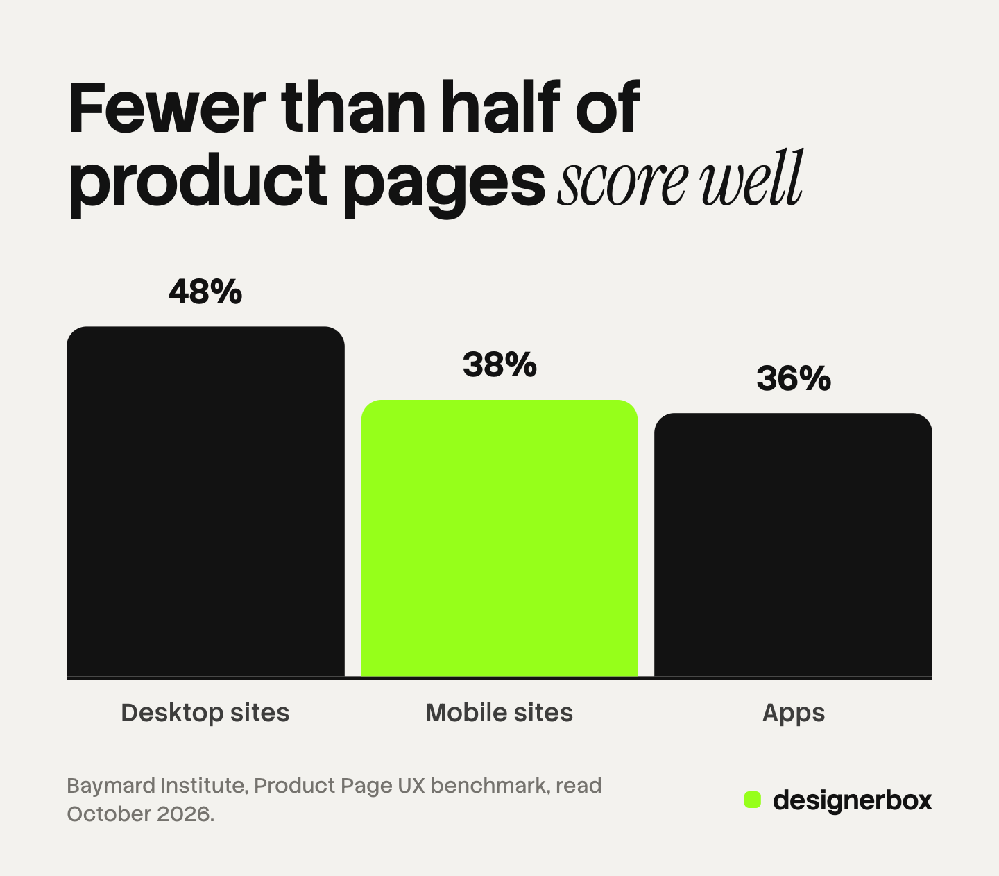
Read the other way, 52% of desktop sites, 62% of mobile sites and 64% of apps are “mediocre or worse”. Baymard also says no site in the benchmark has a perfect score. These are large stores with design teams, so a small brand should not expect its own pages to be better without a check.
The gap between desktop and mobile has a plain cause. A phone shows one image at a time. The shopper has to swipe to find the scale image or the detail image, and many do not. That is why the order of the images matters more on a phone than on a laptop.
Common product detail page mistakes
The most common mistakes on a product detail page are gaps, not design errors. A part is missing, or it exists on some products and not on others. Here are the seven that appear most often.
- A different image set for each product. One product has eight images and the next has two. The shopper reads the short set as a weaker product.
- No image with scale. The shopper cannot tell if the vase is 15 cm or 50 cm tall.
- Variant images that do not match the variant. The shopper selects green and still sees the blue one.
- A first image with text or a badge on it. Google Merchant Center can disapprove it, and marketplaces have their own rules.
- A supplier description. It repeats on every store that sells the same product. Product descriptions that convert shows what to write, and product description examples gives eight you can adapt.
- Hidden return terms. The shopper leaves the page to find them and does not always come back.
- Heavy image files. The first image loads late, and the page feels slow on a phone.
Mistakes 1 to 4 are image problems. They grow with the catalog, because each new product and each new color needs the same set again.
A ten-minute check for one product page
You can check one product detail page in ten minutes with a phone and a list. Open the page on a phone, not on a laptop, because most shoppers will see it there. Then answer these eight questions with yes or no.
- Does the first image show the whole product, alone, with no text on it?
- Is there one image that shows the size of the product beside a person or a known object?
- Is there one close image of the material or the finish?
- When you select another color, does the gallery change to that color?
- Is the price visible without scrolling, with delivery cost stated or linked?
- Is the return policy on the page or one tap away?
- Does the description state sizes and materials in numbers?
- Does the first image appear in under 2.5 seconds on mobile data?
Run the same check on your best seller, a mid-range product and the last product you added. The third page usually fails more questions than the first. That difference is the real state of your catalog. If you sell on Shopify, the nine fields of a Shopify product page maps each question to a field.

Product detail pages across a catalog
DesignerBox is AI creative production for brands and agencies. Anyone can make an AI picture. Making hundreds that still look like your brand is the hard part. A product detail page shows that problem clearly, because each page needs the same image set in the same style.
- One set, built once. You build a workflow with your brand, your products and your rules. It makes the same set for each product: the front image, the angles, the detail and the scene. The AI product photography page shows the kinds of image.
- The whole catalog in a sheet. Batch runs one workflow over a sheet of products. A sheet holds 200 rows. You keep or discard per row and re-run one row.
- Review before download. Critic steps score the results, and best-of-N keeps the best one. You still look at each image beside the real product.
- Cost. The cost is shown before the run.
The full workflow from the first product photo to the finished ad, in one subscription. The images made for the page can become ad sizes and short video with the same brand rules.
The limits matter for this job. DesignerBox makes the images. It does not build the page or write the structured data. DesignerBox does not publish results to a store. You download the results, or send them with a webhook or an S3 step. There is a free plan, and it runs on sample products. Uploading your own photos and the commercial license start on the Pro plan. AI video, virtual try-on, upscaling, the image editor and the video editor start on the Premium plan. Plans and credits are on the pricing page. An AI image must still show the real product, so check color, logo and proportions on each one before it goes on a page.
The first job, built once
Start from a template, add your brand and your products, and run it. See the templates
FAQ
What does PDP stand for in ecommerce?
PDP stands for product detail page. It is the page in an online store that shows one product, with its images, price, options, description and buy button. Some teams write product details page or product page. All three names mean the same page.
What is the difference between a PDP and a PLP?
A PLP, or product listing page, shows many products in a grid, such as a category page. A PDP shows one product in full. Shoppers compare products on the PLP and make the buying decision on the PDP.
How many images should a product detail page have?
There is no fixed number. Baymard Institute describes seven types of product image. A set that covers the front, the angles, a detail, the scale and the product in use usually needs five to eight images. The same count on each product matters more than a high count on a few.
What is a product detail page on Amazon?
Amazon’s seller help describes it as the page where a customer discovers a unique product sold on Amazon. One page can hold offers from several sellers. On your own store, one page holds one offer, and you control every part of it.
Is a product detail page the same as a landing page?
No. A landing page is built for one campaign and one message, and it often has no menu. A product detail page is a permanent part of the store, and it holds the full facts of one product. An ad can send people to either one.
Does a product detail page help SEO?
Yes. Search engines read the title, the text, the structured data and the images of the page. Google can show price, availability and ratings in a product result when the page has product structured data. Unique descriptions and one image for each variant help more than keyword changes.
Can AI make the images for a product detail page?
AI can make most of the set from a real product photo: backgrounds, angles, scenes and on-model images. Each image must still match the real product. In DesignerBox the cost is shown before the run, and you review each result before you download it.
Sources
- Baymard Institute, Product Page UX 2026: 10 Pitfalls and Best Practices: the 48%, 38% and 36% benchmark results, and the percentages for size buttons, scale images, human model images, total order cost, return policy and review images, accessed October 2026
- Baymard Institute, All Products Need at Least One “In Scale” Image: 56% of first actions on images, and 42% of users judging size from images, accessed October 2026
- Baymard Institute, Product page research: the benchmark method and the seven types of product image, accessed October 2026
- Amazon Seller Central, Product detail pages and offers: the definition of a product detail page on Amazon, accessed October 2026
- Google Search Central, Intro to product structured data: product snippets and merchant listings, accessed October 2026
- Google Search Central, Product variant structured data: ProductGroup for variants, accessed October 2026
- Google Merchant Center Help, Image link: the 500 x 500 pixel requirement from 31 January 2027, the 1500 x 1500 recommendation, the 75% to 90% framing and the overlay rules, accessed October 2026
- web.dev, Largest Contentful Paint: the 2.5 second threshold at the 75th percentile, accessed October 2026
- DesignerBox pricing page (designerbox.ai/pricing), October 2026
Product page statistics come from Baymard Institute’s published research, and search and feed rules from Google’s own documentation, as of October 2026. Platform rules change, so read the current page before a catalog-wide change. Individual results vary.