


A product listing page (PLP) is the page in an online store that shows many products at once, as a grid or a list. A category page, a collection page and a search results page are all listing pages. Each product gets one card with a small image, a name and a price. The shopper compares the cards and picks which products to open.
The product listing page is also where uneven photos show first. On a product page the shopper sees one product, so a slightly different crop or light goes unnoticed. On a product grid, dozens of photos sit side by side. One gray background among white ones is visible in a second.
This guide defines the product listing page and compares it with the product detail page. Then it gives six image rules for the grid, and a way to hold those rules when shoes, bags and furniture share one page. It is written for brands and agencies that manage 20 to 500 products.
Key Takeaways
- A PLP lists many products. A PDP shows one. The shopper compares on the listing page and decides on the detail page.
- Most listing pages score low. Baymard Institute rates 58% of desktop sites and 78% of mobile sites as mediocre or worse for product lists.
- The grid shows every difference. Nielsen Norman Group found that consistent photos are easier to scan and compare.
- Six rules hold a grid together. One ratio, one fill, one background, one angle for each category, one light and one second image.
- Mixed categories need two layers of rules. Some rules are shared by the whole catalog. The angle and the context change with the category.
- One image is too few. Baymard recommends access to three or more thumbnails for each product in the list, and 80% of sites do not give that.
What is a product listing page?
A product listing page is a page that shows a set of products as a grid or a list, so a shopper can compare them and choose which ones to open. Baymard Institute defines it as the page that “displays a grid or list of products within a category, filtered set, or search result” (Baymard Institute, October 2026).
In ecommerce, PLP stands for product listing page. The name changes with the platform. Baymard notes that Shopify calls it a collection page, and other platforms call it a category page or a search results page.
Some stores also have a separate category page. Nielsen Norman Group describes it as a kind of homepage for one category, which shoppers pass through “on their way to a product-listing page” (Nielsen Norman Group, October 2026).
A card on a listing page is small, and it still has to carry enough facts. Baymard’s testing names five things shoppers look for in each card: the price, the product title or type, the thumbnail, the rating with the number of ratings, and the product variations (Baymard Institute, October 2026). This guide is about the third one.
Product listing page vs product detail page
A product listing page shows many products with one small image each. A product detail page shows one product with a full image set. The listing page answers “which of these do I open?” and the detail page answers “is this the right one?”.
| Product listing page (PLP) | Product detail page (PDP) | |
|---|---|---|
| Shows | Many products in a grid or a list | One product |
| Image count for each product | One by default, more on hover or swipe | A full set |
| Image size on screen | Small | Large, with zoom |
| What the image must do | Let the shopper compare products fast | Answer every question about one product |
| What an uneven photo costs | It is visible beside its neighbors | It is often not noticed |
| Main action | Open a product | Add to cart |
The two pages share one file. The default image of the listing card is usually the first image of the product page. A rule you set for the grid is a rule for the first image of every product. The companion guide on what a product detail page needs covers the other side.
Why does image inconsistency show on a product grid?
Image inconsistency shows on a product grid because the grid places many photos side by side at the same size. The eye compares them without effort. A different crop, a warmer light or a tilted product stands out against its neighbors, and the page reads as untidy.
Research on listing pages supports this. Nielsen Norman Group studied product photos on listing pages and concluded: “When images are consistent, they are easily scannable and comparable” (Nielsen Norman Group, October 2026). One participant in that study browsed boots that were all shot in the same side view. She could tell the heel height of each boot at once and skip the ones that were too tall.
The same article says consistent photos need the same style, and they do not need to be identical. It lists five things to plan: background, orientation and direction, context, lighting and scale.
Most stores have work to do here. Baymard’s product list benchmark covers more than 170 leading ecommerce sites in the US and Europe. It found that 58% of desktop sites and 78% of mobile sites perform “mediocre” or worse (Baymard Institute, October 2026). That score covers filters and layout as well as images, so do not read it as an image score alone.
Six image rules for a product grid
Six rules keep a product grid even: one aspect ratio, one fill, one background, one angle for each category, one light and one kind of second image. Write each rule as a number or a named choice. A rule such as “clean and bright” cannot be checked.
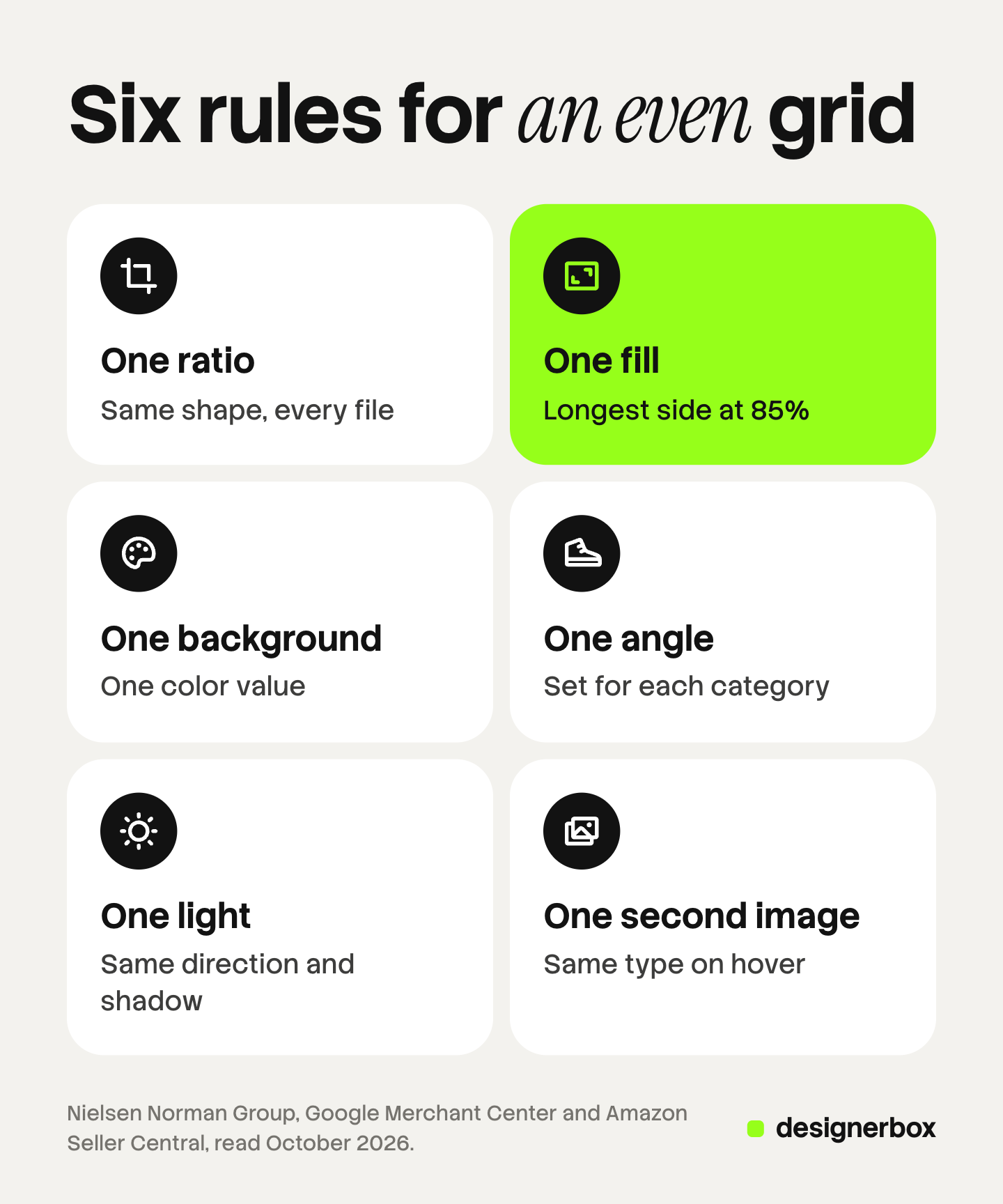
| Rule | What you fix | Example of a written rule |
|---|---|---|
| Aspect ratio | The shape of every file | 1:1 for all default images |
| Fill | How much of the frame the product takes | Longest side of the product at 85% of the frame |
| Background | Color and surface | White, RGB 255, 255, 255, no props |
| Angle | The view, set for each category | Shoes in side view, toe to the left |
| Light | Direction and shadow | Light from the upper left, one soft shadow under the product |
| Second image | What appears on hover or swipe | The product in use |
Aspect ratio. Pick one ratio for every default image. When files have different shapes, the theme has to crop them or leave empty bands, and cards lose their common edge. For the way one platform’s themes handle this, see how Shopify sizes product cards in a collection grid.
Fill. Fill is the share of the frame the product takes. Platforms give numbers you can borrow. Google Merchant Center asks that the product take “no less than 75%, but not more than 90%” of the image (Google Merchant Center Help, October 2026). Amazon asks sellers to show the product as 85% of the main image (Amazon Seller Central, October 2026). A fill of 85% meets both. Ecommerce product photography compares the image spec for five channels.
Background. One background for all default images. Amazon’s guide says its pure white background exists “to create a consistent shopping experience for customers across search and product detail pages”. On your own store the color is your choice. The rule is that it is one color, written as a value.
Angle, light and second image. Set one view and one direction for each category. Fix the direction of the light and the type of shadow. Decide what the second image shows. The next two sections cover the angle and the second image.
These six rules are the grid’s share of a wider spec. The guide to the six layers of consistent product images covers color accuracy, styling and export, which this page does not repeat.
How do you hold the rules when the catalog mixes categories?
You hold the rules across mixed categories by splitting them into two layers. The first layer is shared by every product: ratio, fill, background and light. The second layer is set for each category: angle, direction and context. A search results page then looks even, although a boot and a sofa are shot differently.

Measure fill on the longest side. A boot is tall, a sofa is wide and a tote bag is close to square. If you measure fill by height alone, the sofa becomes a thin strip. Measure the longest side of the product instead. On a 2,000 pixel square frame, 85% is 1,700 pixels. The boot is 1,700 pixels tall, and the sofa is 1,700 pixels wide. Both have the same weight in the grid.
Choose one position. Center the product in the frame, or place every product on the same floor line. Either works. Mixing the two makes products appear to jump up and down along a row.
Set the angle for each category, then freeze it. The table below is an example of a second layer. Your choices can differ. What matters is that each row has one answer.
| Category | Default view | Direction | Second image |
|---|---|---|---|
| Shoes | Side view, single shoe | Toe to the left | Worn, on foot |
| Bags | Front view, handle up | Straight to camera | Carried, to show size |
| Furniture | Three-quarter view | Front to the left | In a room |
| Tops and dresses | Front view | Straight to camera | On a model |
Keep the product as the subject. Nielsen Norman Group describes a fashion store whose listing photos showed a full outfit on a model. Shoppers could not tell which item of the outfit was for sale. If the default image shows a model, crop it so the product for sale fills the frame.
Match the image to the filter. The same research says listing photos should match the filters a shopper selects, such as color. If a shopper filters for red and the card shows the blue one, the grid looks wrong even when every photo is well made. Baymard adds that 42% of sites do not combine variations into one list item, which fills the grid with near copies of the same product. Planning which images each SKU needs and which it shares makes both problems smaller.
Write both layers on one page and send it to every photographer, supplier and retoucher.
The second image: hover, swipe and context
A listing card should give access to more than one image, because one image rarely answers enough. Baymard recommends three or more thumbnails for each product in a list, counting the default one. In its benchmark, 80% of sites do not provide that.

Baymard’s testers saw the cost directly. When a card offered only one or two images, some participants did not have enough to judge the product, and some dismissed products that would have suited them. For apparel and accessories, Baymard says shoppers may want as many as 5 to 15 thumbnails.
On a desktop the second image usually appears on hover. A phone has no hover, so the shopper swipes the card. Baymard notes that on mobile, visible carousel indicators are needed, or shoppers do not know more images exist. Nielsen Norman Group adds one caution for desktop: delay the hover change slightly, so images do not flicker while the mouse moves across the page.
The second image is the place for context. Nielsen Norman Group describes a jeweler that showed rings on white, with a photo of the ring on a hand on hover. Shoppers got the clean comparison first and the scale second. The same pattern works for a sofa: the cut-out first, then the room.
Consistency applies to the second image too. If the hover image is a room scene for one sofa and a fabric close-up for the next, the shopper cannot predict what a hover will show. Pick one type for each category. The guide to the seven product photography angles names the views you can choose from.
A ten-minute grid check
You can check a product grid in ten minutes with a phone and a laptop. Open your largest category on both. Then open a search results page that mixes categories, such as a search for a color.
- Check that every card has the same shape and that no image has empty bands.
- Compare the backgrounds along one row. Look for gray or cream among the white.
- Compare product size along one row. Look for a product much smaller than its neighbors.
- In one category, check that every product faces the same direction.
- Hover over five cards on the laptop, and swipe five on the phone. Note the type of image that appears.
- Select a color filter. Check that each card shows that color.
Write down each card that fails and which rule it breaks. The list often points at one source, such as one supplier or one season. Fix the source first. Then check the order of images on the product page, because the same files feed both pages.
Product grids across a catalog
DesignerBox is AI creative production for brands and agencies. It makes images, ads and video from your brand rules, and product photos are one input. Anyone can make an AI picture. Making hundreds that still look like your brand is the hard part. A product grid is where that difference is easy to see.
- Rules set once. You build a workflow with your brand, your products and your rules. The background, the light and the framing are part of the workflow, so the next product gets the same treatment as the last one.
- A brand as a record. A brand holds your logo, colors, fonts, rules and reference pictures. The workflow reads it on every run.
- A sheet of products. Batch runs one workflow over a sheet. A sheet holds 200 rows, so row one and row two hundred follow the same steps. You keep or discard per row and re-run one row.
- Cost. The cost is shown before the run.
The full workflow from the first product photo to the finished ad, in one subscription. The default image, the second image, the ad sizes and a short video can all come from the same product photo and the same brand rules.
The limits matter for this job. DesignerBox makes the images. It does not build your listing page, set your theme’s crop or connect to a store. You download the results, or send them with a webhook or an S3 step. Every plan below Ultra is one seat. An AI image must still show the real product, so compare color, logo and proportions with the original before a result goes on a grid.
There is a free plan, and it runs on sample products. Uploading your own photos and the commercial license start on the Pro plan. AI video, virtual try-on, upscaling, the image editor and the video editor start on the Premium plan. Plans and credits are on the pricing page.
FAQ
What does PLP stand for in ecommerce?
PLP stands for product listing page. It is the page that shows many products as a grid or a list, such as a category page, a collection page or a search results page. PDP stands for product detail page, which shows one product in full.
Is a category page the same as a product listing page?
Often, yes. Many stores use the two names for the same grid. Some larger stores also have a separate category page that shows a few products and links to subcategories. Baymard Institute and Nielsen Norman Group both describe that page as a step before the listing page.
What is the best aspect ratio for product grid images?
No single ratio is best for every store. Square images suit mixed catalogs, because tall and wide products both fit. Portrait images suit apparel on models. The rule that matters is one ratio for every default image, so the theme does not crop some cards and pad others.
Should product listing page images have a white background?
A marketplace can require it. Amazon requires pure white for the main image. On your own store you can choose any color. Use one background for every default image, and write its value in your image rules so each supplier uses the same one.
How many images should a product card show on a listing page?
Baymard Institute recommends access to at least three thumbnails for each product, counting the default image. Shoppers reach the others by hover on a desktop and by swipe on a phone. In Baymard’s benchmark, 80% of sites offer fewer.
Can AI make consistent images for a product grid?
AI can apply one background, one light and one framing to many product photos, and it can make the second image, such as a room scene. Each result must still match the real product. In DesignerBox the cost is shown before the run, and you review each row before you download it.
Sources
- Baymard Institute, Product Listing Page (PLP) UX: Definition and Ecommerce Best Practices: the definition of a PLP, the names platforms use, and category page against listing page, accessed October 2026
- Baymard Institute, Product List UX: 8 Common Pitfalls and Best Practices: the 58% and 78% benchmark results, the 170 sites, 42% of sites not combining variations, 80% of sites not providing three thumbnails, and 5 to 15 thumbnails for apparel, accessed October 2026
- Baymard Institute, Always Provide 3 or More Product Thumbnails in Product Lists and Search Results: participants dismissing suitable products, and carousel indicators on mobile, accessed October 2026
- Baymard Institute, What Information to Display in Product Listings: the five essential list item attributes, accessed October 2026
- Nielsen Norman Group, 6 Tips for Product Photos on Listing Pages: consistent photos, the five things to plan, the boot and outfit examples, filters, hover delay and the ring example, accessed October 2026
- Nielsen Norman Group, Traditional and Hybrid Category Pages: the description of a category page, accessed October 2026
- Google Merchant Center Help, Image link: the 75% to 90% framing, accessed October 2026
- Amazon Seller Central, Product image guide: the 85% fill and the pure white background, accessed October 2026
- DesignerBox brand and batch pages (designerbox.ai/product), October 2026
- DesignerBox pricing page (designerbox.ai/pricing), October 2026
Listing page research comes from Baymard Institute and Nielsen Norman Group’s published articles, and image rules from Google’s and Amazon’s own help pages, as of October 2026. The category table and the pixel example are our own illustrations. Platform rules change, so read the current page before a catalog-wide change.