


Color theory in photography is the set of rules for choosing which colors share a frame. You place each color on a color wheel, choose a scheme such as complementary or analogous, and then control three values: hue, saturation and lightness. White balance keeps those colors true. For a brand, the same rules decide which backdrop, prop and text color sit beside the product.
This guide teaches each rule with a product image, an ad or a campaign visual. It also covers three topics a brand needs: color accuracy across screens, text contrast on ad creative, and one palette across a whole set of images.
It is written for brands with 20 to 500 products, and for the agencies that make images and ads for them.
Key Takeaways
- The wheel is a ruler. Every hue has an angle from 0 to 360 degrees. A color scheme is a fixed gap between those angles.
- Six schemes cover most images. Monochromatic, analogous, complementary, split-complementary, triadic and tetradic.
- Three values describe any color. Hue is the color family, saturation is its strength, and lightness is how close it is to white or black.
- White balance comes before style. A color cast changes the product color in every scheme you choose.
- Screens differ. Export in sRGB, and check color beside the real product.
- Text on an ad needs contrast. WCAG asks for at least 4.5:1 for normal text and 3:1 for large text.
- A palette is a written rule. Write the hues, the scheme and the white balance once, then apply them to every image.
What is color theory in photography?
Color theory in photography explains why some color combinations look calm and others look loud. It gives you names for the combinations, so you can plan them before the shoot or the image run.
A photographer controls color in four places. The first is the subject, which for a brand is the product. The second is everything around it: backdrop, surface and props. The third is the light, which has a color of its own. The fourth is the edit, where you adjust hue, saturation and lightness.
A product image adds one limit that a landscape does not have. The product color is fixed, and the image has to show it truthfully. So color theory for product images starts from the product and builds the rest of the frame around it.
The color wheel in photography
The color wheel arranges hues in a circle. Web standards describe it in the same way: the W3C calls hue “an angle of the color circle”. In the HSL model, 0 degrees is red, 120 degrees is green and 240 degrees is blue (W3C, CSS Color Module Level 4, October 2026). Yellow sits at 60 degrees, cyan at 180 and magenta at 300.
That gives you a ruler. The opposite of any hue is 180 degrees away. The opposite of orange at 30 degrees is blue at 210 degrees.
There are two common wheels, and they disagree a little. The painter’s wheel uses red, yellow and blue as primaries, and it puts green opposite red. The light wheel, used by cameras and screens, uses red, green and blue, and it puts cyan opposite red. Photographs are made of light and shown on screens, so this guide uses the light wheel and its angles.
Six color schemes on the color wheel
A color scheme, also called a color harmony, is a fixed pattern of gaps on the wheel. Six patterns cover most product images and ads.
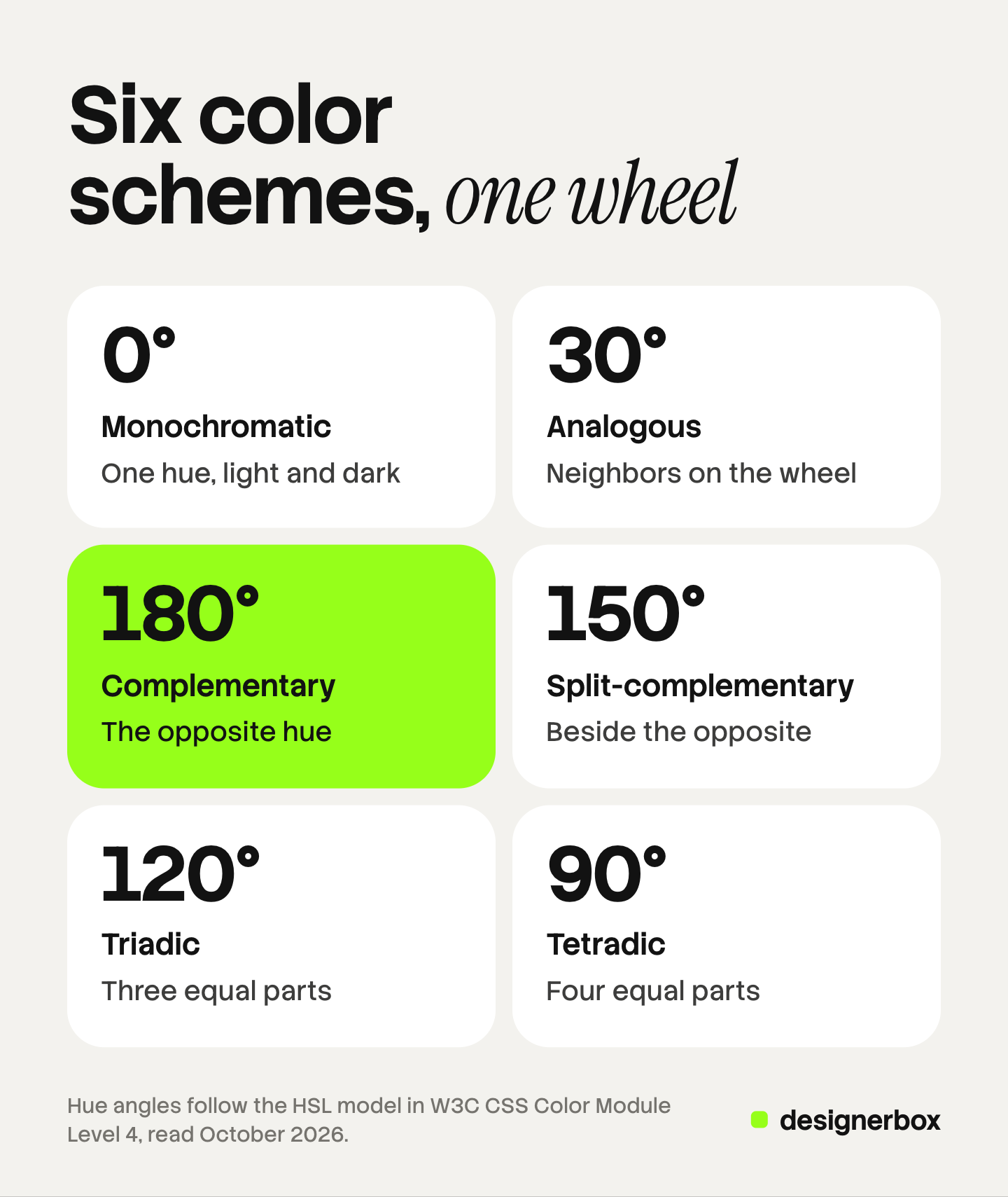
| Scheme | Gap from the main hue | Example with an orange product at 30 degrees | The look |
|---|---|---|---|
| Monochromatic | 0 degrees | Light and dark orange only | Calm, one mood |
| Analogous | Within 30 degrees | Red at 0 and yellow at 60 | Warm and unified |
| Complementary | 180 degrees | Blue at 210 | Strongest contrast |
| Split-complementary | 150 degrees on each side | Cyan at 180 and blue at 240 | Contrast with less tension |
| Triadic | 120 degrees | Green-cyan at 150 and violet at 270 | Lively, three equal parts |
| Tetradic | 90 degrees | Green at 120, blue at 210 and magenta at 300 | Busy, four parts |
One rule holds for all six. Give one hue most of the frame and let the others support it. Equal areas of strong color compete with the product.
Monochromatic and analogous colors in photography
These two schemes keep the hues close together. They read as quiet and consistent, so they suit catalogs, skincare, homeware and any brand with one strong brand color.

Monochromatic photography uses one hue at several levels of saturation and lightness. Think of blue headphones on a blue backdrop. Nothing in the frame competes with the product. The risk is that the product merges with the backdrop. Keep a clear lightness gap between the two, so the outline of the product stays sharp.
Analogous colors in photography use neighbors on the wheel. An amber serum bottle at 40 degrees sits well with a peach backdrop and one red flower. The image feels warm and whole. The risk is low contrast again, so make the product the most saturated object in the frame.
Both schemes are useful for a set. When forty products share one backdrop hue, a shopper sees a brand before reading a logo. Our guide to consistent product images covers the other layers that a set has to share.
Complementary colors in photography and the contrast schemes
The other four schemes put distance between hues. They attract the eye, so they suit ads, hero images and campaign visuals.
Complementary colors sit 180 degrees apart. An orange sneaker on a blue backdrop is the classic case. Each color makes the other look stronger. Use it when an image has to win attention in a feed. Lower the saturation of the backdrop a little, or the two colors clash at the edge where they meet.
Split-complementary keeps the main hue and replaces its opposite with the two hues beside that opposite. The orange sneaker now sits with cyan and blue. You keep most of the contrast and gain a second support color for props or text.
Triadic uses three hues 120 degrees apart, such as red, green and blue. It fits playful brands: toys, snacks, kids’ clothing. Let one hue lead and use the other two as small accents.
Tetradic uses four hues 90 degrees apart, or two complementary pairs. It is the hardest scheme to control. Keep it for a campaign image with several products, where each product already brings a color.
A product range with many colorways needs a decision here. A backdrop that complements the orange version sits next to the blue version as a near match. Many brands choose a neutral backdrop for the listing and keep the contrast schemes for ads. If you recolor one photo into each colorway, our guide to the AI clothes color changer explains how to check the result against the real fabric.
Hue, saturation and lightness
Three values describe any color in a photo.
- Hue is the color family: its angle on the wheel.
- Saturation is the strength of the color. The W3C defines 100% as a fully saturated color and 0% as a gray.
- Lightness runs from black at 0% to white at 100%, with the plain color at 50%.
A scheme only fixes the hues. Saturation and lightness decide whether the image looks soft, rich or loud. A pastel palette and a neon palette can use the same two hues.
For a product image, use the three values in this order:
- Fix lightness first. Correct the exposure so that white areas and dark areas both keep detail.
- Leave the product hue alone. Changing it changes what you sell.
- Adjust saturation last, and adjust the background before the product.
Then compare the edited image with the real item in daylight. If the screen looks stronger than the object, reduce the saturation. Our guide to how to edit product photos in eight steps puts every edit in order.
Color contrast in photography
Contrast is the difference between two areas of a frame. The eye goes to the place where the difference is largest, so that place should be the product.

Color gives you three kinds of contrast:
- Hue contrast. Colors far apart on the wheel, as in the complementary scheme.
- Saturation contrast. One strong color against muted or neutral surroundings.
- Lightness contrast. A light subject on a dark ground, or the reverse.
Lightness contrast is the most reliable of the three. About 1 in 12 men have a color vision deficiency, and the most common type makes red and green hard to separate (National Eye Institute, October 2026). A red product on a green backdrop of the same lightness can look like one flat area to those viewers. Convert the image to grayscale as a check. If the product is still easy to see, the image works for everyone.
Our guide to the types of product photography shows which shot types need a plain ground and which can carry a strong color.
Color temperature and white balance
Light has a color. Warm light is orange, and cool light is blue. Photographers measure this as color temperature in kelvin. Lower numbers are warmer and higher numbers are cooler.
Two daylight references matter for images. The W3C lists them as standard white points: D50 at 5003 K and D65 at 6504 K. The sRGB color space, which the web uses, has a D65 white point (W3C, CSS Color Module Level 4, October 2026).
White balance is the camera or editor setting that tells the image what “white” is under the current light. If it is wrong, every color moves in the same direction. A white shirt turns cream, and a navy bag turns purple. Your careful complementary scheme now uses the wrong hues.
Three habits prevent this:
- Use one kind of light. Mixed window light and warm bulbs give two casts in one frame.
- Shoot a gray card in the first frame of each setup, and set the white balance from it.
- Use one white balance value for the whole shoot, so the set matches.
Our guide to fixing product photo lighting lists which casts an edit can repair.
Color accuracy across screens
A shopper never sees your file. They see it on their own phone or monitor, and each one shows color a little differently. Amazon says so directly: “Customers use a wide variety of displays that render colors differently” (Amazon Seller Central, technical image file requirements, October 2026).
You cannot control the shopper’s screen. You can control three things.
The color space. Export web images in sRGB. The W3C states that untagged images must be treated as sRGB (W3C, CSS Color Module Level 4, October 2026). An image saved in a wider color space and stripped of its profile can look dull in a browser.
The color mode. Amazon accepts RGB files and asks sellers to convert CMYK files to RGB before upload. It also says not to rely on ICC color profiles for accurate color display on Amazon (Amazon Seller Central, October 2026).
The approval. Amazon requires the main image to accurately represent the real color of the product (Amazon Seller Central, product image requirements, October 2026). Approve color with the product beside the screen, and check the image on a phone as well as a monitor.
Text contrast on ad creative
An ad image usually carries words: an offer, a product name, a button. Color theory for ads has to include the text.
The clearest published rule comes from the Web Content Accessibility Guidelines. WCAG asks for a contrast ratio of at least 4.5:1 between text and its background, and 3:1 for large text. Large means 18 point, or 14 point bold. Text inside a logo has no requirement (W3C, Understanding contrast minimum, October 2026). The ratio runs from 1:1 to 21:1.
WCAG is written for web content, and ad platforms set their own rules. It still gives a brand a number to test against. The table uses the WCAG formula on five common pairs. The values are our own arithmetic.
| Text | Background | Ratio | Passes 4.5:1 |
|---|---|---|---|
| White | Black | 21:1 | Yes |
| White | Pure red, hex FF0000 | 4.0:1 | No, large text only |
| White | Orange, hex FF8000 | 2.52:1 | No |
| Black | Orange, hex FF8000 | 8.34:1 | Yes |
| White | Pure yellow, hex FFFF00 | 1.07:1 | No |
The table shows a common mistake. A complementary scheme makes two hues look strong together, yet hue contrast does not make text readable. Lightness does. Choose the text color by lightness, and test it with a free contrast checker.
Text on a photo needs one more step. A backdrop has light and dark areas, so test the text against the lightest and darkest area it covers. A solid panel behind the text removes the problem. Our guide to Facebook ad design covers layout and text placement.
A photography color palette for a set of images
One image needs a scheme. A brand needs a palette: a short written list that every image and ad reads from.
A working photography color palette has five lines:
- The brand hues. Two or three colors with hex values.
- The neutrals. The white, the gray and the dark that backdrops and text use.
- The scheme per image type. For example, neutral for listings and complementary for ads.
- The white balance. One value for every shoot.
- The text colors. Each pair tested for contrast.
Put the palette where the team already works. A product photography style guide holds the image rules, and a brand kit holds the files.
What color psychology research supports
Many guides state that red means urgency or that blue means trust. The research is more careful than that.
A review in the Annual Review of Psychology found that color can carry meaning and can affect how people feel and act. The same review says the field is at an early stage, and that more work is needed before firm recommendations for use (Elliot and Maier, 2014, read October 2026).
Culture matters too. A study in Psychological Science tested 4,598 people from 30 nations. It found color and emotion links that many nations share, and it also found local differences by nation (Jonauskaite and colleagues, 2020, read October 2026).
So treat a color meaning as a starting idea for one market, and test it with your own audience.
Brand palette on every run
DesignerBox is AI creative production for brands and agencies. It makes images, ads and video, and a product photo is one of the inputs. Anyone can make an AI picture. Making hundreds that still look like your brand is the hard part.
Color is where that problem is easy to see. You set the brand once, in a brand with your logo, colors, fonts and rules. A workflow reads that brand on every run. So image forty starts from the same backdrop rule as image one, and the ad uses the same palette as the listing (DesignerBox brand page, October 2026). Our guide to DesignerBox brand lists what a brand holds.
You write the scheme into the workflow steps once: the backdrop, the light and the framing. Batch then runs that workflow over a sheet of products. The cost is shown before the run. The full workflow from the first product photo to the finished ad, in one subscription.
The limits are plain. DesignerBox does not measure color against your physical product, so that approval stays with a person. You download the results, or send them with a webhook or an S3 step. Every plan below Ultra is one seat.
Uploading your own photos and the commercial license start on the Pro plan. AI video, virtual try-on, upscaling, the image editor and the video editor start on the Premium plan. Plans and credits are on the pricing page.
There is a free plan, and it runs on sample products. Get started free
FAQ
What is color theory in photography?
It is the set of rules for combining colors in a frame. You place hues on a color wheel, choose a scheme with a fixed gap between them, and control saturation and lightness. White balance keeps the colors true to the scene or the product.
What are complementary colors in photography?
Complementary colors sit 180 degrees apart on the color wheel, such as orange and blue. Together they give the strongest hue contrast. In a product image, put the product in one color and the backdrop in a less saturated version of the other.
What is monochromatic photography?
Monochromatic photography uses one hue at different levels of saturation and lightness. A blue product on a blue backdrop is one example. Black and white photography is a special case with no hue at all. Keep a clear lightness gap so the subject stays visible.
Which color scheme is best for product photos?
Use a neutral or monochromatic scheme for listing images, and a complementary or split-complementary scheme for ads. A listing image has to show the product color truthfully, so a quiet ground suits it. An ad has to win attention in a feed. Write one scheme per image type in your style guide.
Why does my product look a different color on another screen?
Every display shows color a little differently, and Amazon tells sellers the same thing. Export the file in sRGB, use RGB color mode, and set white balance from a gray card. Then approve the image with the real product beside the screen.
What contrast ratio should text on an ad have?
WCAG, the web accessibility standard, asks for at least 4.5:1 for normal text and 3:1 for large text of 18 point, or 14 point bold. It is a web standard, and ad platforms have their own rules. It is still a sound minimum to test ad text against.
Does color affect how shoppers feel about a product?
Research says color can carry meaning, and that the evidence is still at an early stage. A 30 nation study found shared links between colors and emotions, with local differences. Test a color choice with your own audience before you rely on it.
Sources
- Hue as an angle, the HSL model, saturation and lightness values, sRGB for untagged images, and the D50 and D65 white points: W3C, CSS Color Module Level 4, accessed October 2026
- Text contrast of 4.5:1 and 3:1, the large text sizes and the logo exception: W3C, Understanding Success Criterion 1.4.3, contrast minimum, accessed October 2026
- The contrast ratio formula and its 1:1 to 21:1 range: W3C, Web Content Accessibility Guidelines 2.2, accessed October 2026
- Displays render colors differently, RGB and CMYK color modes, and ICC profiles: Amazon Seller Central, technical image file requirements, accessed October 2026
- The main image must accurately represent the color of the product: Amazon Seller Central, product image requirements, accessed October 2026
- About 1 in 12 men have a color vision deficiency: National Eye Institute, color blindness, accessed October 2026
- Color psychology review: Elliot and Maier, Annual Review of Psychology, 2014, accessed October 2026
- Color and emotion associations in 4,598 people from 30 nations: Jonauskaite and colleagues, Psychological Science, 2020, accessed October 2026
- DesignerBox brand, workflows, batch and the cost shown before the run: DesignerBox brand page (designerbox.ai/product/brand), October 2026
- DesignerBox plan gates: DesignerBox pricing page (designerbox.ai/pricing), October 2026
W3C, Amazon and National Eye Institute facts verified on each publisher’s own page, October 2026. Research findings are quoted from each paper’s abstract. The contrast ratios in the table are our own arithmetic with the WCAG formula. DesignerBox features verified on designerbox.ai, October 2026. Individual results vary.