


A Shopify collection page is the page that shows a group of your products as a grid of cards. You decide which products belong to the collection and in what order they appear. Your theme decides how many cards sit on a row and how each image is cropped. It is the one page where a shopper sees your first images side by side.
Two stores on the same theme share a header, a font and a layout. They look alike until the product grid loads. After that, the images are the only part that belongs to you.
This guide covers how Shopify builds the page, from its own documentation read in October 2026, and five image rules for the grid. It is written for a brand with 20 to 500 products.
Key Takeaways
You control the products and the order. Conditions add products automatically, or you add them by hand. A collection takes up to 60 conditions.
The theme controls the card. In Shopify’s Dawn theme, the Product grid section shows 16 products a page by default, in 4 columns on desktop and 2 on a phone.
The grid shows image one. Shopify displays the first media item of each product on collection pages.
Five rules make a grid consistent. One ratio, one product scale, one background family, one angle for image one, and a planned second image.
What is a Shopify collection page?
A Shopify collection page is the storefront page for one collection. Shopify’s documentation says that a collection “can be displayed on your online store as a webpage with a gallery of the products that are in the collection” (help.shopify.com, October 2026). A customer clicks a product image on that page to open the product. Collections are available on the Basic plan or higher. Other platforms call the same page a product listing page or a category page, and the product listing page guide covers the image rules that carry across platforms.
Shopify adds that “the exact layout and appearance of collection pages depends on the theme and template that you use”. So a collection page has two halves. The collection is data, and you manage it in the admin. The page is a template, and you manage it in the theme editor.
How Shopify builds a collection
A collection is a list of products with rules. You add products automatically with conditions, or you select them by hand. You can exclude products in the same two ways.
Older guides describe two fixed types, manual and automated. Shopify’s help center now calls those “legacy manual collections” and “legacy smart collections”. In the current model, one collection can mix both methods. It draws products from sources: your product list, product variants, other collections or apps (help.shopify.com, October 2026).
| Part of a collection | What Shopify documents |
|---|---|
| Conditions | Match on details such as title, type, tag, price or stock. Up to 60 for each collection |
| Store limit | Up to 5,000 collections that contain conditions |
| Default sort | Most relevant, based on sales performance |
The condition limit comes from Shopify’s page on conditions for collections (October 2026). The collection’s own featured image is a separate file from your product images, and Shopify collection image size covers its limits.
Sort order
Shopify sorts a new collection by Most relevant. You can change the default to best selling, product title, price, newest or oldest, or a manual order that you drag into place (help.shopify.com, October 2026).
This setting matters for images. With a manual order, you choose which products sit together. With any other order, sales, prices and dates choose for you.
The collection template and the product grid
The page itself comes from your theme. Shopify states that “by default, collection pages have a Collection banner section and a Product grid section in the theme editor” (help.shopify.com, October 2026). A change to the template applies to every collection that uses it.
The settings inside the Product grid section depend on the theme. Shopify says they “depend on your theme’s developer and theme version”. As one example, here is the Product grid section of Dawn, a theme built by Shopify, read from version 16.0.0 of its public source (October 2026).
| Setting in Dawn | Options | Default |
|---|---|---|
| Products per page | 8 to 36 | 16 |
| Columns | 1 to 6 | 4 |
| Mobile columns | 1 or 2 | 2 |
| Image ratio | Adapt to image, Portrait, Square | Adapt to image |
| Show second image on hover | On or off | Off |
| Filters | On or off | On |
Two rows decide how your images look. Image ratio sets the shape of every card. With “Adapt to image”, the card follows your files, so mixed files make a mixed grid. “Show second image on hover” swaps in the second media item when a desktop shopper points at a card. Other themes use different names, so read the settings in your own theme editor.
Shopify also creates several sizes of each upload and may use a compact one on collection templates. Our guide to Shopify product image size covers what to upload.
Filters
Filters come from Shopify’s Search & Discovery app. They let customers refine the products on collection pages and in search results. Shopify documents three limits (help.shopify.com, October 2026). A store can have up to 25 filters. A filter can show up to 100 values. A collection with more than 5,000 products does not display filters.
A filter also rearranges the grid. A shopper who selects one color sees a new set of neighbors.
What a shopper compares on a product grid
A product page shows one product. A grid shows many, and the shopper’s job on it is different. Baymard Institute describes the purpose of a product list as letting users “quickly and accurately determine which products to investigate further and which to discard” (baymard.com, October 2026).

Images do most of that work. In Baymard’s testing, participants gave thumbnails “a disproportionately large amount of attention”, and often ignored list items that had no thumbnail (baymard.com, October 2026).
So the shopper compares cards. When one photo is closer, darker or on a new background, the shopper compares the photos and not the products. On one site that Baymard tested, the same backpack appeared in several colors, and the thumbnails were shot from different angles. Baymard notes that this made it more likely that users would read them as different products (baymard.com, October 2026).
The five grid rules for a Shopify collection page
Good Shopify collection page design starts with the files, before the theme editor. These five rules are our own working standard. Each one removes a difference that is not about the product.
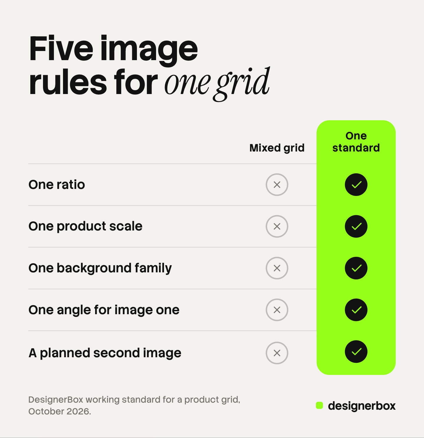
| Rule | What to hold constant | How it fails on the grid |
|---|---|---|
| 1. One ratio | Every first image has the same shape | Cards of different heights, or products cropped at the edge |
| 2. One product scale | The product fills the same share of the frame | A ring looks larger than a bag |
| 3. One background family | One color and one kind of surface | A patchwork of white, gray and room scenes |
| 4. One angle for image one | The same view for every product of a type | The same item looks like two products |
| 5. A planned second image | The same kind of shot in slot two | Hover shows a detail on one card and a room on the next |
Rule 1: one ratio. Choose square or portrait and export every first image in that shape. Then set the theme’s image ratio to match, so that the theme does not crop a product. The audit for the files themselves is in the guide to Shopify image optimization.
Rule 2: one product scale. Keep the same margin around the product on every file of a product type. Mugs can share one scale and lamps another.
Rule 3: one background family. It can be any color. It has to be one decision: one color, one surface, one direction of light. The guide to consistent product images compares the tools that fix backgrounds and scale.
Rule 4: one angle for image one. Shopify shows the first media item of each product on collection pages (help.shopify.com, October 2026). Pick one view for that slot, such as front or three-quarter, and use it for every product of a type. The other places that reuse this image are in our guide to Shopify product images.
Rule 5: a planned second image. If your theme shows a second image on hover, the second media item becomes part of the grid. Decide what it is for the whole catalog: the product in use, on a person, or from the back. Baymard found that 2 images were often not enough for users to judge a product in a list. It also found that 80% of sites did not give access to 3 or more (baymard.com, October 2026). A phone has no hover, so image one still has to do the job alone there. The order of the full gallery is covered in the guide to PDP images that convert.
Why fixing one product at a time stops working
A store usually adds images one product at a time. Each product page looks fine when you check it alone. The grid is the only place that shows the images together.
The numbers explain why this gets harder. With 16 cards on a page, each image has 15 neighbors. A collection of 200 products fills 13 pages of that grid.
The sort order adds to it. Under Most relevant or best selling, positions change as sales change, and a filter changes them again. Any product can appear beside any other, so every image has to match every other image.
So write the five rules once, as numbers and names: the ratio, the margin, the background color, the angle, the second shot. Make every new product to that standard, and redo old products in groups. If you want your Shopify store to stand out among stores on the same theme, start with this standard. It changes your image files and one theme setting. The wider system of color, type and voice is in our guide to ecommerce branding.
A 15-minute grid check
You can test a store in 15 minutes, with no tools.
- Open your largest collection on a desktop. Leave the default sort order on.
- Look at card heights. Uneven rows mean mixed ratios. That is rule 1.
- Look at product size. Find the card where the product is largest and the one where it is smallest. That is rule 2.
- Count the backgrounds. Write the number. More than one family breaks rule 3.
- Check one product type. Do all the items of that type face the same way? That is rule 4.
- Hover over six cards. Note what each second image shows. That is rule 5.
- Change the sort to newest, then to price. New neighbors show new mismatches.
- Repeat on a phone.
List the products that break a rule, grouped by rule. One decision then covers a whole group. When the new files are ready, the guide to Shopify bulk image upload covers how to replace them. The grid is one layer of a wider audit, covered in the guide to Shopify store optimization.

One image standard for the whole grid
DesignerBox makes images, ads and video with AI, for brands and agencies. Anyone can make an AI picture. Making hundreds that still look like your brand is the hard part.
In DesignerBox you build the image set once as a workflow: the ratio, the framing, the background, the light and the list of shots. Your brand rules sit in a brand profile, and the workflow reads them on every run. Batch runs that workflow over a sheet of up to 200 products. Row one and row two hundred get the same standard, and you keep or discard each row.
Check every result against the source photo: a model can change a label or a color. The cost is shown before the run.
DesignerBox does not send finished work to Shopify. You download the results, or send them with a webhook or an S3 step, and then upload them to your store yourself. The same product photos also feed your ads and video: the full workflow from the first product photo to the finished ad, in one subscription.
Uploading your own photos and the commercial license start on the Pro plan. AI video, virtual try-on, upscaling, the image editor and the video editor start on the Premium plan. Plans and credits are on the pricing page.
There is a free plan, and it runs on sample products. Get started free.
FAQ
What is a collection page on Shopify?
A collection page is the storefront page that shows the products of one collection as a grid. Shopify describes it as a webpage with a gallery of the products in the collection. A customer clicks a product image there to open the product page. Its layout comes from your theme and its collection template.
How do I edit the collection page in Shopify?
In the admin, under Products and then Collections, you change the products, the conditions and the default sort order. In the theme editor, you open the collection template and change the Product grid section. It holds settings such as columns, image ratio and filters.
How many products does a Shopify collection page show?
That depends on your theme. In Shopify’s Dawn theme, version 16.0.0, the Product grid section shows 16 products a page by default, and you can set it from 8 to 36. The remaining products go on the next pages.
Which image appears on the Shopify product grid?
The grid shows the first media item of each product. Shopify calls it the featured or main media item and displays it on collection pages, the cart page, the checkout page and the home page. Some themes can also show the second media item when a desktop shopper hovers over a card.
What is the difference between manual and automated collections?
A manual collection holds the products you select. An automated collection adds every product that matches its conditions. Shopify’s help center now lists both as legacy types. In the current model, one collection can use both, with up to 60 conditions.
Sources
- Shopify Help Center, Collections: what a collection page is and plan availability, read October 2026.
- Shopify Help Center, Creating collections and adding products: sources and store limits, read October 2026.
- Shopify Help Center, Understanding conditions for collections, Legacy smart collections and Legacy manual collections: the 60-condition limit and the legacy types, read October 2026.
- Shopify Help Center, Editing collection details and layout: the featured image and the sort orders, read October 2026.
- Shopify Help Center, Templates: the Collection banner and Product grid sections, read October 2026.
- Shopify, Dawn theme source, Product grid section: setting names, ranges and defaults in version 16.0.0, read October 2026.
- Shopify Help Center, Adding filters with Shopify Search & Discovery: filter limits, read October 2026.
- Shopify Help Center, Adding product media and Product media types: the main media item and image sizes, read October 2026.
- Baymard Institute, Product List UX 2025, Always Provide 3 or More Product Thumbnails, What Information to Display in Product Listings and Combine Variations of Products into One List Item, read October 2026.
- DesignerBox pricing, October 2026.
Shopify rules and theme settings verified from Shopify’s own documentation and theme source as of October 2026, and product list findings from Baymard Institute’s published research. Theme settings differ by theme and version. Individual results vary.