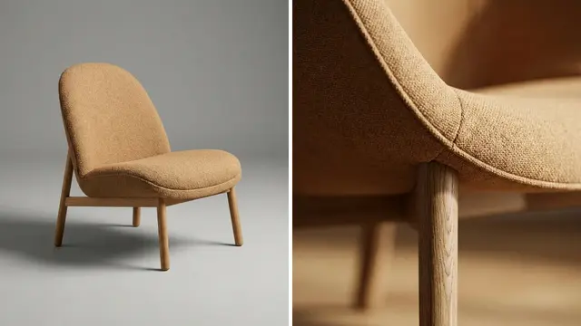


The Shopify collection image size can be anything up to 5000 x 5000 px or 25 megapixels, in a file under 20 MB. Shopify names no recommended size for it, and a 2048 px square is a safe working file. The product images inside the collection grid follow the same limits. They look even only when every featured image shares one aspect ratio.
The question has two meanings. One is the single picture you set on a collection in the admin. The other is the product pictures that fill the grid, which often look uneven.
This guide answers both from Shopify’s help pages, its developer documentation and the Dawn theme’s source code, read in October 2026. It is written for a brand with 20 to 500 products, or its agency.
Key Takeaways
A collection image has the same limits as a product image. Shopify accepts up to 5000 x 5000 px or 25 megapixels, under 20 MB.
The collection image is optional. Without one, Shopify’s featured image for the collection is the first product’s featured image.
Dawn’s product grid defaults to “Adapt to image”. Each card then keeps the shape of its own photo, so mixed shapes make uneven rows.
Portrait in Dawn means 4:5. A square photo on a portrait card loses 10% of its width on each side.
Four rules keep a grid even. One aspect ratio, one canvas size, one margin and one background, on every featured image.
What is the Shopify collection image size?
The Shopify collection image size has one upload rule, set by Shopify. The size on screen comes from your theme.
Shopify states the upload rule in one sentence: “Your product and collection images can be any size up to 5000 x 5000 px, or 25 megapixels.” A second sentence adds that both kinds need “a file size smaller than 20 MB” (help.shopify.com, October 2026).
The two meanings of the question share one table.
| The image | Where you add it | Upload limit | Who decides the shape on screen |
|---|---|---|---|
| Collection image | The Collection image section of a collection | 5000 x 5000 px or 25 megapixels, under 20 MB | The theme section that shows it |
| Product images in the grid | The media section of each product | 5000 x 5000 px or 25 megapixels, under 20 MB | The theme’s product card setting |
For square product images, Shopify says “a size of 2048 x 2048 px usually displays best”. It gives no such number for a collection image. The guide to Shopify product image size covers the upload limits, the formats and what Shopify’s servers deliver. This guide covers what the collection does with those files.
The collection image: what Shopify accepts and where it shows
You add the collection image in the admin. Shopify’s steps say: “In the Collection image section, click Add image to upload an image for the collection” (help.shopify.com, October 2026). One collection takes one image.
The image is optional, and Shopify has a rule for a collection without one. Its developer documentation describes the collection’s featured image this way: “The default is the collection image. If this image isn’t available, then Shopify falls back to the featured image of the first product in the collection” (shopify.dev, October 2026).
When the sort order changes, the first product can change, and the picture on the collection card can change with it. Add a collection image if that card should stay the same.
Themes show the collection image in two places. The first is a list of collections, such as the row of category cards on a home page. In Dawn 16.0.0, the collection list section has an Image ratio setting with three options: Adapt to image, Portrait and Square. Its default is Square (github.com/Shopify/dawn, October 2026). A square collection image therefore fits Dawn’s default with no crop.
The second place is the banner at the top of the collection. Dawn’s collection banner has a setting named Image that turns the picture on or off. On a desktop screen the banner image takes about half the page width, and Dawn requests it at up to 1500 px wide (github.com/Shopify/dawn, October 2026). Other themes use a wide strip, so check yours before you crop a file for it.
How Dawn sizes product cards in a collection grid
In the grid, the theme sets the card shape. Here is what Dawn 16.0.0 contains, read from its source code (github.com/Shopify/dawn, October 2026).
| Setting in the product grid | Options | Default |
|---|---|---|
| Image ratio | Adapt to image, Portrait, Square | Adapt to image |
| Columns on desktop | 1 to 6 | 4 |
| Columns on mobile | 1 or 2 | 2 |
The three ratio options do different things. The card file gives Square a ratio of 1 and Portrait a ratio of 0.8, which is 4:5. Adapt to image uses the aspect ratio of each product’s own featured image (github.com/Shopify/dawn, October 2026).
Dawn’s stylesheet sets the photo to cover the card and to stay centered. A photo with a different shape loses its edges, equally on both sides.
The card is also small. Dawn’s default page width is 1200 px, and a desktop card is that width minus 130 px, divided by 4. That is about 268 px. Dawn offers the browser six widths for a card image, from 165 px to 1066 px, and a 2048 px source covers all of them. Shopify also notes that an image “can never be resized to be larger than its original dimensions” (shopify.dev, October 2026).
Other themes name these settings differently. Open the theme editor, select the product grid on a collection, and read the image settings there.
Why product cards look uneven in a collection grid
Uneven cards have three causes. More pixels fix none of them.

Mixed aspect ratios. This is the common one. Shopify says so directly: “To make your images display to be the same size, you need to use a consistent aspect ratio, or height-to-width ratio, for all the images that you add as your featured, or main, images.” With Dawn’s default, a square photo makes a square card and a tall photo makes a tall card. The titles and prices under them then sit at different heights.
A crop setting that does not match the photos. You can force one card shape with Portrait or Square. The cards then align, but the theme cuts every photo that has another shape. Shopify’s theme images page describes this: “If your image’s aspect ratio is different from the aspect ratio of that area, then the section crops the image to fit” (help.shopify.com, October 2026). A bottle that fills a square frame loses its sides on a 4:5 card.
Different space around the product. Two photos can share a shape and still look unequal. In one the product touches the edges. In the other it sits small in the middle. On the grid, the first product looks much larger than the second. No theme setting corrects this, because the difference is inside the picture.
Mixed backgrounds, such as white, gray and a room scene, add to the effect. The guide to consistent product images lists the tools that fix each of these faults.
Four rules for an even grid
A catalog needs one written standard for the featured image, the first media item on a product and the one the grid uses. The guide to Shopify product images covers the other places that reuse it. The Shopify collection page guide adds two more rules: the angle of image one and the second image on hover.
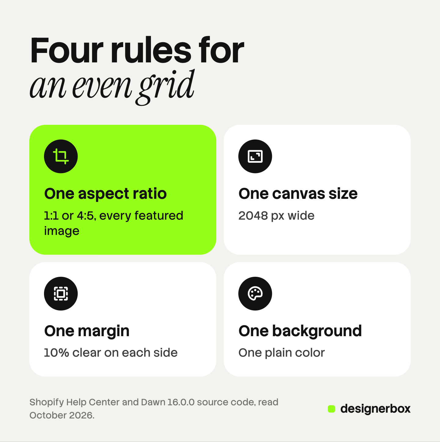
| Rule | What to decide | A working choice |
|---|---|---|
| One aspect ratio | Square or portrait, for every featured image | 1:1, or 4:5 for clothing on a person |
| One canvas size | The pixel size of every file | 2048 x 2048 px, or 2048 x 2560 px for 4:5 |
| One margin | The clear space between product and edge | At least 10% on each side |
| One background | The color or surface behind the product | One plain color for the whole catalog |
The square size is Shopify’s own number. The 4:5 size is arithmetic: 2048 px wide at a ratio of 0.8 is 2560 px tall. That file is 5.2 megapixels, well inside the 25 megapixel limit.
Then set the theme to match the files. If every featured image is square, choose Square in the product grid. If every one is 4:5, choose Portrait. With matching files and settings, the theme has nothing to cut.
Give the written standard to everyone who makes images for the store. The product photography checklist has the checks for each stage before upload.
Margin and position inside the frame
The 10% margin is also arithmetic, and it protects you when a setting changes. Dawn’s two fixed card shapes are 1:1 and 4:5. A square photo on a 4:5 card keeps 80% of its width, so the card cuts 10% from each side. A 4:5 photo on a square card keeps 80% of its height, so the card cuts 10% from the top and the bottom.
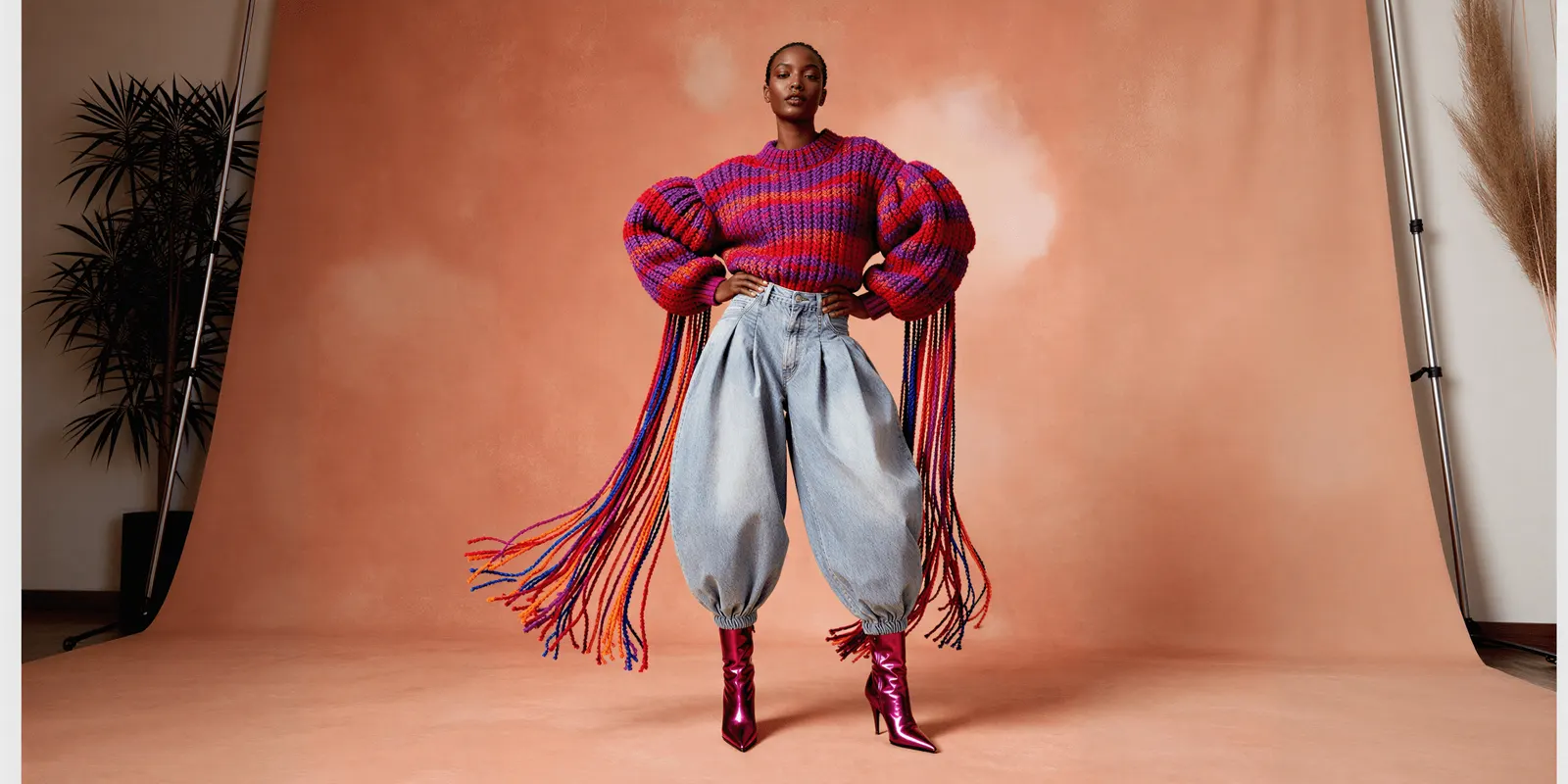
Keep the product inside the middle 80% of the frame in both directions. The same file then works on a square card and on a portrait card.
Position matters as much as margin. Center the product from left to right. For products that stand, such as bottles, lamps and shoes, put the base on the same line in every photo. A row of products then appears to stand on one shelf.
Some photos need the subject away from the center. For those, set a focal point on the image. Shopify states that “focal points always display in frame, even if you have a theme that crops your image to fit the layout”, and that you get one for each image. It lists Dawn 7.0.0 and later among the themes that support them. Check the card after you set one.
A check on your own store
Run this check once on the current catalog, and again after each large upload.
- Open your largest collection on a desktop screen. Look at the first three rows. Do the card images share one height?
- Open the same collection on a phone. Two columns show a crop that four columns can hide.
- Read the theme setting. In the theme editor, find the image ratio setting on the product grid and note its value.
- List the files that differ. Go through the collection and mark each featured image that has another shape.
- Fix the files before you change the setting. A setting can align the cards. Only the files can make the products look equal.
The guide to a Shopify bulk image upload covers the four routes and the limits of each. The guide to a catalog photoshoot shows how to count new images before you make them.
The same shot for every product
A standard is easy to write and hard to keep. The first 20 products follow it. Product 140 arrives from another supplier, with another background and another shape. Anyone can make an AI picture. Making hundreds that still look like your brand is the hard part.
In DesignerBox you build the featured image once as a workflow. You choose the background, the light, the framing and the aspect ratio. Your brand rules sit in a brand profile, and the workflow reads them on every run. You start from your own product photo, and you compare each result with it.
Batch runs that workflow over a sheet of products. Row one and row two hundred run with the same background, framing and aspect ratio settings. You review the results and keep or discard each row. The cost is shown before the run.
Check the pixel size of each result against your standard before you upload it. You download the results, or send them with a webhook or an S3 step, and then add them to your products in the Shopify admin. The same product photo also feeds the ad and the video. The full workflow from the first product photo to the finished ad, in one subscription.
Uploading your own photos and the commercial license start on the Pro plan. AI video, virtual try-on, upscaling, the image editor and the video editor start on the Premium plan. Plans and credits are on the pricing page.
There is a free plan, and it runs on sample products. Get started free.
FAQ
What size should a Shopify collection image be?
Shopify accepts a collection image of any size up to 5000 x 5000 px or 25 megapixels, in a file under 20 MB. It names no recommended size for collection images. A 2048 x 2048 px square is a safe choice, because Dawn’s collection list uses a square card by default.
Does a Shopify collection need its own image?
No. The collection image is optional. Without one, Shopify’s featured image for the collection is the featured image of the first product in it. That picture can change when the sort order changes, so add a collection image if the card should stay the same.
Why are my product images different sizes in a collection grid?
The featured images have different aspect ratios, and the theme keeps each one’s shape. Dawn does this by default, because its Image ratio setting starts on Adapt to image. Use one aspect ratio for every featured image, then set the theme to that shape.
What is the best Shopify product image aspect ratio?
The best ratio is one that every featured image shares. Shopify does not require a specific one. It says you need a consistent ratio across your featured images for them to display at the same size. For square images, Shopify says 2048 x 2048 px usually displays best. Dawn’s fixed card shapes are square and 4:5, so those two ratios fit its grid with no crop.
Should I choose Adapt to image, Portrait or Square in Dawn?
Choose the option that matches your files. Square suits a catalog of square images, and Portrait suits a catalog of 4:5 images. Adapt to image keeps every photo whole, but it only gives even rows when all the photos already share one shape.
Sources
- Shopify Help Center, Product media types: limits for product and collection images, the 2048 x 2048 px square and the consistent aspect ratio, read October 2026.
- Shopify Help Center, Create a manual collection: the Collection image section, read October 2026.
- Shopify Help Center, Theme images: cropping to fit a section and focal points, read October 2026.
- Shopify developer documentation, collection object: the collection image and the featured image fallback, read October 2026.
- Shopify developer documentation, image_url filter: images are never enlarged beyond the original, read October 2026.
- Shopify, Dawn theme 16.0.0 source code: product grid section, product card, collection list section, collection banner section, base stylesheet and theme settings, read October 2026.
- DesignerBox pricing, October 2026.
Shopify limits and Dawn theme settings verified from Shopify’s own documentation and source code as of October 2026. Card sizes and crop percentages are arithmetic from Dawn’s default settings. Themes change with each version. Individual results vary.