
Shopify publishes no official banner size. Its help center gives upload limits and tells you to match the aspect ratio your theme uses. The free Dawn and Horizon themes request banner files up to 3,840 px wide. A safe working size is 3,840 x 2,160 px for desktop. Keep the subject in the middle half of the frame, because a phone crops the sides.
Search for a Shopify banner size and you get four answers. On October 7, 2026, the first page of Google showed 1,920 x 1,080 px, 2,048 x 1,024 px, a range of 1,200 to 2,000 px wide, and a range of 1,920 to 2,560 px wide. Each page stated its number as the answer. None of the four numbers comes from Shopify’s help center.
This guide separates what Shopify documents from what is a convention, for eight theme images.
Key Takeaways
- Shopify documents limits and no banner size. The help center gives megapixel and file size limits. It states no pixel size for a banner, a slideshow or a logo.
- The theme decides the size. Dawn’s image banner requests nine widths, from 375 to 3,840 px. Horizon’s hero stops at 3,840 px as well.
- A phone can show about half of a wide banner. On Dawn’s Large height, a 390 px wide phone shows 56% of a 16:9 image’s width. That figure is arithmetic from the theme’s code.
- Shopify says to keep text out of banner images. Its help page says text inside the image might be moved, cropped or adjusted by the theme.
What size should a Shopify banner be?
Shopify’s help center does not give a number. Its page on uploading images says only this: “To display images in your online store exactly as you want them to, you need to use the correct image aspect ratio” (Shopify Help Center, October 2026). The correct ratio depends on the theme and on the height setting of the section.
Shopify’s blog does publish suggested sizes. Its website image guide, dated June 30, 2026, suggests a hero image between 1,280 and 2,500 px wide and between 720 and 900 px high, at 16:9. The page calls these “suggested sizes, which may need to be adjusted” (Shopify blog, October 2026). That is general website advice, and it describes no Shopify theme section.
The strongest source is the theme code. Shopify publishes the source of Dawn and Horizon, and the code shows which file widths each section requests.
| Section | Theme | Widths the section requests |
|---|---|---|
| Image banner | Dawn | 375, 550, 750, 1,100, 1,500, 1,780, 2,000, 3,000 and 3,840 px |
| Hero | Horizon | 832, 1,200, 1,600, 1,920, 2,560 and 3,840 px |
| Hero, mobile image | Horizon | 416, 600, 800, 1,200 and 1,600 px |
Sources: Dawn release 16.0.0 and Horizon on GitHub, read October 2026.
The browser picks one width from that list for each screen. A phone takes a small file, and a large high-density monitor takes the 3,840 px file. So upload a banner 3,840 px wide when your source photo is that sharp. A wider file is never requested. A narrower file looks soft on a large screen.
What does Shopify document for each theme image?
The second column holds what Shopify states in its help center or its theme code. The third column is a working size, and every working size is a convention with its reason.
| Image type | What Shopify documents | Safe working size (a convention) | Crop risk on a phone |
|---|---|---|---|
| Banner or hero | No pixel size. Dawn and Horizon request up to 3,840 px wide | 3,840 x 2,160 px. It matches the widest request and a 16:9 laptop screen | High. A fixed height crops the sides |
| Mobile hero image | Horizon only: a separate mobile image, requested up to 1,600 px wide | 1,600 x 2,000 px. A 4:5 frame fits a tall screen | Low. The file is made for the phone |
| Slideshow | No pixel size. Dawn requests up to 3,840 px wide | 3,840 x 2,160 px, with every slide in one ratio | High, as for a banner |
| Image with text | No pixel size. Dawn requests up to 1,500 px, or 1,800 px in its large layout | 1,800 px wide, square or 4:5. The image fills about half the row | Low on the Adapt to image height |
| Collection image | Up to 5,000 x 5,000 px and under 20 MB. Dawn offers three ratios: Adapt to image, Portrait and Square | 2,048 x 2,048 px, the same square as your product images | Medium. The Portrait setting crops the sides of a square |
| Blog featured image | No size in the help pages we read. Dawn requests up to 3,000 px wide | 2,400 x 1,600 px. Shopify’s blog suggests a 3:2 shape | Low on the Adapt to image height |
| Logo | Dawn: a width setting from 50 to 300 px, loaded at up to twice that width. Horizon: a height from 12 to 100 px | 600 px wide PNG with a transparent background. Dawn requests no logo file wider than 600 px | None. The theme scales the logo |
| Favicon | Dawn’s setting reads “Displayed at 32 x 32px”. Horizon requests 32 x 32 px as well | A square PNG of 180 x 180 px or larger. The theme resizes it | None for a square. A wide file is cropped to a square |
Sources: Shopify Help Center pages on uploading images and product media types, and the Dawn and Horizon theme code, read October 2026.
Collection images share the product image limits on Shopify’s product media page. A collection tile sits beside product tiles, so one square size keeps the grid even. Our guide to Shopify collection image size covers that tile.
Paid themes differ. A theme from another developer has its own sections and requests, so check its documentation first.
Why does a Shopify banner get cropped on mobile?
A banner section has a height setting, and the image must fill the box that setting creates. Dawn’s image banner offers four heights: Adapt to first image, Small, Medium and Large. On the last three, the section has a minimum height and the image covers it.
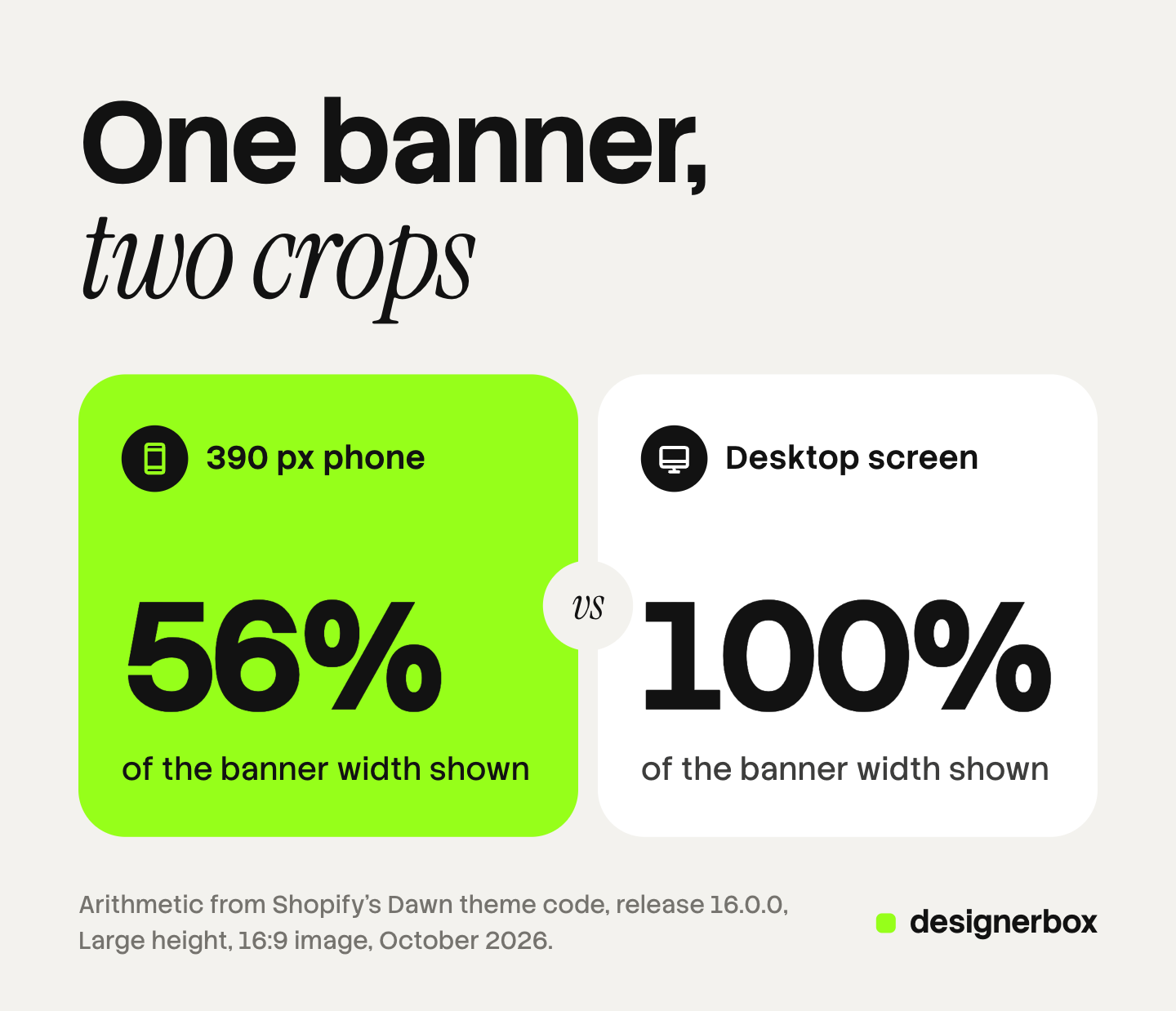
Dawn’s stylesheet sets those minimums: 420, 560 and 720 px on a desktop screen, and 280, 340 and 390 px on a phone. The box on a phone is close to a square. A 16:9 image is much wider, so the theme cuts the left and right sides.
| Dawn height setting | Minimum height on a phone | Width of a 16:9 image shown on a 390 px phone |
|---|---|---|
| Small | 280 px | 78% |
| Medium | 340 px | 65% |
| Large | 390 px | 56% |
The percentages are our arithmetic from Dawn’s stylesheet for one phone width. Shopify publishes no such figures. On a 1,440 px desktop screen, the same image keeps 100% of its width on every height.
Shopify’s help page describes the same effect: “Wide images might be cropped on the left and right when the device used to view them has a tall screen, such as a mobile phone.”
You have four ways to control the crop.
- Set a focal point. Shopify says focal points “always display in frame, even if you have a theme that crops your image.” Each image takes one focal point. Dawn supports them from version 7.0.0, and so does every Horizon theme.
- Choose the adapt height. With Adapt to first image, the box takes the image’s own ratio and nothing is cropped. The cost is size: a 16:9 banner is about 219 px high on a 390 px phone.
- Upload a second image for mobile. Horizon’s hero has a setting named Show different media on mobile. Dawn’s image banner has no mobile image field.
- Compose for the crop. Keep the subject in the middle half of the width. Then one file works on both screens.
The image_url filter behind all of this crops from the center by default (shopify.dev, October 2026). The same filter serves product images, and our guide to Shopify product image size covers the upload limits and the re-encoding in full.
Where should the text in a banner go?
Shopify’s answer is direct. Its help page says: “Images that you use for slideshows or backgrounds shouldn’t have text in them. If the text is a part of the image itself, then it might get moved around, cropped, or adjusted based on your theme.” It tells you to add text and links in the theme editor.

Text set in the theme editor stays whole on every screen, because the theme wraps it. You can change a sale date without a new image file. Shopify also says to choose simple images, so the text over them is easy to read.
Some campaigns need lettering inside the picture, such as a hand-drawn headline. Keep it inside the center-safe area. On Dawn’s Large height that area is the middle 56% of a 16:9 image. Then check the banner on a real phone. For the same problem across ad placements, see our guide to one ad concept in every platform size.
How do slideshow and other section images differ?
A slideshow follows the banner rules with one addition. Dawn’s slideshow height can adapt to the first image, and every other slide then fills a box shaped by slide one. Export all slides in one ratio, or the later slides are cropped.
An image with text section is narrower, so Dawn requests no more than 1,500 or 1,800 px. On its Adapt to image height the whole picture shows, and any ratio works.
Product images follow other rules. Our guide to Shopify product images covers the first image, and the guide to Shopify product page optimization covers the other fields.
An email banner follows a third set of rules, set by the email column and the inbox. Our guide to email banner size covers those.
How heavy can a banner file be?
The upload. Shopify’s theme images page states two megapixel numbers. One line recommends images “up to 5000px x 5000px or 25 megapixels”. A later section says uploads can’t exceed 20 megapixels or 20 megabytes. Stay under the lower one. A 3,840 x 2,160 px banner is 8.3 megapixels, so it passes both.
The delivery. Shopify picks the format for each browser and sends WebP or AVIF where supported, its help page says. A phone that needs a 750 px file never downloads the 3,840 px one.
The banner still matters for speed. It is usually the largest element on the first screen, so it sets the Largest Contentful Paint. Google’s guidance is that a page should reach Largest Contentful Paint in 2.5 seconds or less, measured at the 75th percentile of page loads (web.dev, October 2026).
Two choices are yours to make:
- Put one image section first. Dawn gives high fetch priority to the image only when its section is the first on the page.
- Keep the slideshow short. Dawn loads the first slide right away and the other slides lazily. Only slide one loads with the first screen.
To upload a full set of banner and product files at once, see the four routes in our guide to a Shopify bulk image upload.
One campaign image in every banner ratio
A seasonal campaign needs the same picture several times: a wide desktop banner, a tall mobile banner and a square collection tile. Then the next market needs the same three.
Anyone can make an AI picture. Making hundreds that still look like your brand is the hard part.
In DesignerBox you build that job once as a workflow. You set the ratios, for example 16:9, 4:5 and 1:1, and the workflow makes the same picture in each one. Your brand rules are set once, and the workflow reads them on every run. The cost is shown before the run.
For one picture that needs a change, the image editor makes one edit after another. The picture keeps its detail and resolution. The page for ecommerce brands shows the rest of the image set.
The full workflow from the first product photo to the finished ad, in one subscription.
The limits are plain. DesignerBox does not send finished work to Shopify. You download the results, or send them with a webhook or an S3 step, and add them in the theme editor. Every plan below Ultra is one seat. If your banner photo is final and needs only a crop, Shopify’s own media editor is enough.
Uploading your own photos and the commercial license start on the Pro plan. AI video, virtual try-on, upscaling, the image editor and the video editor start on the Premium plan. Plans and credits are on the pricing page.
There is a free plan, and it runs on sample products. Start from a template and look at the set it returns.
FAQ
What is the best Shopify banner size?
Shopify states no official size. A working size is 3,840 x 2,160 px, because Dawn and Horizon request banner files up to 3,840 px wide. Keep the subject in the middle half of the frame, because a phone crops the sides.
What is the Shopify hero image size for mobile?
Horizon’s hero accepts a separate mobile image and requests it at up to 1,600 px wide. A tall 1,600 x 2,000 px frame fits a phone, and that size is a convention. Dawn’s image banner has no mobile image field.
What size should a Shopify slideshow image be?
Use the banner size, 3,840 x 2,160 px, and export every slide in one ratio. Dawn’s slideshow can set its height from the first image, and a slide with another ratio is then cropped.
What is the Shopify logo size?
Shopify gives a display setting and no file size. Dawn’s logo width runs from 50 to 300 px, and the theme requests no logo file wider than 600 px. A 600 px wide PNG with a transparent background covers it.
What size is a Shopify favicon?
Dawn’s theme setting says the favicon is displayed at 32 x 32 px, and Horizon requests the same size. Upload a larger square PNG and the theme resizes it.
Can DesignerBox make banners in Shopify sizes?
A DesignerBox workflow makes the same picture in the ratios you set, such as 16:9, 4:5 and 1:1. It does not send finished work to Shopify. You download the results and add them in the theme editor.
Sources
- Shopify Help Center, uploading images: aspect ratio guidance, focal points and theme versions, no text in slideshow and background images, wide images on tall screens, format delivery, the megapixel and file size limits (help.shopify.com, read October 7, 2026)
- Shopify Help Center, product media types: product and collection image limits, the 2048 x 2048 px square (help.shopify.com, read October 7, 2026)
- Shopify blog, Website Image Size Guidelines for 2026, dated June 30, 2026: suggested hero and blog image sizes (shopify.com, read October 7, 2026)
- Shopify, Dawn theme source code, release 16.0.0: image banner and slideshow widths, height settings and minimum heights, image with text widths, collection image ratios, article image widths, logo width setting, favicon size, fetch priority (github.com/Shopify/dawn, read October 7, 2026)
- Shopify, Horizon theme source code: hero widths, the mobile media setting, logo height setting, favicon size (github.com/Shopify/horizon, read October 7, 2026)
- Shopify developer documentation, image_url filter: the default center crop (shopify.dev, read October 7, 2026)
- web.dev, Largest Contentful Paint: the 2.5 second threshold at the 75th percentile (web.dev, read October 7, 2026)
- Google search results for the query “shopify banner size”, United States, first page: the four sizes quoted in the introduction (google.com, read October 7, 2026)
- DesignerBox workflows and image editor: DesignerBox product pages (designerbox.ai/product/workflows, designerbox.ai/product/image-editor), October 2026
Shopify facts verified on Shopify’s help center, blog, developer documentation and public theme code on October 7, 2026. Every working size in the table is a convention with its reason stated, and the crop percentages are arithmetic for a 390 px wide phone, not measurements. Themes change with each release, so check your own theme’s settings before you export a full set. Individual results vary.