


Ecommerce branding is the set of decisions that make an online store look and sound like one business. It covers seven layers: the name and promise, the logo, color and type, the product photos, the packaging, the voice, and the site and email. For a one-person store, the hard part is keeping all seven the same on every new product, without a designer.
You launched with twelve products and one afternoon of photos. Six months later you sell forty. You photographed them on four different days, with two phones, in whatever light the kitchen had. The logo exists in three versions, and the newest product page uses a font nobody chose. Nobody decided to change the brand. It drifted, one product at a time.
This guide is a working system for a one-person online store with 20 to 500 products. Each layer ends in a rule you can write in one line and check by eye, plus the platform spec it has to meet on Shopify, Amazon or Google, where one applies. The last section is a ten-point check for every new product. For the photo side of the job, DesignerBox for solo founders starts from a phone photo of the real product.
Key Takeaways
-
A brand is seven layers of decisions. Each layer needs one written rule.
-
Write rules you can check. “Daylight from the left, on a sand-colored board” can be checked. “Feels premium” cannot.
-
Check the name before you print anything. A mark too similar to a registered one is a common reason the USPTO rejects applications.
-
Choose colors with a number. WCAG 2.2 asks for a contrast ratio of at least 4.5:1 between normal text and its background.
-
Product photos are what shoppers look at first. In Baymard Institute’s testing, 56% of users began on a product page by exploring the images.
-
Platforms set part of the style. Amazon wants a pure white main image with the product at 85% of the frame. Google Merchant Center does not accept logos laid over a product image.
-
The checklist is the system. Run the same ten checks on every new product, and product forty looks like product one.
What is ecommerce branding?
Ecommerce branding is how an online store makes every point of contact look and sound like the same business. A shopper meets you on a product page, in an ad, in an email and in a box at the door. Branding decides what each of those looks like and how each one speaks. For a small store, all of it fits on one page of rules.
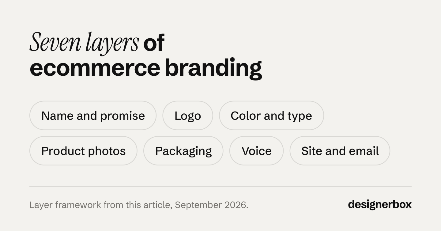
The seven layers stack. The promise decides the name. The name and the promise decide the look. The look decides the photos and the box. The voice carries the promise into every sentence you write. A change at the top moves everything below it, so decide the layers in order.
Branding for small business is the same work at a smaller size. A large brand pays an agency for a long book of guidelines. A one-person store has a founder, a phone and a store theme. The layers stay the same. The rules have to be short enough for one person to follow on a busy day.
Why does a one-person brand drift?
A one-person brand drifts because every new product brings a new set of small decisions. You photograph it on a new day, in new light. You write its page from memory. You make its launch post in whatever app is open. Each choice is reasonable. Together they make forty products that look like they come from six different shops.

Photos are where drift shows first, because photos are what shoppers look at first. In Baymard Institute’s usability testing, 56% of users began on a product page by exploring the product images (baymard.com, April 2020). A grid of mismatched photos is the first thing those shoppers see.
The usual fix is more effort: a new shoot, a new theme, a new look. That fixes the look only until the next product arrives. The lasting fix is fewer decisions. Make each decision once, write it as a rule, and reuse it every time. The survey numbers often quoted for brand consistency are weaker than they look, and the apparel branding guide traces where they come from. You do not need them to see the problem. Put your last ten product photos in a grid and look.
Name and promise: how to build a brand from one sentence
Start with the promise, because the other six layers depend on it. A promise is one sentence with three parts: who the product is for, what it gives them, and why they can believe it. Here is an example for an invented linen store: “Plant-dyed linen for homes with children, made to be washed every week.” Every photo, box and email should agree with that sentence. The wellness branding guide shows how one promise becomes a short list of visual rules.
Shopify gives the promise two fixed boxes. In its Brand settings, a slogan can be up to 80 characters, and a short description should be 150 characters or fewer (help.shopify.com, read September 2026). Write your promise to fit both. Shopify uses the short description in bios and listings, so shoppers see it in more places than your home page.
Then choose the name. Four checks come before any logo work:
- Say the name aloud to a friend once. Can they spell it?
- Is the .com, or your country’s domain, free?
- Is the same handle free on the social platforms you plan to use?
- Does a search of the USPTO trademark database find a similar name for similar products?
The fourth check matters most. The USPTO says one of the most common reasons it rejects an application is a trademark “too similar to an already registered one”, with a likelihood of confusion (uspto.gov, read September 2026). It also says a full clearance search covers its federal database, state trademark databases and the internet, and that the state databases and the internet are your responsibility. This is general information, not legal advice. Ask a trademark attorney before you spend money on a name.
Logo, color and type without a designer
A one-person brand can start with a wordmark: the store name set in one typeface, in one color. It is cheap to make, easy to read at small sizes and easy to keep the same.
Make two versions and no more. Shopify’s Brand settings ask for a default logo in PNG or JPEG, at least 512 pixels wide. They recommend a square logo of 512 by 512 pixels for social profiles, where it may be cropped to a circle. Shopify also asks for no margins around the logo file, because extra space makes the header bigger and the logo smaller (help.shopify.com, read September 2026). Keep one master file of each version in one folder. A brand kit explains how to stop four versions of one logo from spreading.
For color, pick one main color, one or two supporting colors and one dark neutral for text. Write each one as a hex code, and use no others.
Test every text color against its background. WCAG 2.2 success criterion 1.4.3 asks for a contrast ratio of at least 4.5:1 for normal text. Large text needs 3:1, and WCAG defines large text as at least 18 point, or 14 point bold (w3.org, read September 2026). A pale brand color can fail as text and still work as a background. Test each pair once, then write the result into the rule.
For type, use two fonts at most: one for headings and one for body text. If you have no budget for a font license, Google Fonts are open source and free. Google’s FAQ says you can use them commercially and “within any logo” (fonts.google.com, read September 2026). If you buy a font, read its license for logo and web use before the brand depends on it.
The visual layer as rules, for an invented store:
- Logo: wordmark only, in ink or white, never stretched or recolored.
- Main color: one green, on buttons and the insert card only.
- Text: near-black on off-white, contrast checked at 4.5:1 or more.
- Headings: one font, one weight.
- Body: one font, one size on the site and in email.
Product imagery rules for an online store
This is the layer that breaks first, and the one shoppers judge first. The job is the same shot for every product. Decide a shot list once, for example a packshot on white, one angle, one close detail and one scene. Then fix what makes photos match: background, light direction, camera angle, crop, styling and export size. A product photography style guide turns those choices into rules anyone can check.
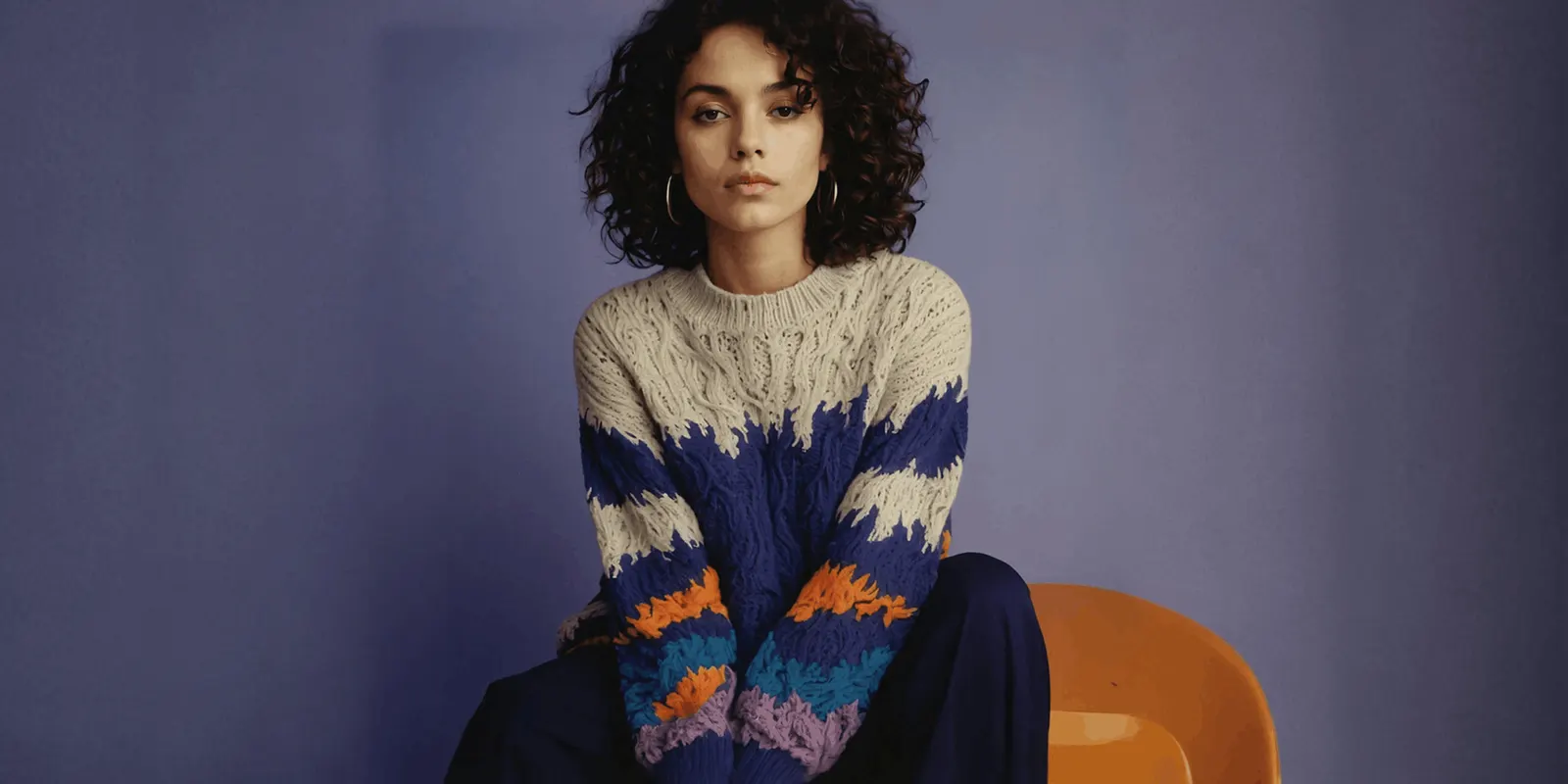
Keep three approved photos as your reference set. Compare every new photo with them, side by side, before you add it to the store. The reference set shows the light, the shadow and the crop at once. If you sell electronics, the tech product photography guide covers glossy finishes and screens.
Marketplaces set part of the style for you. Amazon says the main image needs a pure white background (RGB 255, 255, 255), and it asks you to show the product as 85% of the image. It must also represent the product accurately, as a realistic, professional-quality image (sellercentral.amazon.com, read September 2026).
Google Merchant Center does not accept product images with overlays such as watermarks, brand names or logos, unless the logo is part of the product itself. It does not accept a border either, and it recommends a solid white or transparent background (support.google.com, read September 2026).
So your logo belongs on the product, the tag or the box inside the photo. It never sits on top of a feed image. In a shopping feed, your brand look comes from the light, the surface and the props. If your photos come from a phone, AI product photography starts from that phone photo.
Packaging and unboxing on a small budget
A small store rarely needs a custom printed box at the start. Three parts can carry the brand instead:
- A plain stock mailer in one color that fits your palette.
- One branded mark: a sticker, a rubber stamp or printed tape in your main color.
- An insert card with the promise, care instructions and how to contact you, in your two fonts.
The rule for this layer is repeatability. Choose parts you can buy again in the same color next year. If a supplier changes, check the new box against a photo of the old one before you use it.
Anything printed on the box or the card is a claim, so print only what you can prove. Photograph the packaging once, in your product photo style, for your own unboxing photos.
Brand voice, site and email
Write your voice as three words and two short lists. The three words describe how you speak, for example “plain, warm, exact”. The first list holds words you always use. The second list holds words you never use. “Wash it every week” might be on the first list. “Luxurious” might be on the second, if your promise is about daily use. Read every product page and email against both lists before you publish or send it.
Your store should read the brand from one place. Shopify’s Brand settings hold your logos, colors, cover image, slogan and short description. Compatible themes read those brand assets into the theme settings automatically, and apps that use Shopify’s Brand API use them as the default (help.shopify.com, read September 2026). Set the brand there once, instead of in every theme section. For the product page itself, Shopify product page optimization covers nine fields in order.
Send email from an address on your own domain, with the same logo, the same colors and one button style. This is also a delivery rule. Gmail requires everyone who sends to personal Gmail accounts to use SPF or DKIM authentication for the sending domain. Senders of 5,000 or more messages a day also need DMARC, and their marketing emails need one-click unsubscribe (support.google.com, read September 2026).
How to keep the brand the same on every new product
The first launch is easy. The fortieth is where brands drift. Run the same ten checks on every new product before you start selling it. Each check is quick, because the rule already exists.
| Layer | The check | A pass looks like |
|---|---|---|
| Promise | Does the product copy agree with the promise sentence? | Nothing on the page contradicts it |
| Logo | Is it the master file, in the right version? | Wide logo in the header, square logo on social |
| Color | Is every color from the hex list? | No new color without a new rule |
| Type | Two fonts, and no third | Headings and body match the rest of the site |
| Main photo | Same background, light, angle and crop as the reference set | No tile looks different in a grid of nine |
| Marketplace image | On Amazon, a white main image with the product at 85% | No logo laid over any feed image |
| Other shots | Same shot list as every other product | Same number of shots, in the same order |
| Packaging | Same mailer, mark and insert card | The card has care notes for this product |
| Voice | Product copy uses the always list | No word from the never list |
| The launch email uses the saved template | Sent from your own domain |
The grid test is the fastest photo check. Put the new main photo in a grid with the last eight products and look at it on your phone. If one tile has a different background, light or crop, it fails. Consistent product images sets out the grid test and the six layers behind it, and a product photography checklist lists the photo checks in six stages.
Review the rules once a quarter. Add a rule only when the same mistake happens twice. Remove any rule nobody can check. When the rules stop changing, put them on one page. A brand guidelines template gives that page a structure.
One brand record for every product
Anyone can make an AI picture. Making hundreds that still look like your brand is the hard part.
DesignerBox is AI creative production for brands and agencies. Scale your images, ads and video with AI and keep your brand on every piece: build the workflow once with your brand rules, run it on every product, see the cost before each run, and keep everything from the first product photo to the finished ad in one place. DesignerBox for ecommerce brands shows how photos of each new product become the packshot, the scenes and the ad sizes.
For a one-person store, the setup follows the layers above. In Brand, you save your logo, colors, fonts, voice and rules once. Every workflow reads that record before a run. A template already holds the light, the angle and the crop for a job. You add a phone photo of the real product and press Run.
Batch runs one workflow over a whole sheet of products. You review the results in one pass. You keep or discard per row, and re-run one row on its own. The full workflow from the first product photo to the finished ad, in one subscription. DesignerBox for solo founders shows this setup for a one-person brand.
Here are the limits. You download the results and add them to your store yourself. Uploading your own photos and the commercial license start on the Pro plan. AI video starts on the Premium plan, so the free plan cannot make video. Team features, shared brand kits and white label are on the Ultra plan, and every plan below Ultra is one seat. The name, the packaging and your emails stay your own work.
A free plan for your first run
There is a free plan, and it runs on sample products. Start from a template and see the cost before you run it. Get started free.
FAQ
What is ecommerce branding?
Ecommerce branding is the set of rules that makes an online store look and sound like one business everywhere a shopper meets it. It covers seven layers, from the name and promise to the site and email. For a one-person store, the rules fit on one page.
How do I build a brand for my online store without a designer?
Work in order. Write a one-sentence promise, then choose a name and search the USPTO trademark database. Make a wordmark in one font and pick a few colors with a contrast check. Decide a fixed shot list for photos. Then run the same ten checks on every new product.
How many fonts and colors should a small brand use?
Two fonts are enough: one for headings and one for body text. For color, use one main color, one or two supporting colors and one dark neutral for text. Check every text color against its background for a contrast ratio of at least 4.5:1.
Should I check my store name for trademarks?
Yes, before you print or buy anything. The USPTO says a trademark too similar to a registered one is one of the most common reasons it rejects an application. It also says searching state trademark databases and the internet is the applicant’s job. Ask a trademark attorney before you file.
How do I keep product photos consistent as my catalog grows?
Fix the shot list, the background, the light, the angle, the crop and the export size once. Keep three approved photos as a reference set. Compare every new photo with them in a grid on your phone.
Can I use AI images for my store’s product photos?
Yes, within each platform’s rules. Google Merchant Center requires AI-generated product images to keep the metadata that marks them as AI-made, such as the IPTC DigitalSourceType value TrainedAlgorithmicMedia. Amazon says the main image must represent the product accurately. Hold AI images to the same brand rules as any photo.
Sources
- Baymard Institute, “Ensure Sufficient Image Resolution and Zoom”, Edward Scott: baymard.com, April 2020, accessed September 2026
- USPTO, “Why search for similar trademarks?”: uspto.gov, last updated November 2023, accessed September 2026
- Shopify Help Center, “Managing your brand assets”: help.shopify.com, accessed September 2026
- W3C, Understanding WCAG 2.2 Success Criterion 1.4.3, Contrast (Minimum): w3.org, accessed September 2026
- Google Fonts, Frequently Asked Questions: fonts.google.com, accessed September 2026
- Amazon Seller Central, product image requirements (G1881): sellercentral.amazon.com, accessed September 2026
- Google Merchant Center Help, image requirements: support.google.com, accessed September 2026
- Google Workspace Admin Help, email sender guidelines: support.google.com, accessed September 2026
- DesignerBox pricing page (designerbox.ai/pricing), September 2026: plan gates
Platform rules verified from Shopify, Amazon, Google, the USPTO and W3C as of September 2026. Individual results vary.