

A brand guidelines template is a ready-made outline for the rules that keep your brand the same everywhere: logo, color, type, imagery, voice, layout, channels and ownership. A useful one holds every rule in a shape a person or a workflow can check: a number, a do-and-don’t pair, or a named file. Below is a 12-section template to copy, and six public brand guidelines to study.
Most brand guidelines are written for a reader who has time. The PDF says the brand is fresh, confident and warm. A freelancer reads those three words and makes one ad. A supplier makes a different one. An image tool never opens the PDF at all. By the next product launch, the shop shows two greens and three kinds of product photo.
This guide gives you the sections, what to write in each one, and an example rule for each. It is for brand and ecommerce teams with 20 to 500 products, and for agencies that write guidelines for their clients. The job is the same standard on every product. DesignerBox for brand teams runs those rules on every product, and the last section shows how.
Key Takeaways
-
A template gives you the sections, not the rules. Every field still needs a value that your team decides and records in one place.
-
Write each rule in one of three shapes. A number, a do-and-don’t pair, or a named file. A person can check all three, and so can a workflow.
-
Twelve sections cover a product brand. Cover and owner, summary, logo, color, type, photography, graphic elements, layout, voice, channels, co-branding and AI use.
-
Logo rules need two numbers. Clear space, measured with a part of the logo, and a minimum size in pixels and millimeters. Spotify and Shopify publish both.
-
Brand text colors still need contrast. WCAG 2.2 asks for 4.5:1 for normal text. Text in a logo is exempt, and the rest of the brand is not.
-
Voice rules work best as pairs and word lists. Mailchimp writes “smart but not snobbish”. GOV.UK writes “select”, and never “click”.
-
Give the guide one owner, a version and a date. Then test it on someone new before you share it.
What is a brand guidelines template?
A brand guidelines template is an outline with a heading for each part of the brand and space for your rules. You copy it, write your own values, and share one version with everyone who makes things for the brand. That includes staff, freelancers, suppliers, agencies and the AI tools they use. The template saves time on structure. The value is in the rules you write into it.

Three documents are often confused. A brand kit is the set of files people use every day: logo files, color values, fonts and templates. A product photography style guide sets how every product photo looks. Brand guidelines sit above both. They hold the rules for the whole brand, and they point to the kit and the photo guide for detail.
The names vary too. Some teams call the whole document a brand style guide. Others use “style guide” for the writing rules only. The name matters less than one fact: there is one current version, and everyone knows where it is.
What makes a brand rule checkable?
A rule is checkable when two people read it separately and reach the same yes or no. “Use plenty of white space” fails that test. “Keep a margin of 8% of the image width on every side” passes it. A workflow needs the same thing a new designer needs: a value, not a mood.
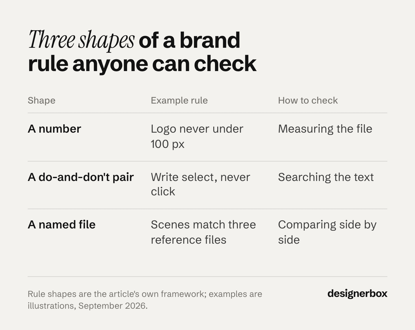
Every rule in the template below takes one of three shapes:
| Shape | Example rule | How a person checks it | How a workflow uses it |
|---|---|---|---|
| A number | Logo never under 100 px wide on screen | Measures the file | Sets the logo size in the layout step |
| A do-and-don’t pair | Write “select”, never “click” | Searches the text | Flags or replaces the word |
| A named file | Product scenes match reference_scene_01 to 03 | Compares the result with the three files | Uses the files as the style to follow |
Adjectives still have a place. Put them in the brand summary, where they explain why a rule exists. Keep them out of the rules themselves.
If a rule cannot take one of the three shapes, it is a preference. Move it to an appendix, or cut it. A long list of preferences hides the few rules that matter.
A brand guidelines template to copy
Copy this table into a document and write your own value in each row. The example rules are illustrations. Change every number to fit your brand.
| # | Section | What to write | Example rule someone can check |
|---|---|---|---|
| 1 | Cover and owner | Version, date, owner, and what the guide covers | ”v2.0, 1 September 2026. Owner: brand lead. Covers the shop, marketplaces, social and ads.” |
| 2 | Brand summary | What you sell, to whom, and three voice traits as pairs | ”Warm but not cute. Expert but not technical.” |
| 3 | Logo | Versions, file names, clear space, minimum size, backgrounds, don’ts | ”Clear space equals the height of the icon. Never under 100 px wide on screen.” |
| 4 | Color | Each color in hex, RGB, CMYK and Pantone, its job, and its share of a layout | ”Accent green on no more than 10% of a layout. Text pairs pass 4.5:1.” |
| 5 | Typography | Families, weights, sizes, line height and a fallback font | ”Headlines at weight 600. Body 16 px on screen. Fallback: Arial.” |
| 6 | Photography | Light, background, framing, props, and what never changes on the product | ”Three approved and three rejected reference photos, each with one reason.” |
| 7 | Graphic elements | Icons, patterns and illustration style | ”Icons: 2 px line, rounded ends, one color.” |
| 8 | Layout and templates | Grid, margins, and one template file per format | ”Every format has one file, named brand_format_size_v2.” |
| 9 | Voice and tone | Voice pairs, tone by situation, and a use and avoid word list | ”Write ‘select’, never ‘click’. No sentence over 20 words in product copy.” |
| 10 | Channels | Each platform’s own rules, with the page and the date you read it | ”Marketplace main image rules copied from the platform’s page, with the date.” |
| 11 | Co-branding | How your logo sits beside a partner’s, and how others may use yours | ”Partner logos at equal height, one icon width apart.” |
| 12 | AI use and approval | What AI may change, what it never changes, and who approves | ”AI may change the scene. It never changes the product, the logo or the text.” |
Two rows do most of the work. Row 1 makes the guide trustworthy, because everyone can see which version is current. Row 12 is often missing from older guides. It tells staff, suppliers and agencies what an AI tool may change and what it may not.
For a clothing brand, some of these values come from earlier choices. Apparel branding covers the six decisions to make before any photo. For a store run by one person, ecommerce branding without a designer covers the same ground in seven layers.
Brand guidelines examples to study
We read these six public guides in September 2026. Each one shows at least one rule in a checkable shape. Mailchimp, GOV.UK and Monzo are brand style guide examples for writing. Shopify, Spotify and Asana are written for partners and developers who use the logo. They show logo rules clearly, but not a whole internal brand system. Study the shape of each rule, not the brand.
| Guide | What it covers | A rule shape to study |
|---|---|---|
| Mailchimp Content Style Guide | Voice, tone, grammar, accessibility and a word list | Voice traits written as “X but not Y” pairs |
| GOV.UK A to Z style guide | Word-by-word writing rules | ”Select” in place of “click”, with the reason |
| Monzo writing principles | Writing principles with examples | Each principle says which kinds of writing it applies to |
| Shopify, Using our brand | Logo versions, clear space, minimum size, don’ts and trademark use | Minimum size: 80 px or 28 mm wide |
| Spotify design guidelines | Logo, icon, color and album artwork | Artwork corners: 4 px on small and medium devices, 8 px on large ones |
| Asana brand guidelines | Logo lockups, clear space, color and co-branding | Partner logos spaced by the width of its three-dot symbol |
Two of them add details worth copying. Asana’s brand page shows a “Last Updated” date of June 25, 2026, so a reader knows the page is current. Mailchimp’s guide states its own license: it is public under a Creative Commons Attribution-NonCommercial 4.0 license, and it asks for credit if you reuse it.
What none of them can give you is your own values. A template and six examples give you the shape. The numbers, the pairs and the files still have to come from your brand.
Logo, color and type rules
These three sections carry the most numbers. They are also the easiest to check, by a person or by a workflow.
Logo
Each of the partner guides above measures clear space with a part of its own logo, so the rule grows and shrinks with the logo. Shopify sets clear space equal to the x-height of its wordmark. Spotify sets an exclusion zone of half the height of its icon. Asana sets clear space equal to the height of its symbol.
Then add a minimum size, in screen units and print units. Spotify says its logo “should never be smaller than 70px in digital or 20mm in print”. Shopify’s minimum is 80 pixels or 28 millimeters wide. End the section with a short list of don’ts, with a picture of each: stretch, rotate, recolor, add a shadow, place on a busy background. Each of the three guides lists don’ts like these.
Color
Write every color in each space you use: hex and RGB for screens, CMYK for print, and Pantone for packaging and spot color. Then give each color a job and a share, such as “accent on no more than 10% of a layout”. A share is checkable. “Use the accent sparingly” is not.
Add a contrast rule for text. WCAG 2.2 asks for a contrast ratio of at least 4.5:1 for normal text, and 3:1 for large text (w3.org, September 2026). The W3C counts 18 point text, or 14 point bold text, as large. Text inside a logo has no contrast requirement. The W3C also says that brand guidelines beyond the logo are not part of that exception. So list the text and background pairs that pass, and ban the rest.
Typography
Name the font families and the weights you have a license for. Then give the sizes in pixels or points, a line height, and a fallback font for places where your font cannot load, such as some email apps. “Clean, modern type” tells a designer nothing. “Headlines at weight 600, body at 16 px, fallback Arial” tells them what to do.
Imagery, layout and product rules
Imagery is where written rules fail most often. Words like “natural” or “premium” describe thousands of different photos. So the imagery section should point to files. Pick three reference pictures that pass and three that fail, and write one reason under each.
A style reference is an image that shows the look you want another image to take. A person can match it. So can an image tool that accepts reference images. The photo style guide covers the rest of product photography: light, angles, retouching and export sizes. A product photography checklist then turns those rules into 30 pass or fail checks for each new product.
For a product brand, one imagery rule matters more than the others: the product never changes. Its shape, color, print, logo and text stay exactly as they are. Write it as a never rule. Apply it to people, suppliers and AI tools in the same way.
Layout rules need named files too. Keep one template file for each format you publish, such as a square feed post, a vertical story and a marketplace image. Name each file with the brand, the format, the size and the version. “Use the template” is only checkable when everyone opens the same file.
Voice and tone rules
Voice is the part of the brand that stays the same. Tone changes with the situation. Mailchimp’s style guide says its tone “is usually informal, but it’s always more important to be clear than entertaining”.
Write voice traits as pairs. The first word says what the brand is, and the second says how far to go. Mailchimp writes: “We’re weird but not inappropriate, smart but not snobbish.” A writer can check a sentence against a pair. Nobody can check a sentence against the single word “fun”.
Then add a word list with two columns: use and avoid. The GOV.UK style guide says not to use “click”, “because not all users click”, and to use “select” instead. It also says to use “and” rather than ”&”, with two named exceptions. Monzo’s writing principles replace “blacklist” and “whitelist” with “blocklist” and “allowlist”, and they explain why the words matter.
A word list is the most checkable rule in the guide. A person can search for the word, and so can a script. The wellness branding guide uses the same method for visuals: it turns each motif into a yes-or-no rule.
Last, add a short tone table for the texts your team writes most: a product page, an ad, an out-of-stock email and a reply to a complaint. One line each is enough.
How to test and maintain brand guidelines
Test the guide before you share it. Give it to someone who was not in the room, with three real jobs: a product photo brief, an ad and a caption. Ask them to use only the guide. Every question they ask is a missing rule. Every answer they had to guess is a rule that is not checkable yet.

Then run the same test with a workflow. Put the checkable rules into it, run it on ten products, and place the results beside your approved reference pictures. Where the results drift, the rule behind them is vague, or it sits in a paragraph instead of a field. Where AI brand drift starts covers the handoffs where this happens most.
Keep the guide current with four habits:
- One owner. One person approves every change.
- A version and a date on the cover. Everyone can see which copy is current.
- A change log. One line per change: what changed, why, and from which date.
- A fixed review date. Platform rules and image sizes change, so check the channels row against each platform’s page at every review.
An agency keeps one guide per client. The 12 sections stay the same, and only the values change. A new client starts from the same template, and the first review happens before the first full run.
Brand rules a workflow reads
Anyone can make an AI picture. Making hundreds that still look like your brand is the hard part. A PDF guide only works when every person opens it and reads the right page. A workflow needs the rules as fields: a color code, a font name, a never rule, a file.
DesignerBox is AI creative production for brands and agencies. Scale your images, ads and video with AI and keep your brand on every piece: build the workflow once with your brand rules, run it on every product, see the cost before each run, and keep everything from the first product photo to the finished ad in one place.
The checkable rules from your template go into a brand record. It holds your logo files, colors, fonts, voice, never rules, products and up to four reference pictures. Every workflow reads the record before each run. You build a job once as a workflow, and a colleague runs it as an app from a short form.
Batch runs one workflow over a whole sheet of products. You review the results in one pass, keep or discard per row, and re-run one row alone. Three critic steps score the results, and best-of-N keeps the best one. Content scaling covers what changes when one product becomes dozens of files.
The full workflow from the first product photo to the finished ad, in one subscription. DesignerBox for brand teams shows the setup for an in-house team.
Here are the limits. The written guide still matters, because printers, suppliers and partners work outside DesignerBox. You still check product color against the real product. You download the results, or send them with a webhook or an S3 step. Nothing goes into your shop on its own. Uploading your own photos and the commercial license start on the Pro plan. Team features, shared brand kits and white label are on the Ultra plan, and every plan below Ultra is one seat. An agency keeps one brand record per client.
A free plan for your first run
There is a free plan, and it runs on sample products. Start from a template and see the cost before you run it. Get started free
FAQ
What should brand guidelines include?
Twelve sections cover most product brands: cover and owner, brand summary, logo, color, typography, photography, graphic elements, layout and templates, voice and tone, channels, co-branding, and AI use. Write each rule as a number, a do-and-don’t pair or a named file, so a person or a workflow can check it.
How long should brand guidelines be?
Long enough to hold every rule, and short enough to read before a job. Keep each section to one page of rules. Move the reasons, the history and the mood boards to an appendix. A rule that nobody finds before a deadline does not hold the brand.
What is the difference between brand guidelines and a brand style guide?
Many teams use the two names for the same document. Others use “style guide” for the writing rules only. The Mailchimp Content Style Guide and the GOV.UK style guide are both writing guides. What matters is that one document holds the rules, with one owner and one current version.
Can I copy another company’s brand guidelines?
Use their structure and the shape of their rules as a model. Do not copy their logos, colors, fonts or text. Some guides state their own terms: Mailchimp’s content style guide is public under a Creative Commons Attribution-NonCommercial 4.0 license and asks for credit. Read the terms before you reuse any text. This is general information, not legal advice.
How do brand guidelines work with AI tools?
An image model does not open your brand PDF before it makes a picture. It works from the inputs it gets on each run. So the rules have to travel as values: color codes, font names, never rules and reference pictures. A rule written as an adjective, such as “fresh” or “premium”, gives the tool nothing to check.
Who should own brand guidelines?
One person, usually the brand lead or the head of ecommerce. The owner approves each change, updates the version and the date, and keeps a change log. An agency names one owner for each client’s guide.
Sources
- Mailchimp Content Style Guide, Voice and Tone, and the license note on its welcome page: styleguide.mailchimp.com, read September 2026
- GOV.UK, A to Z style guide (entries for “click” and “Ampersands”): gov.uk, read September 2026
- Monzo, writing principles: monzo.com/tone-of-voice, read September 2026
- Shopify, Using our brand: clear space, minimum size and don’ts: shopify.com/brand-assets, read September 2026
- Spotify for Developers, design guidelines: logo and icon sizes, exclusion zone, album artwork: developer.spotify.com, read September 2026
- Asana brand guidelines, last updated June 25, 2026: asana.com/brand, read September 2026
- W3C, Understanding Success Criterion 1.4.3: Contrast (Minimum), WCAG 2.2: w3.org, read September 2026
- DesignerBox Brand, Workflows and brand teams pages (designerbox.ai, September 2026)
Brand guideline examples verified from each company’s public page in September 2026. The Asana and Spotify pages were re-checked on 2 October 2026. The example values in the template are illustrations, not requirements. Individual results vary.