


Static ad examples fall into six families. Each family copies something the viewer already sees in the feed: a screen (a notification, a search, a text thread), an editorial page (news, research, a stat), a game (a quiz, a tier list), a diagram (a Venn, a chart), a voice (a review, a handwritten note) or a callout (a warning, “not for everyone”). The copied look is what makes people stop scrolling. It also decides which rule the ad has to pass.
Lists of these formats are popular on Instagram. One reel from August 2026 showed 35 formats in 25 seconds, under a second each (instagram.com/reel/DcfwsjTpyaq, August 2026). At that speed a list is a menu. It does not tell you which format fits your product, or which one an ad reviewer will reject.
This guide sorts 30 static ad formats into those six families. For each family it names the claim the format can prove and the platform or legal rule to check before it ships. It is written for performance agencies and brand teams who make static ads every week. For the plain shapes (packshot on a color block, lifestyle scene, offer frame), see the seven product ad formats. For making the ads themselves, the AI ad generator starts from your own product photo.
Key Takeaways
-
Every native format borrows trust. A receipt, a news page or a review looks like something the viewer already believes. That is why it works, and why the rules watch it.
-
Pick the format by the claim you can prove. A number fits a stat card. A comparison fits a diagram. A real customer quote fits a review format. No proof, no format.
-
Fake buttons break the rules. Meta’s policy checklist names images that show “non-existent functionality”, such as a play button that plays nothing. TikTok bans fake play, close and call-to-action buttons.
-
“Are you…?” is a Meta problem. Meta’s personal attributes policy rejects ads that assert or imply a person’s age, health or finances. “Are you 18 years old?” is one of its own examples.
-
Fake reviews are illegal in the US. The FTC rule on reviews and testimonials has applied since 21 October 2024, and it covers AI-generated fake reviews.
-
Ads dressed as news must say they are ads. The FTC, the EU unfair commercial practices directive and the UK CAP Code all require it.
-
Diversity beats iteration on Meta. Meta says distinct creative, not small edits of one ad, is what helps its ad system find the right people.
What counts as a static ad example?
A static ad example is a single-frame image ad, shown so you can study its layout. Nothing moves and nothing plays. The whole message lands in one look. The six families below are all static, and each one borrows its layout from something the viewer already knows: a phone screen, a newspaper, a game, a chart, a person or a sign.
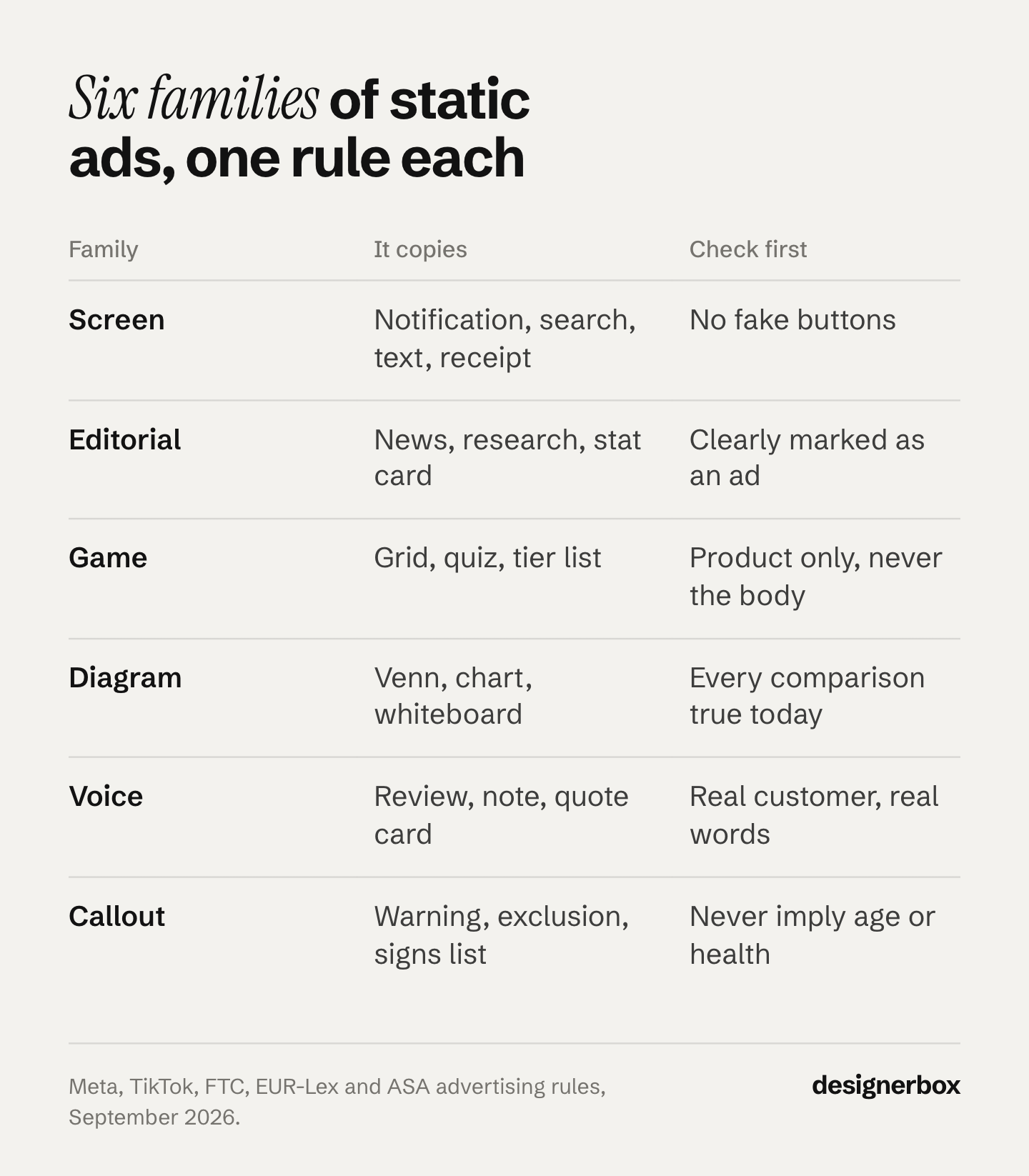
The borrowed layout does one job. It makes the ad look like content for the first half second. That is when a viewer decides whether to stop. After that, the ad has to deliver the claim it promised, or the stop is wasted.
Static is also the cheap unit for testing. The case for static against video, and the placements each one can use, is in static ads vs video. Where the picture itself should come from is in ad visuals: AI, stock or a shoot. The sizes a single image needs on each platform are in image ads on five platforms.
Why do native-looking static ads work?
They work because the platform treats a new format as a new ad. Meta wrote in April 2025 that “the focus has shifted from niche targeting to creative diversification as the best lever to find the most relevant audiences” (facebook.com/business, April 2025). In December 2025 it explained the difference. Creative iteration “might produce two ads with identical visuals, but different text CTAs”. Creative diversification “would generate two distinctly different pieces of creative” (facebook.com/business, December 2025).
So thirty colors of one layout count as one idea. A receipt, a tier list and a Venn diagram about the same product count as three. That is the practical value of a format list: it gives you distinct layouts for the same message.
Two limits apply. We found no public dataset that ranks these 30 formats by performance, so treat any “best format” claim with care, including one in this guide. And a format that wins for one brand can fail for the next, because the claim underneath is different. Test them. Why most creative tests cannot be read covers how many results a readable test needs.
Screen formats: notifications, searches and messages
Screen formats copy an interface the viewer uses every day. They look the most like real content, which is why the review rules watch them closely.
The rule to check: the ad must not show a function that does not work. Meta’s policy checklist tells advertisers to make sure ads do not “contain images that portray non-existent functionality (for example, a “play” button that doesn’t play actual content)” (facebook.com/business/help, September 2026). TikTok bans “fake video play buttons”, “fake close buttons” and “fake call-to-action buttons or pop-ups” (ads.tiktok.com, September 2026).
- The push notification. A lock screen with one alert: “Your order has shipped” or “Price drop on your saved item”. It proves the product is part of daily life. Draw it as a picture of a phone, and never place a real system alert shape where a viewer could tap it.
- The search results page. A search bar with the question your buyer types, and your product as the answer. It proves the problem is common. Use only a search you have seen people type.
- The text message thread. Two friends talking about the product. It proves word of mouth. If it reads as a real conversation between real customers, the review rules below apply to it.
- The inbox email. A subject line in an inbox, often from the founder. It proves there is a person behind the brand. Keep the sender real.
- The forum post. A community-style question with an answer that names the product. It proves peer trust. It is also the format most likely to read as a fake testimonial, so write it as the brand or use a real post with permission.
- The receipt. A till receipt that lists what the buyer gets, or what the old way costs. It proves value in numbers. Every line item has to be true.
A practical note on AI tools. Screen formats carry a lot of small text: times, battery icons, sender names, button labels. Image models can garble small text. Read every word at full size before the ad ships. For the plainer formats, 24 AI image prompts by ad format gives prompts you can copy.
Editorial formats: news, research and stat cards
Editorial formats copy a newspaper, a journal or a data card. They borrow authority. The rule to check is a basic one: an ad must be recognizable as an ad. The FTC says ads that are “not identifiable as advertising to consumers are deceptive if they mislead consumers into believing they are independent, impartial, or not from the sponsoring advertiser itself” (ftc.gov, December 2015).
- The breaking news card. A red banner, a headline, a photo. It proves urgency. Keep your brand visible in the frame, and never copy a real publisher’s name or masthead.
- The research headline. A study title with one finding. It proves a scientific basis. Link the real study on the landing page, and quote the finding exactly as the paper states it.
- The stat headline. One big number and one line. It proves scale. The number needs a source you can show.
- The cost per use breakdown. The price of the problem next to the price of your product, per day or per use. It proves value. Both figures need a basis a reviewer could check.
The same rule appears in Europe and the UK. Annex I of the EU Unfair Commercial Practices Directive lists as always unfair “using editorial content in the media to promote a product where a trader has paid for the promotion without making that clear” (eur-lex.europa.eu, point 11).
The UK CAP Code rule 2.1 says “marketing communications must be obviously identifiable as such”, and rule 2.4 gives “advertisement feature” as an example heading for an advertorial (asa.org.uk, September 2026). This is general information, not legal advice. Check with your own counsel before an editorial-style ad runs in a new market.
Game formats: quizzes, grids and tier lists
Game formats ask the viewer to do something: choose, guess, rank. They borrow the pull of a puzzle. The rule to check depends on what the game is about. A game about taste is easy. A game about the viewer’s body, age or money meets Meta’s personal attributes policy, covered under callout formats below.
- The pick-one grid. Nine tiles, one question: “Pick your roast” or “Tap your skin type”. It proves range. Keep it about the product, never about the viewer’s body. A grid of goal weights is a weight loss ad. Meta requires those to target people aged 18 or older, and it bans “statements of inferiority about physical appearance” (transparency.meta.com, September 2026). The claim rules for that category are in supplement advertising.
- The quiz card. “Guess which one is ours” or “Which of these has no added sugar?”. It proves a difference the viewer can see. The answer has to be on the card or one tap away.
- The tier list. Products ranked S to D in a grid. It proves where you sit in the category. Rank on a stated basis, such as price per serving or ingredient count.
- The playlist card. A music-app layout where each “track” is a product benefit or a use case. It proves variety. It is a fake screen too, so no play button.
- The spot-the-difference pair. Two near-identical photos, one with your product. It proves the detail that matters. The difference must be real and visible at phone size.
Diagram formats: Venn, charts and whiteboards
Diagram formats argue with a picture. They borrow the look of a lesson. They are the easiest family for a brand to own, because the drawing is yours. The rule to check is truth in comparison. The FTC “encourages the naming of, or reference to competitors, but requires clarity, and, if necessary, disclosure to avoid deception of the consumer” (ftc.gov, August 1979).

- The Venn diagram. Two circles, two things buyers want, your product in the middle. It proves you do not force a trade-off. Both circles must name real needs.
- The comparison chart. Your product against “the old way”, row by row. It proves a better choice. If you name a competitor, every row has to be accurate on the day the ad runs.
- The line graph. One line that falls or rises over time, with the product at the turning point. It proves a mechanism. A graph with no axis labels or no source proves nothing and looks like it is hiding something.
- The whiteboard sketch. A hand-drawn question and three answers, as if from a meeting. It proves thought went into the product. It suits a brand with a complex product and a simple point.
- The annotated photo. Your product photo with circles, arrows and handwritten notes. It proves a detail: the stitch, the seal, the zip. It needs a sharp photo, because the notes point at pixels.
Voice formats: reviews, notes and complaints
Voice formats put a person on the frame. They borrow the trust people give to other people. This family carries the most legal weight.
The FTC rule on consumer reviews and testimonials has applied since 21 October 2024 (ftc.gov, November 2024). It makes it unlawful to create a review or testimonial that misrepresents that the reviewer exists, used the product, or had the stated experience (law.cornell.edu, 16 CFR 465.2, September 2026). The FTC says the rule covers “AI-generated fake reviews” (ftc.gov, August 2024).
- The zero-star review. A real one-star or zero-star complaint, answered by the brand. It proves honesty. The complaint must be real, and it must be quoted as written.
- The handwritten note. A note on paper or a sticky note, in a founder’s or a customer’s hand. It proves care. If it says a customer wrote it, a customer wrote it.
- The customer quote card. One line from a review, the name, a small product photo. It proves the result. Keep the proof that the customer said it.
- The founder note. A short letter signed by the person who started the brand. It proves accountability. Use the founder’s own words.
- The text on skin. A benefit written on a hand or an arm, next to the product. It proves the product meets the body. It has no speaker, so keep the words on the skin to a claim you can prove.
One more line applies to every voice format with a face in it. The FTC Endorsement Guides say an ad that presents “actual consumers” should use actual consumers, or “clearly and conspicuously disclose” that the people are not (law.cornell.edu, 16 CFR 255.2, September 2026). The FTC points to this line when it explains that AI avatars in ads can be deceptive (ftc.gov, October 2026). How the rule applies to AI-made creator ads is covered in AI UGC ads and the FTC line.
Callout formats: warnings, exclusions and signs
Callout formats speak straight to one kind of buyer. They borrow the feeling of being seen. The rule to check is Meta’s personal attributes policy. It says ads “must not contain content that asserts or implies personal attributes”, including age, “physical or mental health” and “vulnerable financial status” (transparency.meta.com, September 2026). Its own rejected examples include “Are you 18 years old?” and “Ready to upgrade your skin to look younger?”. A passing reference to an age group is allowed.
- The X for Y line. “Like a language app, but for history.” It proves the product fits a habit the buyer already has. Name a category, not a brand you do not own.
- The “not for everyone” card. “This supplement isn’t for everyone”, then who it is for. It proves confidence. Describe the product’s buyer, never the viewer’s condition.
- The “avoid this” warning. A red cross over the common mistake, and your product as the fix. It proves expertise. The mistake must be a real one.
- The censored card. A black bar over a word or a detail, which the landing page reveals. It proves there is something worth seeing. Meta’s checklist also warns against “withholding key information to entice someone to click”, so the bar hides a detail, never the offer.
- The signs list. “Five signs your shoes need replacing.” It proves the problem is real. Point the signs at the product, never at the viewer. “Five signs you have acne” asserts a health condition. “Five signs your cleanser is too harsh” does not.
How to pick three formats for one product
Start from the claim you can prove, then pick the family that shows that claim best. A format with no proof under it is a trick, and a trick that works once trains the viewer to ignore the next ad. Pick three formats from three different families for each product. That gives Meta three distinct pieces of creative to work with. To turn the three into files for each network, see image specs for paid social campaigns. If this is your first ad, the order of work is in the seven steps of making an ad.
| The claim you can prove | Family to use | Check before it ships |
|---|---|---|
| A number: a price, a stat, a saving | Editorial or screen (receipt) | The source of every figure |
| A difference from the old way | Diagram | Every comparison row is true today |
| Real customer words | Voice | You hold the original review |
| Range or variety | Game | The game is about the product |
| A daily habit it fits | Screen | Nothing on screen looks tappable |
| One clear buyer | Callout | No “you” plus age, health or money |
Then run them as a test, not as a guess. Twelve frames across four claims and three formats is a readable first week. How many variants a month needs is set out in ad variants at scale. The fastest way to waste the set is to make every frame look the same, which is how AI ads start to look like slop.

If the ad uses AI-made images, check the label rules too. TikTok asks you to label ads with AI-generated or heavily AI-edited media, and it rejects or restricts undisclosed ones. The full list of rules now in force is in AI disclosure in ads.
Static ad formats as a workflow
Anyone can make an AI picture. Making hundreds that still look like your brand is the hard part. A format list gives you thirty layouts. A catalog needs the same three layouts on every product, in the brand’s fonts, colors and voice, every week.
DesignerBox is AI creative production for brands and agencies. You build a format once as a workflow: your product photo in, the layout, the headline, the brand rules, then the sizes each platform needs. The AI ad generator starts from your own product photo. The winning-ad variations template makes new versions of an ad that already works. You set the brand once in Brand, and the workflow reads it on every run.
Batch runs one workflow over a whole sheet of products, and you review the results in one pass. You keep or discard per row, and re-run one row on its own. Three critic steps score the results, and best-of-N keeps the best one. You still read every word on a screen format yourself. The cost is shown before each run. The full workflow from the first product photo to the finished ad, in one subscription.
Here are the limits. DesignerBox does not publish into Meta or TikTok. You download the results, or send them with a webhook or an S3 step. Uploading your own photos and the commercial license start on the Pro plan. Team features, shared brand kits and white label are on the Ultra plan, and every plan below Ultra is one seat. An agency running formats for several clients needs Ultra, and DesignerBox for agencies explains that setup. Plans and credits are on the pricing page.
A free plan for your first run
There is a free plan, and it runs on sample products. Start from a template and see the cost before you run it. Get started free.
FAQ
What is an example of a static ad?
A static ad is a single image ad with no motion or sound. Common examples are a product on a color block, a customer quote card, a comparison chart, a receipt that lists what the buyer gets, and a stat card with one big number. Each one delivers the product, the claim and the reason to tap in one frame.
Which static ad format works best on Meta?
No public dataset ranks static ad formats, so no format wins for every brand. Meta’s own guidance is to diversify. It says distinct pieces of creative, not small edits of one ad, help its system find the right audience. Run three formats from three different families per product and let the results decide.
Can a static ad look like a phone notification?
It can show a notification as a picture, but it must not pretend to be one. Meta’s policy checklist says ads must not portray “non-existent functionality”, such as a play button that plays nothing. TikTok bans fake play, close and call-to-action buttons. Draw the notification inside a visible phone, and keep anything tappable out of the frame.
Are ads that look like news articles allowed?
Yes, if the viewer can tell it is an ad. The FTC treats an ad as deceptive when viewers cannot identify it as advertising. The EU directive bans paid editorial that does not say it is paid. The UK CAP Code requires marketing to be “obviously identifiable”. Keep your brand visible, and never copy a real publisher’s name.
Can I use AI to write reviews for a static ad?
No. The FTC rule on consumer reviews and testimonials makes it unlawful to create a review that misrepresents that the reviewer exists or used the product, and the FTC says it covers AI-generated fake reviews. Use real reviews, quoted as written, and keep the original. AI can lay out the card. It cannot write the customer’s words.
Can a static ad say “Are you over 40?”
On Meta, that is a risk. Meta’s personal attributes policy rejects ads that assert or imply a person’s age, health or finances, and “Are you 18 years old?” is one of its own examples. A passing reference to an age group is allowed. Describe the product’s buyer (“made for skin over 40”) instead of asking the viewer.
How many static ad formats should I test at once?
Three formats from three different families per product is a practical start. It gives Meta three distinct pieces of creative. Twelve frames across four claims and three formats is a readable first week for most accounts. The binding limit is sample size, so check how many results a readable test needs before you call a winner.
Sources
- Meta, “The creative advantage: unlocking the power of diversification with Meta Andromeda”: facebook.com/business/news, April 2025, accessed September 2026
- Meta, “Demystifying creative diversification”: facebook.com/business/news, December 2025, accessed September 2026
- Meta Business Help Center, advertising policy basics checklist: facebook.com/business/help/757209948405699, accessed September 2026
- Meta Advertising Standards, Privacy Violations and Personal Attributes: transparency.meta.com, accessed September 2026
- Meta Advertising Standards, Health and Wellness: transparency.meta.com, accessed September 2026
- TikTok Ads Policy, Misleading and false content, including fake buttons and the AI-generated content label: ads.tiktok.com, last updated April 2026, accessed September 2026
- FTC, Commission Enforcement Policy Statement on Deceptively Formatted Advertisements: ftc.gov, December 2015, accessed September 2026
- FTC, Native Advertising: A Guide for Businesses: ftc.gov, accessed September 2026
- FTC, Statement of Policy Regarding Comparative Advertising: ftc.gov, August 1979, accessed September 2026
- FTC, Consumer Reviews and Testimonials Rule: Questions and Answers: ftc.gov, November 2024, accessed October 2026
- FTC, final rule banning fake reviews and testimonials: ftc.gov, August 2024
- 16 CFR 465.2 and 16 CFR 255.2, via Cornell LII: law.cornell.edu/cfr/text/16/465.2 and law.cornell.edu/cfr/text/16/255.2, accessed September 2026
- Directive 2005/29/EC (Unfair Commercial Practices Directive), Annex I point 11: eur-lex.europa.eu, accessed September 2026
- UK CAP Code, section 02, Recognition of marketing communications: asa.org.uk, accessed September 2026
- Format list reel, 35 formats in 25 seconds: instagram.com/reel/DcfwsjTpyaq, August 2026
- DesignerBox pricing page (designerbox.ai/pricing), September 2026: plans and feature gates
Ad policies verified from Meta, TikTok, the FTC, EUR-Lex and the ASA as of September 2026. The FTC’s questions and answers on the reviews and testimonials rule were re-checked on 2 October 2026. Individual results vary.