 Pastel paper background

Pastel background product photography with edges that stay visible

Your product goes on soft pastel paper, with the colour held and the edge still visible. Test blush, butter yellow, mint and lilac on the same item. Each run costs 4 to 10 credits, so a full colour test stays under a dollar.

Start free
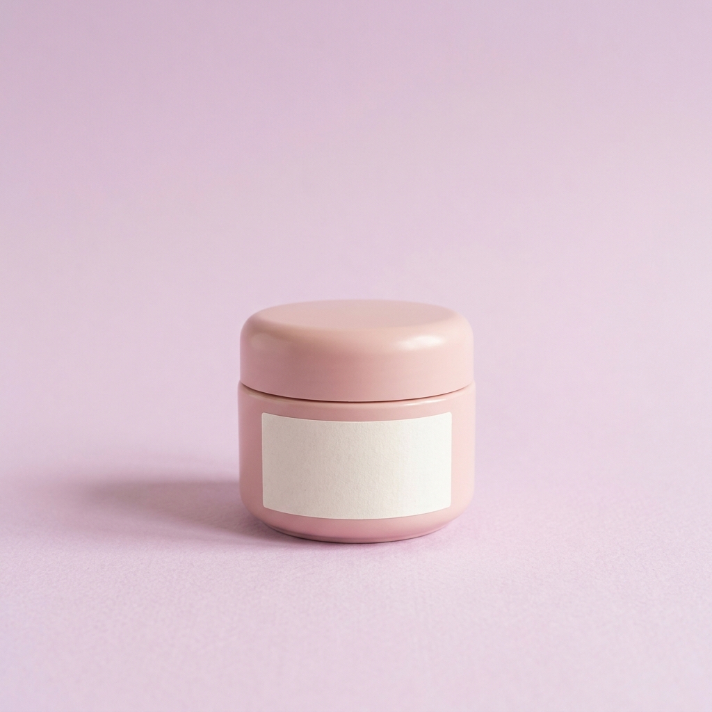
Soft pink ceramic cosmetic jar with a blank label, centred on pale lilac paper under even daylight.
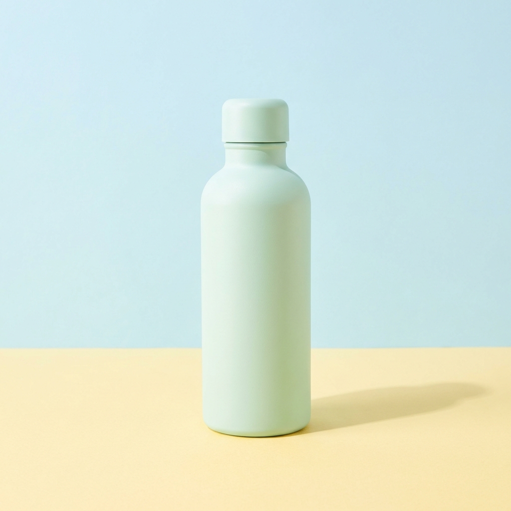
Pale mint reusable water bottle standing on butter yellow paper in front of a pale sky blue backdrop.
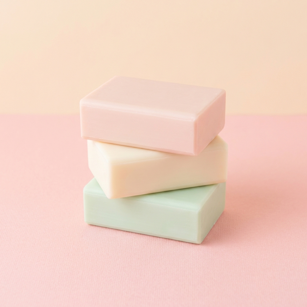
Stack of three blank soap bars in blush, cream and pale green resting on soft pink paper.

A pastel background is a soft, low saturation colour ground, usually paper, in shades such as blush, butter yellow, mint and lilac. Beauty, wellness and small home goods use it most, because the packaging is already pale and the label has to stay the loudest thing in the frame. It also gives a range one family. Nine items on nine soft colours still read as one set, which a plain white ground cannot do. Everything then rests on one number, the brightness gap between the product and the paper. Hold that gap and a pale jar keeps its outline. Lose it and the jar melts into the sheet. A dark or high gloss product carries its own separation, so it usually looks better on a deeper ground. Pastel also wants soft, even daylight, because hard light turns one part of a pale sheet into a bright patch and leaves the rest grey.

The hard parts of pastel paper

Four problems that only appear when the product and the ground are both pale.

Pale product on pale ground

A blush soap bar on cream paper has almost no tone gap, so the outline disappears. Fix it with brightness rather than hue. Put about 15 percent between the product and the ground, measured as brightness. Then add a soft contact shadow at the base and a slightly cooler edge on the shadow side. Both give the eye a line to follow without making the product look cut out.

Pastel hues drift under white balance

Pastels hold little saturation, so they move further than strong colours when the balance is wrong. A 300K shift turns lilac into warm grey and butter yellow into dirty cream. A saturated red stays red through the same error. Name a balance figure in the prompt, near 5400K for daylight, and rerun rather than correcting the hue afterwards. Reducing saturation in an editor adds noise in the smooth areas.

Lifting exposure without losing the paper

A pastel set wants about one stop over a mid grey reading, which is what makes it feel light. Push further and the paper clips. Once the brightest area reaches pure white, the pastel colour is gone and no edit can restore it. Aim for the brightest paper near 235 out of 255. That keeps the colour and still reads as bright on a phone screen.

Paper colour reflects onto the product

A large pastel sheet reflects its own colour back onto the product. Butter yellow paper warms the underside of a white bottle, and mint paper leaves a green cast on chrome caps. This is real on a physical set and models copy it, which is why a white item can look tinted in the result. Ask for a white bounce card on the shadow side. It returns neutral light to the lower half without removing the pastel colour.

Tools for a pastel set

Four apps, each doing one job on a pastel background.

Pastel paper without a paper roll
Styled Scene Generator

Pastel paper without a paper roll

Styled Scene Generator places your product on a named pastel surface, so you can test blush, butter yellow, mint and lilac from one upload. Write the paper colour and the backdrop colour as two separate lines. Ask for a soft contact shadow, because a pale product on pale paper needs that shadow to look like it touches the surface. Each run costs 4 to 10 credits.

Open the tool
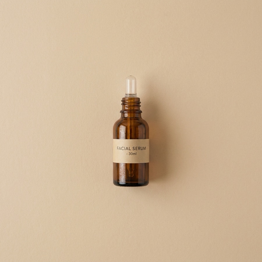
Pastel grids seen from above - Before
Before
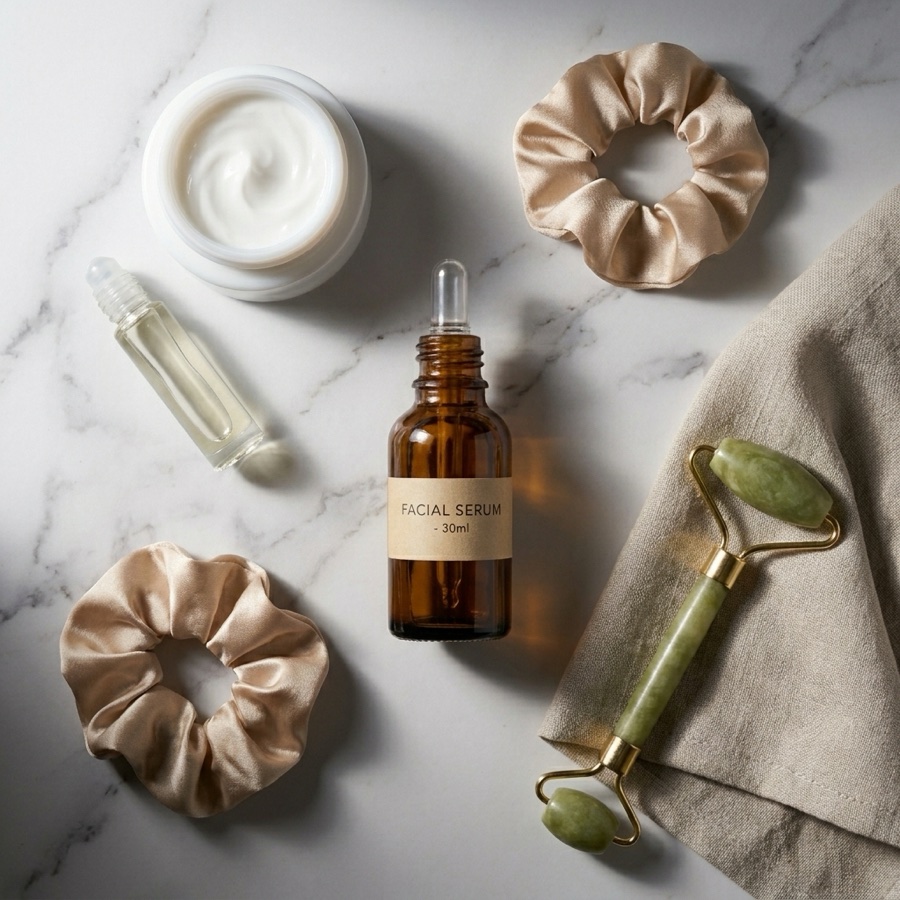
Pastel grids seen from above - After
After
Flat Lay Studio

Pastel grids seen from above

Flat Lay Studio builds the overhead view, which is where pastel does most of its work. You can place three pastel sheets side by side with one item on each, so a range reads as one set in a feed row. Keep the light flat and even. A low, raking light across pale paper shows every crease and dent in it.

Open the tool
A clean edge off pale paper - Before
Before
A clean edge off pale paper - After
After
Background Remover

A clean edge off pale paper

Background Remover cuts the product away from the pastel ground and returns a clean white file and a transparent file. Pale on pale is the hardest cut, so set the tone gap when you shoot and the edge will hold. The transparent file lets you place the same jar on a different pastel later, so you do not shoot the product again.

Open the tool
Pastel posts with room for text
Social Media Ad Studio

Pastel posts with room for text

Social Media Ad Studio builds the paid and organic sizes from a finished pastel frame. Pastel leaves a quiet area of paper to write on, so a headline sits on the ground and not over the product. Ask for the product low and to one side. Dark grey text on blush paper holds a contrast ratio near 4.5 to 1, which small screens need.

Open the tool

Each before and after above demonstrates the tool named on the card, using that app's own sample image, so the subject you see may not be from this industry. Run the same tool on your own photos to see it on your work.

Four steps to a pastel set

From one product photo to a matched pastel run.

1
Upload one photo and name two colours
Upload one clear photo of the product. Uploading your own product photo is on Pro and above. Then write the paper colour and the product colour in plain words, for example a pink jar on pale lilac paper. The model needs to know which pale thing is the product. If your product is white, say white, because most models read an unnamed white item as part of the paper.
2
Set the tone gap
Ask for a ground that is clearly lighter or darker than the product, not the same weight. A gap of about 15 percent in brightness is enough to hold the edge. A pale mint bottle works on butter yellow paper, because the yellow sits lower in tone. A blush soap bar on cream paper is too close.
3
Fix the light and the balance
Ask for soft daylight from one side with a large source, plus a white bounce card on the shadow side. Name a colour balance near 5400K. Pastels are low in saturation, so a 300K error turns lilac into grey. Ask for the brightest part of the paper to sit near 235, not pure white, so the paper keeps its colour.
4
Check the colour, then save the run
Open the result at full size and compare the paper with the colour you named. Drift shows in the paper long before it shows in the product, so sample a flat area away from the shadow. If lilac has gone warm grey, rerun with the balance named again, because pulling the hue back in an editor adds noise across a smooth sweep. Check the brightest patch of paper is still under pure white, since a clipped sheet has no colour left to correct. Last, store the paper words and the balance figure with the run, or the next product in the range starts from a guess.

Order of work

Tone comes before light on a pastel set. If you light the frame first and then change the paper colour, the exposure moves again and the product edge softens. Colour balance comes before any cut-out, because a warm cast pulls a pale product and pale paper closer together and the edge gets harder to find. Upscale last. A smooth pastel sweep can show banding when a small file is stretched, so raise only the frame you have already accepted. Save the setup once the colour is right, or you will repeat the same drift on the next product.

Files a pastel set returns

Four outputs to check before a pastel run counts as finished.

A frame with a readable edge

The first file has to prove separation. Zoom to 100 percent and look along the top edge of the product, where the paper is brightest. If the outline fades into the ground there, the tone gap is too small. A soft contact shadow under the base fixes most of it.

Hue variants of one product

Run the same jar on three pastels and keep the files together. Blush, mint and lilac from one upload gives you a feed row that looks planned. Note the exact colour words you used. Six months later you will want the same lilac for a new item, and those words are the only record.

A white file and a transparent file

Every pastel set should end with a plain white version and a cut-out with no background. Many stores want plain white on the main listing image and allow colour on the rest. The transparent file also lets you move the product onto a different pastel for a campaign without a new run.

A large copy with no banding

Many selling channels compress what you upload, and a smooth pastel sweep is where that shows first. The soft change across the paper breaks into visible steps. Check the file at full width on a large screen, because a phone screen hides them. If steps appear, rerun with a flatter, evenly lit sheet or ask for a faint paper grain, since both give the eye something to read across the step. Image upscale, which is on the Premium plan, gives the sweep more pixels to spread across.

Model choice for pale colour

Pale colour puts two things under strain. The first is the step between two close tones, which is where the product edge lives. The second is a wide sweep of soft paper, which is where banding starts. Nano Banana Pro holds the small tonal steps, so a cream jar keeps an outline on blush paper. Seedream renders the wide sweep with less stepping, so a large area of one soft colour stays smooth at full width. Run the same jar through both and look at one place, the top edge of the product where the paper is brightest. A weak result loses the outline there first.

Pastel background questions

Six things sellers ask before a first pastel run.

Which pastel colour should I choose for my product?
Choose a pastel that sits at a different brightness from your product, then pick the hue. A pale mint bottle reads well on butter yellow, because the yellow is lower in tone. A blush soap bar disappears on cream. As a rule, warm products look calm on cool grounds such as lilac and pale sky blue, and cool products look calm on blush or butter yellow.
Why do my pastel backgrounds look grey or muddy?
Grey pastel is almost always a colour balance error. Pastel hues carry little saturation, so a shift of 300K to 400K can drain them, and lilac is the first to go. Name the balance in the prompt, near 5400K for daylight. Also check that the paper is not clipped. Once the brightest part of the paper hits pure white, the colour is gone and no edit can restore it.
How do I stop a pale product from disappearing into pastel paper?
Give the product a tone gap and a contact shadow. Ask for a ground about 15 percent brighter or darker than the product, measured in brightness rather than hue. Then ask for a soft shadow where the product meets the paper, which draws the base line. A thin, slightly cooler edge on the shadow side also helps. Avoid a hard outline, because it reads as a cut-out.
Will the pastel paper match the colour of my packaging?
Not exactly, because you describe the paper in words and words cover a range. You will get a soft lilac, not one fixed value. That is fine, as long as you stop trying to match. A near miss between the paper and your box reads as a mistake, while a clear difference reads as a choice. Pick a pastel a few steps away from your packaging colour, or one at a different brightness. If a brand colour has to appear, keep it on the product and let the paper stay quiet.
How much does a pastel background set cost in credits?
A run costs 4 to 10 credits, and a colour test is three or four runs, one per shade. The physical version is priced differently. Pastel means one paper roll per colour, so blush, mint and lilac is three rolls, three tubes and the space to store them flat. Pale paper is also the least forgiving to keep. One scuff or one crease shows on a soft sheet where a dark sheet would hide it, so the marked front section gets cut off and thrown away. Here the fourth colour costs the same as the first.
How do I get the same pastel colour on every product in a range?
Save the setup in Workflows and rerun it for each product. The workflow keeps the paper words, the light and the balance, so item nine sits on the same lilac as item one. Write the colour words down as well, because a colour you describe by name is easier to repeat than one you match by eye. Compare each new file with the first file in the range. The colour drifts a little each time if you compare with the previous one.

The background catalogue

The catalogue lists all twelve backgrounds side by side, so you can compare pastel with white, marble, linen and the rest.

See all backgrounds

Put your product on pastel paper

Start on the free plan with 112 credits. That is enough to generate pastel frames and see which shade keeps the edge of a pale product. Free files carry a watermark, so treat the run as a colour test. Any paid plan clears it, and your own jar arrives with Pro.

Start free